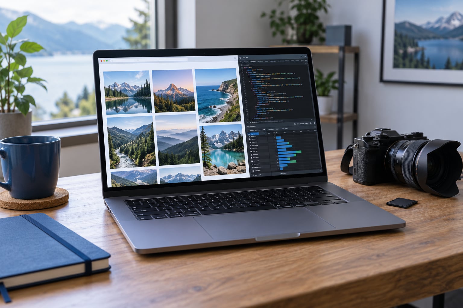
To make a photo gallery load faster, you cut the number of bytes a browser downloads before the first photographs appear, serve each screen the size it actually needs, and hold back the rest until a visitor scrolls. For a wedding gallery of 800 frames or a portfolio of full-resolution exports, that single habit is usually the difference between three seconds and fifteen.
I built photography sites for years and the pattern never changes: the machine is fine, the connection is fine, the gallery is drowning in oversized files. If you are searching for this because your own gallery feels sluggish, the fixes below run in order of impact, and the first one takes five minutes.
Google scores page experience with three Core Web Vitals, and they are worth knowing by name because every tool you are about to use reports them. Largest Contentful Paint (LCP) measures how fast your biggest visible element, usually a photograph, appears: aim for under 2.5 seconds. Cumulative Layout Shift (CLS) measures whether images shove text around while they load: aim for under 0.1. Interaction to Next Paint (INP) measures how quickly the page responds to a tap or click: aim for under 200 milliseconds.
For an image-heavy gallery, LCP is almost entirely a story about one file: its size, its format, and how many competing requests are queued ahead of it. Everything below serves that one goal and the two after it.
Table of Contents
What You Need Before You Open a Single File
You need access to the place where the images actually live. On a self-hosted site that means FTP or a file manager, on WordPress it means the media library, and on Squarespace or Wix it means the asset panel. Whatever the platform, you need the ability to replace one image and see the result before you replace three hundred.
Beyond that, four things are enough:
- An image editor. Lightroom and Capture One both export web-sized copies directly, and free tools like Squoosh handle one-off jobs if you would rather not open your catalog.
- A performance tool. PageSpeed Insights runs from any browser with no install, and WebPageTest shows you a filmstrip of what the page looked like at second one, second two and second three.
- A browser with developer tools. Chrome and Safari both let you throttle the connection and inspect every request, which turns guesswork into a list.
- A text editor and a backup. If you hand-edit gallery markup or add attributes, you want Notepad or a code editor ready, and a copy of the current version.
Step-by-Step: How to Make a Photo Gallery Load Faster
How to Audit Your Current Gallery Speed in Five Minutes
Measure before you change anything, because otherwise you cannot tell whether a fix helped. Paste your gallery URL into PageSpeed Insights, wait for the run, then scroll to Diagnostics. The number that matters most is the Total Byte Weight of images, and the one that matters most inside it is the LCP element and its listed potential savings.
Record four figures in a note: total image weight, the size of the single largest above-the-fold image, the LCP time on mobile, and the number of image requests the page fires. A 50-image gallery that requests 60 files for a page of 50 photographs has a bug in it, not just a weight problem.
Then open WebPageTest on the same URL and watch the filmstrip. If the page looks finished at second eight but your visitor could read the caption text at second one, you have a clear picture of what is holding everything back. Note that a test run from a fast European data centre flatters you, so look at PageSpeed’s mobile run rather than trusting a fast desktop number.
Compress and Export Images Without Losing Quality
This is where most gallery weight actually lives. A 6000-pixel camera JPEG routinely lands between 8 and 20MB before any editing. Displayed in a gallery column that is 900 pixels wide on a phone, almost all of that data never reaches the viewer’s eye, and the compression has already thrown away detail nobody can see at that size.
The working rule is simple: resize to the display dimensions, then compress, then sharpen for screen. Exporting at 3000 pixels on the long edge at a quality setting of 75 to 80, in sRGB, produces a file a fraction of the size that still looks crisp when zoomed. Exporting at the camera’s native resolution at quality 100 produces a file nobody needs and everybody downloads.
| Delivery version | Typical size of one photograph | Where it belongs |
|---|---|---|
| Full-resolution camera file | 8 to 20MB | Downloadable purchase or print only |
| Large gallery image, 3000px long edge | 400KB to 1MB | Lightbox and zoom view |
| Web display image, 1600 to 2000px long edge | 150KB to 350KB | Grid, slideshow, blog body |
| Thumbnail, 400 to 600px | 20KB to 60KB | Masonry grid, contact sheet, admin view |
These are typical ranges for a modern camera file, not a promise about yours. Open one of your own images and check, because your camera and your export settings decide the real numbers.
In Lightroom the export settings screen is: File Settings set to JPEG, Quality around 75 to 80, Image Sizing set to Long Edge at 3000 pixels for the lightbox version and 1600 for grid display, Color Management set to sRGB, and Sharpening set for Screen with the amount low. Capture One works the same way through its Output tab, with Long Edge, Quality and Color Space under the JPEG preset. Export a web preset once and stop re-deriving it per image.
One more setting matters more than photographers expect: progressive JPEG. The browser can render a partial image immediately and refine it, so a photograph appears as a blurry version that sharpens instead of appearing after a blank pause. It costs nothing in file size and helps the perceived speed of every grid you build.
Serve the Right Image Size for Each Screen
An old desktop export sent to a phone on mobile data is the most common waste in a photography site, and it is pure configuration, not content. Responsive images let one image element offer several files and let the browser choose:
<img src="ridge-1600.jpg"
  srcset="ridge-600.jpg 600w, ridge-1000.jpg 1000w, ridge-1600.jpg 1600w"
  sizes="(max-width: 700px) 100vw, 50vw"
  width="1600" height="1067"
  alt="Ridge line at sunrise with low cloud">
The sizes attribute tells the browser how wide that slot will actually be on the current screen, which matters more than it looks: a two-column desktop grid at 50vw means a 1000w file, while a phone gets the 600w one. Without sizes, browsers fall back to the srcset width as if the slot always filled the whole viewport, and phones download desktop files anyway.
The width and height attributes are not optional decoration. They let the browser reserve the right box before a single pixel of image arrives, which is what keeps Cumulative Layout Shift under 0.1. A gallery whose images pop into an empty page and shove the caption text downward is failing CLS even when the photographs are perfectly compressed.
On WordPress, core has generated srcset since 5.5, so a theme that displays images at full width gets responsive markup for free once the media library has thumbnails of several sizes. On Squarespace and Wix the equivalent happens automatically when you set the image block width instead of using a full-width block.
Use Lazy Loading for Below-the-Fold Images
Lazy loading means telling the browser not to download an image until it is close to entering the viewport. A visitor sees a grid immediately, the first row of thumbnails arrives first, and the rest of the photographs download only as they scroll toward them. It is the cheapest large saving available to a gallery, because a visitor who scrolls halfway never downloads half the files at all.
In markup it is one attribute on the image element:
<img src="gallery/thumb-07.jpg" loading="lazy"
  width="600" height="400" alt="Bride walking back to the ceremony">
WordPress adds it to images below the fold automatically, and most themes and page builders have a lazy-load toggle in their settings panel. On a hand-built gallery you add the attribute to every image except the first row.
Here is the part that catches people out. Never add loading=”lazy” to the image that is the largest thing in the first viewport. That image is your LCP element, and lazy loading tells the browser to postpone exactly the download the metric measures, which makes your score worse rather than better. Mark it eager and give it priority instead:
<img src="gallery/hero-1600.jpg" loading="eager" fetchpriority="high"
  width="1600" height="1067" alt="Cover image of the gallery">
If your gallery opens with a full-bleed hero photograph, that is the one file to protect. Everything under it is fair game.
Optimize the Gallery Code, Thumbnails, and Caching
A grid of photographs is a page that requests dozens of files at once, and browsers queue requests. Over plain HTTP/1.1 a single origin gets about six connections at a time, so sixty thumbnails queue up behind each other in waves. This is why an unfiltered 60-thumbnail view took one PhotoPrism user about eight seconds per batch, and why narrowing the working set with a colour or category filter cut that to seconds. Any filter that reduces the number of photographs the page must fetch cuts real time, not just scrolling.
Three practical fixes sit on top of that:
- Make the grid display a real thumbnail file, not the full image scaled down by the browser. A 400-pixel-wide thumbnail should be a 400-pixel file, and the gallery should keep the full image for the lightbox only.
- Load the full-size image when someone clicks, not when someone hovers the thumbnail, and keep that file off the initial page entirely.
- Defer anything that is not needed to draw the grid. Carousels, sliders, filters, chat widgets and analytics scripts should not compete with photographs for bandwidth.
Caching is the other half. A Cache-Control header that lets the browser keep a photograph for a year means a returning visitor downloads nothing at all. On WordPress a caching plugin writes those headers; Cloudflare in front of the domain does the same at the edge, plus it serves copies from a data centre near the visitor instead of from wherever your host happens to be.
Do you need a CDN? Not on a small portfolio with a few hundred images on a decent host. Once you are serving event galleries where several clients browse at once, or you are outside the region your server sits in, the edge cache usually pays for itself quickly. Treat it as a fix for visitors far from your server, not as a default.
How to Test the Faster Gallery on Real Devices
Run the same three tests again, the same way you ran them before, so the numbers mean something. PageSpeed Insights on mobile, WebPageTest filmstrip, and the Network tab in Chrome with Slow 4G throttling turned on.
Throttling matters more than it sounds. Turn it on, reload, and scroll the gallery as a visitor would. If the photographs appear progressively as you scroll rather than all at once, lazy loading and thumbnails are doing their job. If the page jumps around while images arrive, the width and height attributes are missing somewhere.
Then check the photographs themselves. Zoom into a full-width image on the real screen and look at edges against a sky, which is where over-compression shows first. A quality setting of 75 to 80 that survives inspection at 100 percent is a good setting. Most people can push lower, but pushing lower on a wedding gallery to save bandwidth is a strange place to economise.
Finally, open the gallery on a phone over mobile data. Everything you measured on a fast connection lies by a factor of ten, and this is the connection most of your clients are using.
Common Mistakes That Keep Galleries Slow
These are the errors I see over and over, in roughly the order they cost you time:
Sending full-resolution files to the grid. The page loads the photograph a visitor sees at 900 pixels wide as a 6000-pixel original. Fix: generate a separate display size and use it in the grid, keeping the full file for the lightbox and downloads.
Lazy loading the first image. It is the correct tool applied to the one file where it does damage. Fix: loading=”eager” and fetchpriority=”high” on the LCP image, loading=”lazy” on everything else.
Missing width and height. The layout shifts every time an image lands. Fix: add both attributes, or an aspect-ratio style, on every gallery image.
Uploading straight from the camera with no export preset. Every upload carries 15MB of data nobody needs. Fix: export a web preset once and use it for every gallery upload from then on.
Running two optimisation plugins at once. Users stacking image optimisers and performance plugins report double compression, regeneration loops, and slower results than having neither. Pick one image optimiser and one cache plugin, and turn off anything that duplicates their job.
A lightbox that loads full-size files on hover. Browsing a gallery then downloads every image you pass over. Fix: swap the thumbnail on click, not on hover.
Testing only on desktop, on fast broadband. Your score looks great and your clients on phones still wait. Fix: throttle to Slow 4G and test on a real device before you call it done.
Never re-testing. A plugin update, a theme change or a new gallery template can undo months of work. Run PageSpeed Insights once a month and after every plugin change, and keep the result in a note.
If you have an afternoon, do these in order: export proper web-sized images, set the display size in the grid, add lazy loading to everything below the first row, add width and height, turn on caching. That sequence fixes most galleries, in that order of return.
Frequently Asked Questions
What is lazy loading for images?
Lazy loading is an HTML attribute, loading=u0022lazyu0022, that tells the browser to skip downloading an image until it is close to appearing on screen. Everything above the fold downloads straight away, so the visitor sees the first photographs without waiting for the other two hundred. It saves real bandwidth when most visitors never scroll to the end. It is widely supported in Chrome, Firefox, Safari and Edge.
Should I lazy load the first image on my page?
No. Never add lazy loading to the largest image visible in the first viewport. That image is what Google counts as Largest Contentful Paint, and lazy loading makes the browser postpone precisely the download the metric measures, which pushes your score in the wrong direction. Mark that image loading=u0022eageru0022 with fetchpriority=u0022highu0022 and lazy load everything below it instead.
How big should my gallery images be?
Match the file to the largest size the slot actually displays. For a grid that shows images about 1000 pixels wide, export around 1600 pixels on the long edge at quality 75 to 80. Keep a 3000-pixel version for the lightbox. A grid thumbnail of 400 to 600 pixels is plenty. Anything larger is bandwidth you hand to visitors for detail they cannot see.
Is WebP or AVIF better for a photography website?
AVIF produces the smallest files, often around half the size of a comparable JPEG, but encoding is slower and a few older devices fall back to JPEG. WebP is the safer default: broad support, good savings, fast to encode. Either way, serve a JPEG or PNG fallback so no visitor gets a broken photograph. On WordPress an image optimiser handles the conversion and the fallback for you.
Why is my photo gallery slow even though I compressed my images?
Usually the weight is not in the photographs themselves. It is in the number of requests, scripts competing with them, a missing cache, or one oversized hero image at the top. Check the LCP element listed in PageSpeed Insights diagnostics first. Then count the image requests against the number of photographs on the page, and look at whether two plugins are both trying to optimise and cache the same files.
How many photos can I put on one gallery page?
There is no fixed number, because page weight and request count matter more than the count itself. A 60-image gallery with real thumbnails, lazy loading and caching can feel quicker than a 12-image gallery of full-resolution files. Keep above-the-fold images under about 1MB in total, lazy load the rest, and for very large event libraries consider filters or pagination so each view requests a smaller set.
Conclusion: Your Gallery Speed Action Plan
Start by measuring. Run PageSpeed Insights on your gallery URL on mobile and write down the total image weight and the LCP element, because that is the file you are about to fix first.
Then work down this list: export web-sized copies from Lightroom or Capture One at 1600 to 3000 pixels and quality 75 to 80, point the grid at real thumbnails, add srcset and sizes so phones stop downloading desktop files, add width and height to stop the layout jumping, lazy load everything below the first row but keep the hero image eager, and turn on caching. Run the same mobile test again a week later.
That sequence covers most of what a gallery actually needs, and it never asks you to give up image quality your visitors would ever notice.