To design a photo book layout, start with a finished edit, pick one page shape, and build a simple repeating grid before you place a single image. Most books fall apart in the sequencing and pacing, not the typography. Set aside a full afternoon, work in the order below, and check the result on paper before you print a run.
That order matters more than it sounds. Photographers usually pick a template first, fill it with whatever fits, then wonder why the finished book feels busy. Start with the pictures and the structure follows.
What You Need
Six things, and three of them are decisions rather than gear.
- A finished edit. Colour-corrected, cropped, and exported from your photo editor at full resolution. Working from raw files mid-layout is how colour shifts start.
- A clear theme or narrative. One sentence describing what the book is about. A weekend in the Dolomites, the first year of a garden, a year in review.
- A narrowed selection. Twenty to thirty images is a realistic starting pool for a 24 to 40 page book.
- A page-format decision. Square, portrait, landscape, or panoramic, based on how your photographs were actually shot.
- A layout tool. Anything that does master pages and print export will work.
- A proofing method. A screen at best. A single printed copy at worst, and ideally both.
If you want to build a reusable template rather than rebuild the book from scratch each time, set that up deliberately at the start. It pays off on the second project.
Step-by-Step
Eight steps, and they run in this order for a reason. Each one answers a question the next one depends on.
How to define the purpose and audience
Before choosing a template, decide what the finished pages should make a reader feel, and who is going to hold the book. A wedding album is read slowly by someone who knows the couple. A portfolio lookbook is glanced at by strangers who need to see your range in under a minute. Those two books share images but nothing else.
Write the purpose down as one sentence and put it where you can see it while you design. Every layout decision gets tested against it: does this spread move the story forward, or is it here because the photo was good?
Choose the right book format
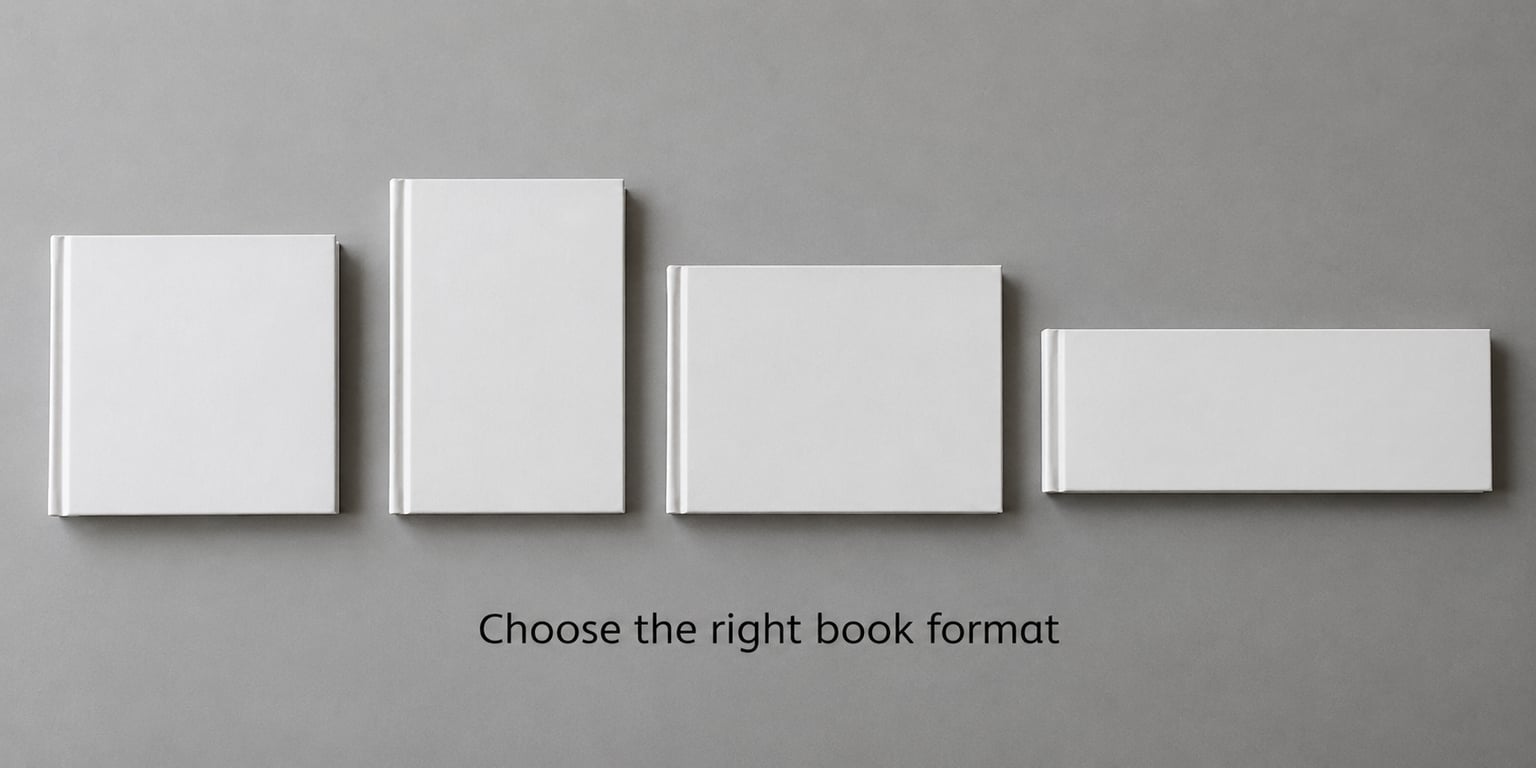
Page shape is not a style decision, it is a technical one. Choose the format that matches how you shoot, because cropping a portrait image into a wide page destroys the thing that made the frame work.
| Format | Best for | Effect on layout |
|---|---|---|
| Square | Mixed portrait and landscape | Forgiving of almost any crop; spreads read evenly across the crease |
| Portrait | Portraits, full-body work, vertical travel | Tall images fill the page; pairs stack better than they sit side by side |
| Landscape | Panoramas, group shots, editorial sequences | Great for wide images; awkward for single portraits, which float in empty space |
| Panoramic | Story sequences, single-trip books | Horizontal pacing feels natural, but the page turns more slowly |
Binding changes the maths too. In a layflat book the pages sit flat and almost any layout works. In a perfect-bound book the centre crease eats detail, so faces and key subjects stay well away from the middle of the spread.
Edit and select the strongest photographs
Cut hard. Judge each image on four things: is it technically clean, does it carry emotional weight, does it push the story along, and does it look different from its neighbours. An image that fails only one of those can stay; one that fails three goes.
The most common selection error is keeping a shot purely because it came from the same shoot. If nothing in it is new, it is filler, and filler weakens the pages around it.
As a working rule, one to three photos per spread keeps a book breathing. More than that and you are making a contact sheet, not a designed object.
Create a sequence with a visual rhythm
A photo book needs a beginning, a development, and an ending. Opening with your widest or most graphic image, building through tighter moments, and closing on something quiet works almost every time.
Rhythm comes from variation: scale, viewpoint, colour, direction of movement. A run of five similar frames reads as an error even when each frame is good. Alternate wide and close, colour and neutral, one image and a pair.
Test the order cheaply first. Number your favourites in a contact sheet or a plain document, flip through on screen, and try two or three orderings before you build anything. Sequencing is far easier to change as thumbnails than as placed pages.
Build a flexible page system
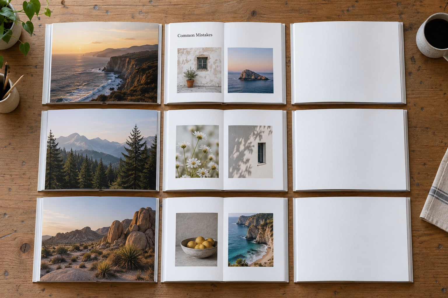
You need four or five page patterns, not one template applied to every spread. A workable set: full-bleed single, framed single with caption, image pair, image trio, and a quiet text page used for a title, a quote, or a chapter break.
Build those as master pages or master layouts so margins, gutters, and type styles stay identical everywhere. Then vary the pattern on each spread so no two consecutive pages look the same.
Set your grid once and protect it. Outer margins can sit around 15 to 20 mm, inner margins need to be wider than outer ones so the binding does not eat your images, and any full-bleed image that crosses the spine needs extra slack in the centre.
Add type, captions, and credits carefully
Words are support, not content. In a photo book, the type should tell a reader what they are looking at, and then get out of the way.
Stick to two or three fonts, one for headings and one for captions, and let size and weight carry the hierarchy rather than adding more typefaces. Captions sit close to the image they describe, small enough to read without competing.
A title page and a chapter divider between sections do more for pacing than any decorative font will. Keep names, dates, and locations consistent in style and placement, and record permissions for any image that leaves your own archive.
Check pacing, contrast, and viewing distance
Sit down and read the book at arm’s length, in order, turning every page. Most problems show up here and nowhere else. You are looking for abrupt jumps in density, where five busy spreads sit in a row with no quiet page to rest on.
Check that the image that matters most on each page has breathing room around it, and that quiet pages still have a job. A page with one small image and a caption can be a deliberate breath. A page with one small image and nothing else is usually an oversight.
Watch the extremes. A run of dark images followed by a white page feels like a light switch. Mix values across a section instead of sorting by them.
Proof, print, and review a small run
Soft proof on a calibrated monitor catches most errors, and none of the colour surprises. That last part matters, because print shops in this community report the same thing constantly: images look flat or dark once they come back from a lab. Shipping the file exactly as the printer’s colour profile specifies is the fix that costs nothing.
| Spec | Value | Why it matters |
|---|---|---|
| Image resolution | 300 dpi at final print size | Below that, faces and fine texture go soft on paper |
| Bleed | 3 mm (0.125 in) on full-bleed edges | Cuts are never pixel-perfect; without bleed you get white hairlines |
| Page count | Multiples of four | Lets you print a cover, endpapers, and back pages properly |
| Colour | Printer’s colour profile, converted to CMYK | Stops the surprise shift between your screen and the finished book |
| Export | Print-ready PDF, fonts embedded | The printer opens one predictable file instead of guessing |
| Spine safety | Keep faces 10 mm off the centre crease | Perfect-bound books swallow detail right where it matters |
Order one copy first, not ten. Forum conversations about photobooks repeat the same advice from every angle: people who skip a proof regret it, and people who got one wish they had done it earlier. Read the finished copy at reading size, not from across the room.
Common Mistakes
Eight errors I see repeatedly, each with the fix that resolves it.
- Using four fonts or more. Pick one sans or serif for headings and one for captions. Everything else comes from size, weight, and spacing.
- Filling every page. Leave white space on purpose. A quiet page is part of the pacing, not a leftover.
- Placing text over an important subject. Move the words to a margin or a caption area, or choose a different image.
- Repeating the same composition across a run. Alternate full-bleed, framed, and paired pages so the book has cadence.
- Sequencing strictly by date. Chronology is a reference, not a story. Rearrange by how the images build.
- Putting a face in the centre crease. In perfect-bound books, shift the pair outward or crop to a different frame.
- Ignoring print specs. Set trim size, bleed, and margins from the printer’s template before you lay out a single page.
- Skipping the paper proof. Order one copy. Judging colour and type from a monitor alone is guessing.
One more worth naming: building the whole book before making any decisions about tools. Pick the layout program early enough to know what it can do, then stop fiddling and start sequencing.
Frequently Asked Questions
How many photos should be in a photobook?
For a 24 to 40 page book, aim for roughly 30 to 60 images, which works out to one to three photos per spread. Fewer images with more white space usually reads as a designed book rather than a printed contact sheet. Start by choosing your strongest 20 to 30, sequence those, and only add more if a spread genuinely feels thin.
What is the best program to create photo books?
It depends on how much control you want. Browser-based tools and print-shop apps are fastest but constrain your layout to their templates. Affinity Publisher gives near-professional control with a gentler learning curve than InDesign, which is the right choice if you plan to reuse templates across projects. Lightroom’s book module suits a straight, image-first sequence.
How can I design my own photo book?
Start from a finished edit rather than a template. Define the purpose and audience, pick a page format that matches how you shoot, narrow to your strongest images, and sequence them into a beginning, middle, and end. Then build four or five master page layouts, place your images into them, add minimal captions, and export a print-ready PDF at 300 dpi.
How do you keep photos out of the spine of a photo book?
In a perfect-bound book the centre crease hides detail, so keep faces, hands, and text at least 10 mm from the middle of the spread. Pair two images that work independently rather than one panorama crossing the fold, or open the image across four pages so the crease falls in sky, floor, or shadow. Layflat binding removes the problem but not the page-turn rhythm.
Do photo books need bleed?
Only for full-bleed images that run off the page edge. Add 3 mm, about 0.125 in, on those sides so the printer’s trim cut has no white hairline. Framed images with a margin around them do not need bleed. Most print services supply a template with the correct bleed and trim size already set, and starting from it saves guesswork.
Should I use a free template or design from scratch?
A free template is a useful way to learn page setup and see how a finished book handles margins and type, and it is fine for a first project or a family album. Designing from scratch in InDesign or Affinity costs more upfront but pays off once you build one master template you can reskin for every later book.
Conclusion
A balanced photo book layout comes from sequence and restraint, not decoration. Decide what the book is about, choose a format that fits your photographs, cut the image pool hard, and vary scale and density from spread to spread.
If you only do three things this week: select your strongest 20 to 30 images, sequence them into a beginning, middle, and end on a contact sheet, then build one simple page system with four patterns and test it across ten spreads before adding any text. That test will tell you more than an afternoon of template browsing.