To calibrate a monitor for photo editing, you measure what your display actually emits with a colorimeter, compare it to a known standard, and let the software write a custom ICC profile your computer applies automatically. Without that profile, every screen shows slightly different color and brightness, and any fudge you apply to compensate comes back wrong on a print. The whole job takes about 20 minutes once your monitor has been switched on for half an hour.
Most guides jump straight to the hardware. If you do not own a colorimeter yet, the visual method below still gets you a usable setup, with honest limits on how far it can take you.
Table of Contents
- What You Need
- Step-by-Step: How to Calibrate a Monitor for Photo Editing
- Common Mistakes
- Frequently Asked Questions
- How bright should my monitor be for photo editing?
- How to calibrate a monitor for photo editing without a colorimeter?
- Should I calibrate to D65 or D50 for photo editing?
- How often should I calibrate my monitor?
- Is Windows built-in monitor calibration accurate?
- Why do my prints look different from my screen?
- Conclusion
What You Need
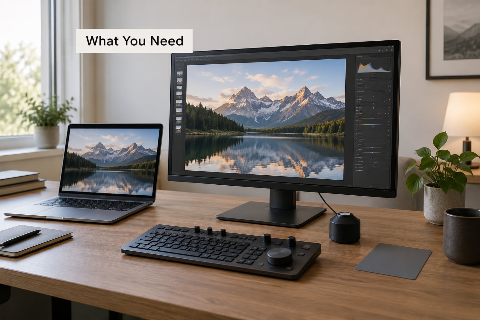
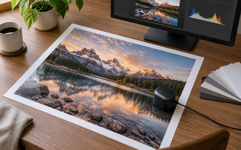
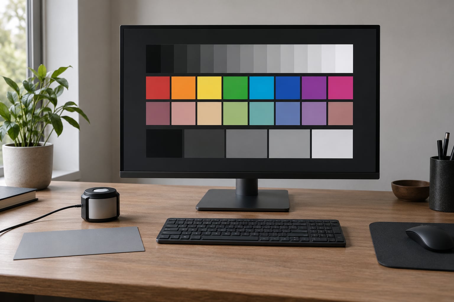
A hardware colorimeter is a small puck you plug into a USB port and rest flat against the screen. It reads the light coming off your panel and the calibration software builds a profile from those readings. Calibrite and Datacolor both sell units paired with their own software, and both are fine for photo work.
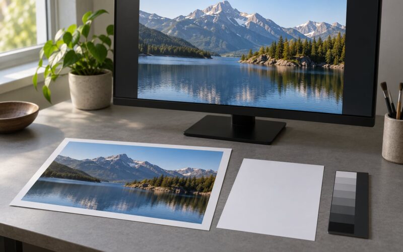
Beyond the device you need a stable display, room light you are willing to work in every session, your editing application, and a neutral test image you can trust. Grab a gray card or a printed photo you know is neutral for checking shadows later.
The distinction that matters is measurement versus eyeballing. A visual calibration nudges brightness and color until things look right to you in a given room at a given moment. A hardware calibration measures the panel, corrects what it finds, and produces numbers you can check. The second is repeatable, and the first is a starting point.
You also need your editing application open in sRGB mode, or a wide-gamut profile if that is the workflow you actually ship in. Calibrating while Lightroom is set to ProPhoto and exporting sRGB tells you nothing useful about the export.
Step-by-Step: How to Calibrate a Monitor for Photo Editing
1. Prepare the monitor and editing environment
Switch the display on and leave it for at least 30 minutes before touching anything. Panels drift as they warm up, so calibrating a cold screen means you are calibrating the wrong screen.
Set the resolution to native and the refresh rate to its normal value. Reset the display to its factory color mode, which on most monitors means sRGB, and on some wide-gamut panels means a custom mode with the gamut slider at its default position.
Turn off everything that changes color on its own. On macOS that means True Tone and Night Shift, on Windows it means Auto-Brightness, Night Light, HDR and any dynamic contrast. Give your editing room a normal level of daylight-matched lighting, and close blinds so the room does not change during the session. You calibrate for the room you edit in.
Wipe the screen with a microfiber cloth. Dust and fingerprints on a matte panel flatten the darkest tones enough to be visible in a black point check.
2. Set the monitor to a neutral starting point
Before measuring, reset the on-screen controls. Brightness back to the factory default, contrast left at its native setting, color temperature on standard or the sRGB preset. The colorimeter software will do the real work, and starting from a scrambled menu makes the result harder to reproduce later.
Set brightness roughly where it normally sits during editing. If it is cranked to maximum, the software will ask you to bring it down mid-run, and on a single-monitor setup that adjustment is awkward to make while the calibration window has focus.
Keep contrast at native. Pushing contrast above the panel’s own default clips the highlights, and no profile can recover detail the display is already throwing away.
3. Choose the right target values for photo editing
The targets tell the software what to aim for. For most photographers working in sRGB, the standard set is a D65 white point, gamma 2.2, and a luminance target matched to your room. Treat these as sensible defaults rather than laws of nature.
White point: D65, roughly 6500K, matches what most web content assumes and what your phone and your client’s screen will show. Choose D50, around 5000K, when print matching is your main job and your workflow prints through a profiled paper-white path.
Gamma 2.2 suits most editing rooms. Gamma 2.4 gives slightly deeper shadows and is the cinema convention, not the photography one.
Luminance is where most guides get vague. Match the screen to the room rather than picking a number out of the air. In a dim or curtained room, 80 cd/m2 or below keeps the screen the brightest thing in view. In a normally lit room, 100 to 120 cd/m2 works. In a bright room with daylight around you, 120 and up so you are not editing against a glare.
Black level: let the software set it, and leave panel-native contrast alone. Contrast ratio and flare correction are two settings most beginners should not touch. If a piece of software offers ambient light compensation, turn it off for a static editing setup.
4. Run a visual calibration or hardware calibration
With a colorimeter, connect the device and launch the vendor software that came with it. Create a new profile, pick your display from the list, and set the technology type to match your panel. Leave the patch count at the medium setting unless you are chasing the smallest possible error.
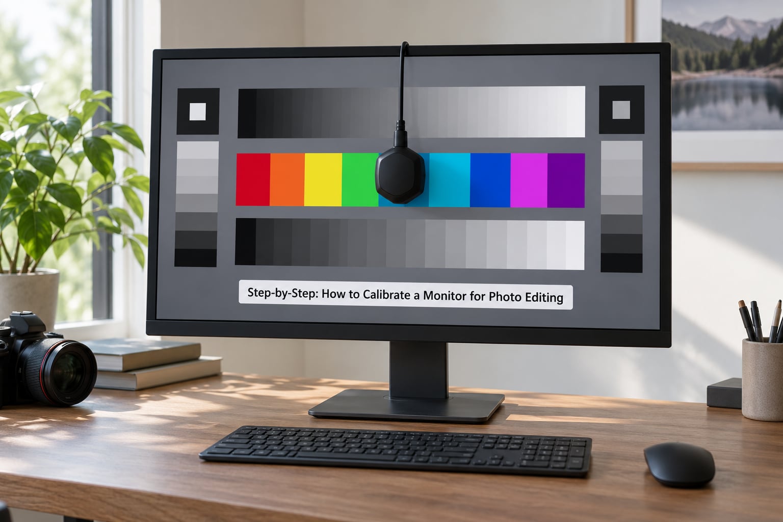
Choose your targets from step 3, place the device flat against the center of the screen so it sits flush against the glass, and start the measurement. The screen will flash through a long series of colored patches. Do not touch the mouse or the brightness controls while it runs.
When the software asks you to adjust brightness manually, use the physical buttons on the display rather than an on-screen slider where you can. A good result lands with an average delta E under 1 and a maximum under 2. Delta E is a single number for the visible difference between what the panel showed and what it should have shown, where below 2 is not visible to the eye. Save the profile and give it a plain name like your display model and the date.
Without a colorimeter, use what you have. On Windows, the built-in Display Color Calibration wizard is a gamma-and-brightness tool and nothing more. On macOS, open the ColorSync calibration panel in System Settings and run the gamma sliders against a neutral gray image. Online gamma test pages and phone apps can confirm that a screen is grossly wrong, but none of them measure your panel, so none of them can fix it.
A visual pass means three things. Set the monitor to its sRGB mode if it has one. Adjust brightness until white looks white and blacks look black against a dark room. Then open a reference image you trust and adjust the color temperature preset until skin tones and neutral grays stop shifting as you move closer and further away.
If the brightness controls sit behind the calibration window, which happens on single-monitor setups, use the keyboard shortcut or the physical display buttons, and if that still fails, run the brightness step separately before starting the profile run.
5. Verify the result in your photo-editing application
Restart your editing application so it picks up the new profile. Check the display profile name in the application’s color management panel and confirm it matches the file you just saved, not the default generic profile.
Open a grayscale ramp and a color test chart. Both should look even, with no visible banding or a tint in the mids. Then open a photograph you have printed before and inspect it at full screen, especially in the shadows and on skin.
For prints, turn on soft proofing with the profile from your print lab. The proof tells you how the lab will interpret the file. It does not make your screen match paper exactly, because paper has its own white point and texture that no monitor reproduces perfectly.
Export in the color space you intended. A calibrated screen showing an untagged file accurately displays a file that is still wrong.
6. Recalibrate when conditions change
Run a routine check every few weeks and a full calibration every month or two. Cheap laptop panels drift noticeably faster than good external monitors, so if you work on one, check it more often.
Recalibrate properly after any of these: moving to a different room or changing your lighting, resetting the display to factory settings, changing the color space in your application, switching the monitor to HDR or a wide-gamut mode, or a firmware update. If HDR switches itself on by itself, your profile is invalidated until you recalibrate with that mode active.
A quick check between full runs takes a minute: open a known neutral image and look at it from your normal editing distance. Slight drift is invisible until it is not, which is why a scheduled re-check beats reacting to a bad print.
Common Mistakes
Editing in an uncontrolled room is the most common and the most damaging. A calibrated screen in bright afternoon sun next to a window is calibrated to nothing. Fix: calibrate in the room you edit in, and if the light changes during the day, recalibrate or dim the room.
Confusing brightness with contrast is the second. Brightness sets where white sits. Contrast sets the difference between light and dark. Cranking contrast to make a flat image pop destroys highlight detail permanently, before the profile is even generated.
Using the wrong ICC profile is the third. Editing in ProPhoto while exporting sRGB, or exporting an untagged file, produces errors no calibration can correct. Set the working and export spaces deliberately and name the profile in the application so you always know which one is active.
Relying on sRGB mode as a substitute for calibration is a habit many forum users warn about. The mode clamps the gamut and improves consistency, but it does not correct the panel’s own error, and it certainly does not fix a gamma curve that is off. Treat it as a good starting state, not a finished one.
Judging the result from a single image tells you almost nothing. A familiar photo already carries your eye’s expectations. Check a grayscale ramp and a test chart instead, because those show the errors directly.
Two more worth naming. Judge your screen against a phone or a laptop beside it, which produces differences no calibration resolves, because each panel is different. And do not expect a colorimeter to fix a bad panel. It corrects what it measures; it cannot add gamut, fix uneven backlighting or smooth out a display that is dim in one corner.
Frequently Asked Questions
How bright should my monitor be for photo editing?
Match the screen to the room you edit in rather than to a fixed number. In a dim room, 80 cd/m2 or below keeps the display the brightest thing in view. In ordinary daylight-matched lighting, 100 to 120 cd/m2 is a good target. In a bright room with windows open behind you, go higher, around 120 cd/m2 or up. Whatever you choose, keep it consistent during your editing sessions.
How to calibrate a monitor for photo editing without a colorimeter?
Run the visual route: set the display to sRGB mode, reset contrast to native, and use the Windows Display Color Calibration wizard or the macOS ColorSync gamma sliders against a neutral gray image. Adjust brightness until white reads white and blacks read black, then check a reference image you trust. These steps improve consistency, but nothing without a device can measure your panel, so expect drift and no delta E numbers.
Should I calibrate to D65 or D50 for photo editing?
Use D65, roughly 6500K, for screen work and for anything delivered digitally, because most web content, phones and client displays assume it. Choose D50, around 5000K, when print matching is your main job and you soft proof against a paper profile. Many photographers keep one sRGB display calibrated to D65 and handle print work through soft proofing rather than switching the whole workspace.
How often should I calibrate my monitor?
Check it every few weeks and run a full calibration every month or two. Laptop panels drift faster than good external monitors, so those deserve more frequent attention. Calibrate immediately after you change rooms or lighting, reset the display to factory settings, switch into HDR or a wide-gamut mode, or update the display firmware. Each of those changes invalidates the existing profile.
Is Windows built-in monitor calibration accurate?
It is a gamma and brightness tool, not a measuring tool. The Display Color Calibration wizard shows you test images and asks you to adjust sliders until they look right to your eyes, which cannot detect an error your eye has stopped noticing. It is a reasonable first pass and it costs nothing. For measured, repeatable results you need a hardware colorimeter that writes a real ICC profile.
Why do my prints look different from my screen?
Usually because you fudged colors to compensate for an uncalibrated display. The print lab works from the data in your file, so every adjustment you made on a wrong screen gets applied on paper. A custom ICC profile removes the need for that compensation. Turn on soft proofing with the profile from your lab to catch the remaining gap, and remember paper texture and paper white can never be reproduced exactly on a screen.
Conclusion
Start with the part that costs nothing. Turn the display on, leave it 30 minutes, switch off True Tone, Night Shift, HDR and auto-brightness, reset contrast to native, and calibrate in the room where you actually edit. That alone puts you ahead of most screens people work on.
Then pick your target values honestly: D65 and gamma 2.2 for digital delivery, a luminance that matches your room, and D50 only when print matching drives your work. With a colorimeter in hand the whole run takes twenty minutes and gives you numbers you can check. Without one, the visual pass still helps, as long as you know what it cannot fix. Check the result with a neutral test image, not a favorite photo, and schedule the next recalibration before you need it.