The short answer is a neutral-toned fine art paper with high black density, either a matte cotton rag or a baryta-coated gloss. Gloss papers give you the widest tonal range and the punchiest blacks, while matte papers suit portraits, skin tones and images you will hang in indirect light. The right choice depends on the image, the lighting where it will live, and how much of the surface texture you actually want to see.
Most of the confusion comes from treating paper as a brand question when it is really a set of physical properties. Fibre base, surface texture, white point, gloss differential and black density do most of the deciding. Get those right and the brand name matters far less than people expect.
Table of Contents
- What Paper Is Best for Black and White Prints?
- How Do Paper Fiber, Surface, and Tone Affect the Image?
- Which Black and White Paper Types Should You Consider?
- How Do You Choose Paper for Portraits, Outdoor Scenes, or High-Contrast Images?
- Matte, Gloss, Lustre, or Pearl: Which Finish Should You Print On?
- What Paper Size and Format Should You Use?
- How Should You Prepare the Image and Test the Paper?
- What Are the Common Black and White Printing Mistakes?
- Frequently Asked Questions
- Conclusion
What Paper Is Best for Black and White Prints?
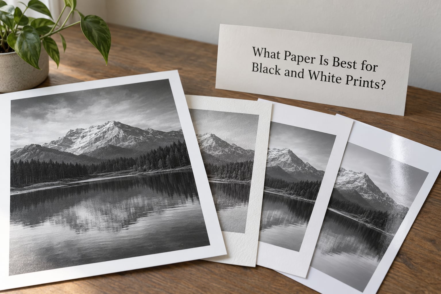
Buy a neutral-toned fine art paper, not a bright white photographic paper, and start with a matte surface if the print is going on a wall and a baryta gloss if you want maximum density. Those two answers cover most situations a photographer runs into.
Neutral tone means the paper does not push blacks toward blue, green or brown. Bright whites with optical brightening agents read as crisp and clean on screen, but they can tint a monochrome image under warm household lighting. Neutral papers also make it far easier to judge your own adjustments, because the paper is not quietly shifting your midtones.
On black density, baryta-coated papers hold the deepest blacks of anything you will print at home. The coating is a barium sulfate layer, the same idea as traditional fibre-based darkroom paper, and it reflects almost no light back at you. Matte rag papers reach black too, just a touch more softly.
Texture is the choice most people overthink. A subtle texture, the kind you cannot identify without tilting the print under raking light, adds depth and hides fingerprints. A pronounced texture becomes part of the image and will fight fine detail in skies and hair.
How Do Paper Fiber, Surface, and Tone Affect the Image?
Five characteristics do nearly all the work, and every paper you look at is a combination of them. Here is what each one changes in a monochrome print.
| Characteristic | What it means | How it changes your print |
|---|---|---|
| Fibre base | Cotton rag, alpha-cellulose or a resin-coated base | Cotton rag looks warmer and feels more substantial; alpha-cellulose is smoother and whiter; resin-coated is the most reflective |
| Surface texture | The physical roughness of the coated surface | Smooth surfaces render fine detail; textured surfaces diffuse reflections and can blur the finest detail |
| Brightness | How white the unprinted base looks | Bright white increases perceived contrast and, with optical brighteners, can shift under warm light |
| Tone | The colour cast baked into the paper | Neutral keeps your edits honest; warm papers complement skin and sepia-leaning work, cool papers suit cold, graphic images |
| Black density (D-max) | The darkest black the surface can hold | Higher density gives deeper shadows and more separation in the low end |
Gloss differential is the one people forget. On a glossy or baryta paper, the ink sits on top of the surface, so printed areas are shinier than the surrounding paper. That shine is what makes a contrasty black and white image look so crisp in person, and it is also why the same print is impossible to read from the wrong angle.
Which Black and White Paper Types Should You Consider?
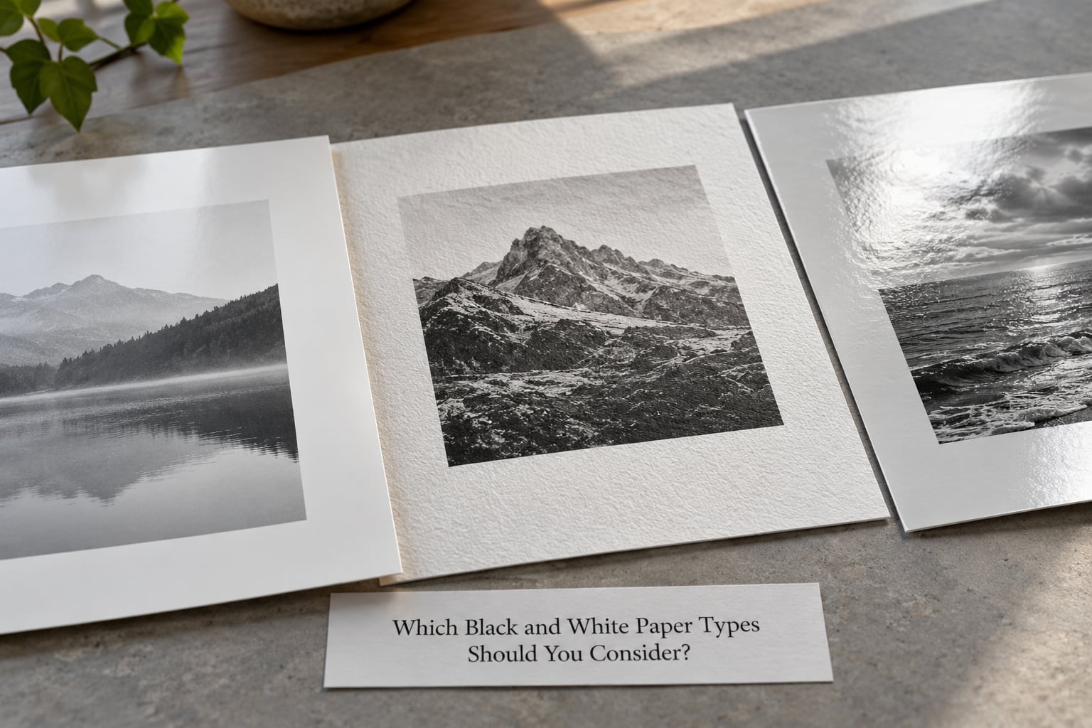
Three categories cover almost every inkjet paper you will find, and each behaves differently under a monochrome image.
Cotton rag papers
Made from cotton linter rather than wood pulp, cotton rag is acid-free, feels substantial in the hand and takes ink deep into a matte surface. It suits portraits, gallery prints and anything you plan to sell. Examples in this group include Canson Platine Fibre Rag, Canon Premium Fine Art Smooth and Hahnemuhle Photo Rag.
Alpha-cellulose fibre papers
Purified wood pulp, buffered so it stays archival, and usually brighter and smoother than cotton. Look for Hahnemuhle Photo Rag Baryta, Ilford Gold Fibre Gloss and Epson Legacy Baryta II in this group. The surface takes a little more ink at the low end, which is why many printers reach for it when they want shadows with weight.
Baryta-coated papers
A barium sulfate layer sits under the imaging layer, giving high black density and a smooth, near-gloss surface. Fotospeed Platinum Baryta and Hahnemuhle Fine Art Baryta sit here. This is the closest you get to the look and feel of fibre-based darkroom paper on an inkjet machine.
Forum threads on r/AskPhotography and talkphotography keep returning to the same outcome: printers who stay happy with their output end up with three or four core papers rather than a shelf of half-used boxes. One matte cotton rag, one baryta, one smooth gloss and one textured sheet covers almost every image you will print.
How Do You Choose Paper for Portraits, Outdoor Scenes, or High-Contrast Images?
Match the surface to the tonal character of the image instead of picking one paper for everything.
- Portraits. Matte cotton rag, neutral or slightly warm tone. The soft surface hides skin texture and keeps highlights from looking brittle under indoor lighting.
- Outdoor scenes with fine detail. Smooth baryta or a high-gloss fibre paper. These hold the widest tonal range and separate haze, foliage and distant ridges that matte papers tend to merge.
- High-contrast graphic or architectural work. A bright white, smooth paper with high black density, so the blacks stay solid and edges stay crisp.
- Low-key images with large dark areas. Baryta, which resists that flat grey look in the shadows. Test the darkest part first.
- Images you intend to sell. Whatever you can profile accurately and supply consistently, with a permanence record for that specific paper and ink combination.
Matte, Gloss, Lustre, or Pearl: Which Finish Should You Print On?
Finish changes how much of the print the light returns to your eye, and that is what shifts perceived sharpness and tonal range. The table below is the short version.
| Finish | Appearance | Tonal range | Reflections | Best for |
|---|---|---|---|---|
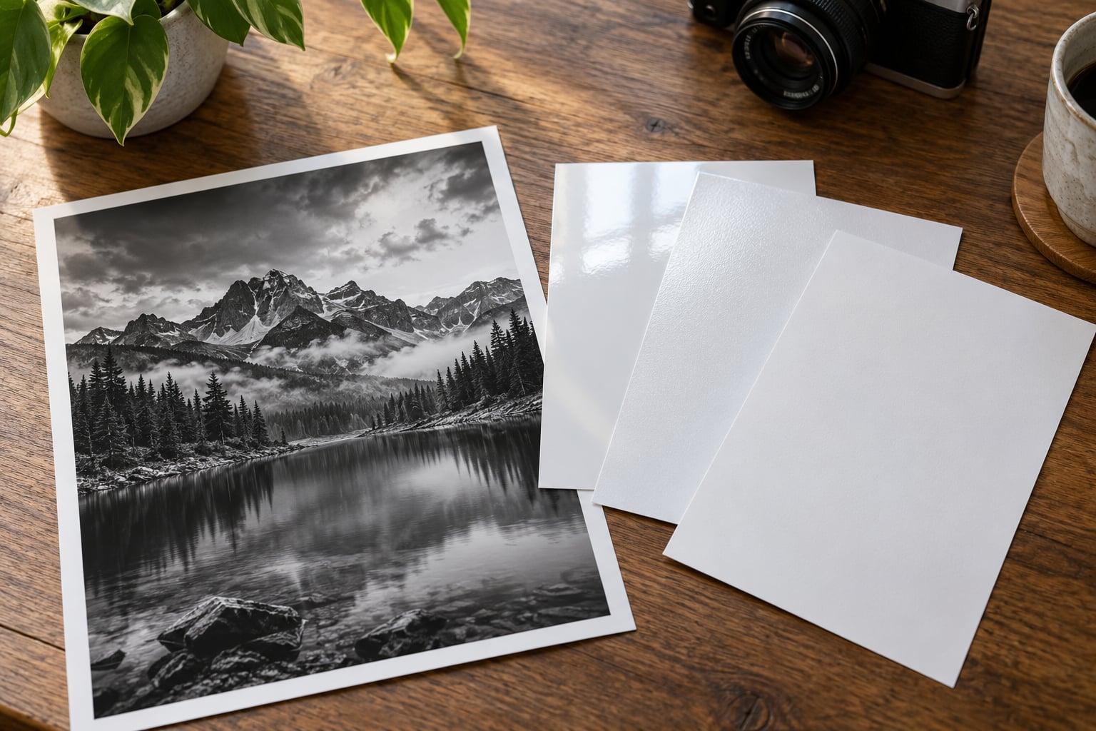
| Gloss | Mirror-like, high contrast | Widest | Strong, angle-dependent | Bold outdoor scenes, high-contrast work, display under controlled light |
| Lustre (satin) | Smooth with a soft sheen | Very wide | Moderate | Scenery, architecture, anything printed larger than A3 |
| Pearl | Textured with a metallic shimmer | Wide | Low to moderate | Portraits and images where texture is welcome |
| Matte | Flat, no sheen | Narrower, softer | None | Portraits, gallery work, rooms with warm or diffuse lighting |
If you cannot control the lighting where the print hangs, matte removes the guesswork. If you can, a lustre surface is the compromise most photographers end up preferring for large prints: near the density of gloss, far less glare.
What Paper Size and Format Should You Use?
Match the paper’s aspect ratio to the camera’s frame and you avoid cropping later. A 3:2 sensor suits 5R and 20R sizes, while a 4:3 or square sensor suits 4R, 8×10 inch and 30×30 cm sheets. Common inkjet sizes cover 4×6 inch through 13×19 inch, and A3 and A2 sheets cover European framing.
Leave a border for larger work. A 2 to 5 cm white margin on matte paper gives the eye somewhere to rest and hides the fact that the edge is a cut edge rather than a hand-torn one. On gloss, an edge-to-edge image usually looks stronger because the surface itself frames it.
Check your printer’s maximum paper weight before buying. Many consumer and prosumer models take up to about 290 to 300 gsm, while many fine art sheets run 300 to 315 gsm. A sheet that is slightly too thick can feed badly or get rejected by the driver, so match the spec sheet rather than assuming.
How Should You Prepare the Image and Test the Paper?
A ten minute test print will tell you more than an hour of reading about D-max. This is the process that actually answers the question.
- Calibrate the monitor and printer. A calibrated screen and a current printer profile for your exact ink set are the baseline. Everything after this step depends on them.
- Load the correct ICC profile. Use the profile supplied for the specific paper, not a generic one. Manufacturer profiles for fine art papers often assume perceptual rendering, which suits most images but flattens hard monochrome work. Relative colorimetric with black point compensation usually gives cleaner blacks.
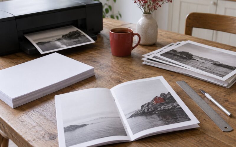
- Print mini prints or a crop. Print at 10 to 15 percent scale on a full sheet, or crop a representative area to A5. Judge blacks, midtone separation and texture at that size first.
- Evaluate under consistent light. Look at the print under neutral daylight or a 5000K viewing light, not under warm ceiling bulbs, and give your eyes a few minutes to adjust.
- Compare against the paper’s own white. Hold a strip of the unused sheet next to the highlights. If the print whites look grey or tinted next to the raw paper, the profile or your settings are off.
- Check permanence. For work you intend to sell or exhibit, use a combination with an independent permanence record covering both the ink and that paper.
Storage matters as much as the sheet. Keep unopened paper flat in its original sleeve, away from direct light, in a room with stable humidity. Prints already made should be interleaved with acid-free tissue rather than stacked glossy side to glossy side, which causes permanent reflections on the surface.
What Are the Common Black and White Printing Mistakes?
- Blocked shadows. The low end has collapsed into a single black mass. Print a smaller or less contrasty version of the image and check with a test strip, or switch to a paper with higher black density.
- Washed-out blacks that look grey. Usually an ICC rendering intent mismatch. Switch to relative colorimetric with black point compensation and print again.
- A colour cast in a neutral image. Check the paper tone first. A warm rag paper in a lit-neutral render will look yellowish; the fix is to stop fighting it with software and either accept the warmth or choose a neutral sheet.
- Glare that kills the print. Not a paper fault, a placement fault. Move the frame so no window or lamp reflects at a normal viewing angle, or go matte.
- Over-sharpened micro-contrast. Textured papers amplify halos and noise in the shadows. Sharpen for your actual viewing distance and apply less than your screen habit suggests.
- Wrong paper profile or a generic profile. The classic cause of colour casts in monochrome prints. Profile the printer, ink and paper together, and check the profile is the one built for your exact sheet.
- Texture that swamps fine detail. Pick a smoother surface for skies, foliage and hair, or increase the output size so the texture reads as paper rather than noise.
Frequently Asked Questions
What is the best paper to print black and white photos on?
A neutral-toned fine art paper with high black density is the best choice, and most printers settle on two or three sheets they reuse. Gloss and baryta surfaces give the widest tonal range and deepest blacks. Matte cotton rag suits portraits and warm indoor lighting. Buy a small sample pack from the manufacturer before committing to a full box.
Is glossy or matte better for black and white photos?
Gloss shows more contrast, more black density and sharper perceived detail, but it reflects light and looks wrong from the wrong angle. Matte looks even from every direction and is easier to live with on a wall. Choose gloss for controlled lighting and punch, matte for portraits and rooms where the light is diffuse or warm.
What paper do professional photographers print on?
Professionals mostly print on their own printer’s OEM papers, because profiles and permanence data are reliable for those combinations. Cotton rag mattes such as Canson Platine Fibre Rag or Canon Premium Fine Art Smooth and baryta sheets such as Hahnemuhle Photo Rag Baryta or Ilford Gold Fibre Gloss are common choices.
What is cotton rag archival paper?
Cotton rag is made from cotton linter instead of wood pulp. It is acid-free, takes ink deep into a matte surface and feels heavier in the hand. Because it does not yellow the way untreated wood pulp can, it suits gallery prints, portraits and any work you intend to sell. It is usually more expensive than alpha-cellulose.
Can a regular printer print on glossy photo paper?
Most home inkjet printers handle glossy and baryta photo paper fine, as long as the sheet weight is within the printer’s stated limit, often around 290 to 300 gsm. Consumer office printers and some all-in-one models are a different story, so check the manual. Use borderless or fit-to-page settings so no printer margin leaves an unprinted edge.
What paper weight works best for fine art prints?
For home printing, stay at or below your printer’s maximum weight, which is commonly 290 to 300 gsm. Professional fine art sheets run 300 to 315 gsm and suit larger printers, gallery framers and print labs. Heavier sheets feel more substantial and resist curling, but a sheet the printer cannot feed reliably is never worth the extra weight.
Conclusion
Start by picking a neutral-toned fine art paper that suits the image and the room it will hang in: matte cotton rag for portraits and diffuse light, baryta or gloss for punch and maximum tonal range. Order a sample pack, print a crop at 10 to 15 percent scale with the correct ICC profile, and judge it under neutral light before you commit to a full edition.
That first test is the whole decision. Once you see how a sheet handles your blacks and your whites, narrowing down what paper to use for black and white prints takes about a minute.