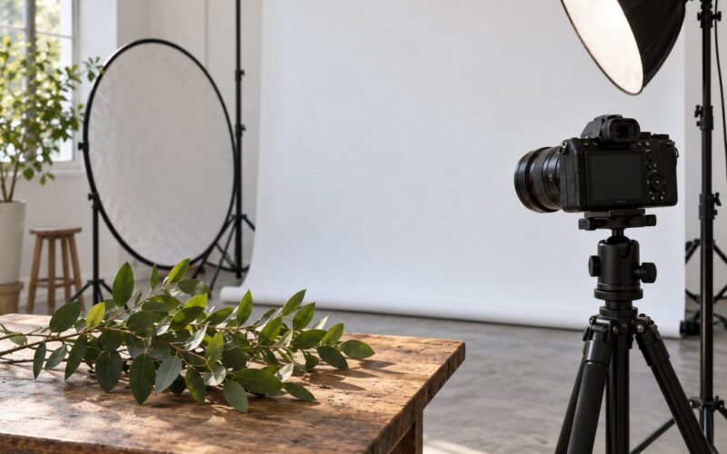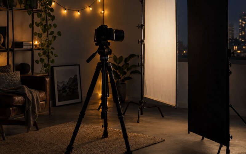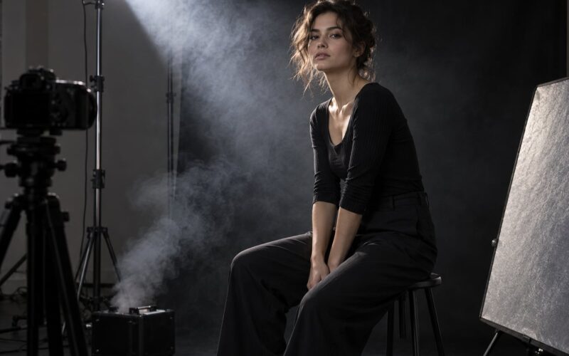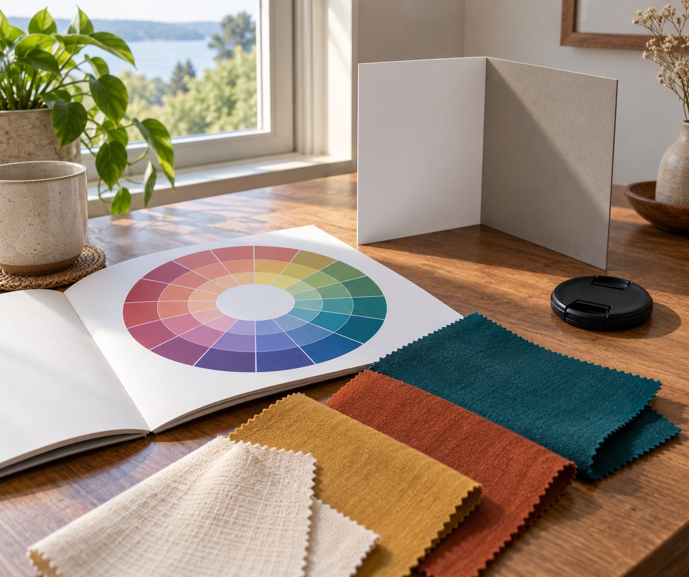
How to use color theory in portrait photography comes down to a short list: pick one color relationship, then apply it in only three places, wardrobe, background and light color. Opposites on the color wheel make a subject stand out, neighbors make a calm, cohesive frame, and the right light temperature keeps skin looking like skin. Most of the work happens before you lift the camera.
It takes about ten minutes of planning to pick a color relationship, and the payoff shows up in every frame from that session. Here’s how I work through it on a real shoot.
What You Need
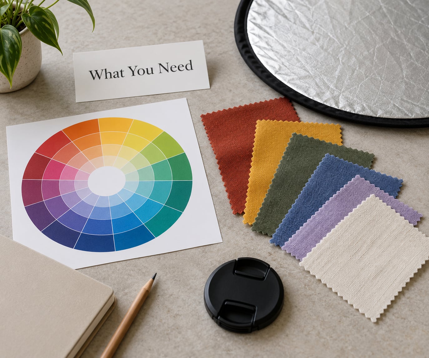
A printed or screen color wheel. The free Adobe Color web app extracts a palette from any photo, which is how I build one from a location before I visit it.
A swatch set or a folder of garment photos. Screens lie about color, so I test fabric in daylight against a neutral surface before trusting it.
A hand-held reflector and a white or silver card. They do more for background separation than any colored gel does.
Permission to see the back of your subject’s head. One reflector fills a shadow, two put light back onto the face, and from behind they separate hair from a wall.
A neutral check. I shoot one frame with a white card or gray card in the scene. Without a reference, the white balance slider is guesswork.
A light meter or the histogram, plus your camera’s kelvin setting. Both matter, because color temperature shifts everything downstream.
Step-by-Step
Here’s the sequence I run before and during a portrait session, in order. Skip ahead and you’ll spend the shoot fighting colors you already decided on.
1. Decide the Mood Before Choosing Colors
Decide the emotion first, because color follows it and not the other way around. Warm reds, oranges and yellows read as energetic, intimate or welcoming. Cool blues, greens and purples read as calm, serious or distant. Muted earth tones read as quiet and timeless, and high-contrast pairings read as bold and editorial.
Write the mood in one word before you open a palette app. “Confident” and “tender” produce completely different wardrobes for the same person, and the difference shows in the frame.
2. Build a Simple Color Palette
Most portraits only need three colors: one dominant, one supporting and one accent. The dominant color usually lives in the background because it occupies the most pixels. The supporting color sits in clothing or a prop. The accent is a small saturated hit, often a scarf, lipstick or a gel.
Place those three on the color wheel first. If you build the palette from relationships rather than from what looks nice in a shop, the frame holds together even when a garment surprises you on the day.
3. Use Color to Flatter Skin
Skin is the anchor color of any portrait. Before you commit to a backdrop, hold the fabric or paint chip next to the subject’s face in daylight and check the jawline and forehead, not the cheek.
Warm undertones, which show as golden, peach or olive, tend to sit well against cool blues, teals, cool greens and purples. Cool undertones, which show as pink, red or blue-ish, tend to sit well against warm oranges, rust, mustard and warm browns.
Test rather than assume, because undertone reading from a photo is unreliable and lighting changes the answer. If you want separation instead of blending, put the backdrop at least two steps away from the skin’s hue, and vary the value so the face reads first.
4. Coordinate Clothing, Background, and Props
Pick one element to carry the dominant color and keep the others quieter. When clothing and backdrop are both loud, the eye has nowhere to land and the face gets lost.
The advice that comes up most often on portrait forums is practical and specific: avoid pure white and pure black garments, and steer clients toward mid tones. White blows out and picks up every wrinkle, while black swallows shape and merges with a dark wall. Mid tones hold detail from either direction.
Steer clients away from neon, large plaids, polka dots and anything with a visible logo. Patterns with high contrast frequencies fight the face, and saturation near skin makes complexions look blotchy.
For groups and families, choose a shared palette and vary the shades, textures and weights rather than the hue. Everyone in the same three colors reads coordinated; everyone in five different colors reads chaotic.
It helps to send the palette before the shoot. A phone photo of three garments with names like “top, bottom, layer” gets clients to arrive already decided, which removes half the on-set color problems.
5. Shape the Light Around the Palette
Light carries color, and it will override every wardrobe decision you made. Daylight is roughly 5500 to 6000 kelvin. Tungsten and candlelight sit near 2700 to 3200 kelvin, and fluorescent office lighting lands green with a hard cast on skin.
Set your white balance deliberately rather than leaving it on auto. If you are shooting mixed light, put a gel on the source that fights it, or correct it in post, because a green cast on skin reads as illness before it reads as atmosphere.
Colored light and colored wardrobe divide attention, so pick one. If the clothing is already the saturated accent, keep the light neutral. If the wardrobe is neutral, a warm gel or a cool gel becomes the accent and does the same job. A small white reflector keeps the fill from reintroducing the color cast.
6. Use Color Contrast to Direct Attention
Contrast in color means difference in hue, saturation or value, and you want the largest contrast next to the face. A bright neutral collar and a darker backdrop will pull the eye to the chin and jaw even when the composition is plain.
Value contrast is the quiet one people miss. A mid-tone face against a dark background reads instantly; a mid-tone face against a mid-tone background needs a rim light, a flag, or a change of position to separate.
To judge it, squint at the frame until detail disappears and you see only shapes. If the head does not read as the strongest shape, the colors are not doing their job yet.
7. Refine the Palette in Editing
Editing is the second stage, not the first. Get white balance right first with the eyedropper or the gray card reference, since every later color decision depends on it.
Then work with local adjustments rather than global sliders. A global saturation move hits skin, clothing and background equally, which is why portraits often end up looking over-processed. Use the HSL panel to pull saturation out of a background that competes, and to warm or cool the hue of a garment you did not control.
Split toning is the finishing move. A gentle warm tone in the highlights and a cool tone in the shadows separates planes and reinforces the mood you picked in step one. Keep the range slider low and check skin between every pass.
That two-stage framing matters. One photographer on r/PhotographyAdvice put it plainly: color in photography is white balance, and color in editing is grading or cinematic toning. Separate those jobs and each one stays manageable.
Common Mistakes
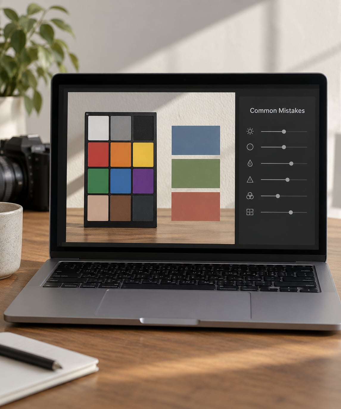
Relying on color names instead of relationships. “Blue and orange” tells you nothing, because every blue and orange combination behaves differently. Look at where the hues sit on the wheel and how far apart they are in value and saturation.
Using too many competing hues. Four saturated colors in one frame turn into noise. Cut back to one dominant, one supporting and one accent, and let one color carry the image.
Matching clothing to the background. Same hue, similar value, and the subject visually dissolves. Change the value before you change the hue; a darker garment against a light wall is usually enough.
Ignoring skin tone until the edit. If the wardrobe was wrong on the day, grading will not rescue it. Test colors against the face in daylight, before the subject changes clothes.
Making global color changes first. Sliding overall saturation or temperature affects everything at once and wrecks skin. Fix white balance globally, then make every color decision locally.
Fighting what you were given. A green cast from fluorescent light, a busy room, a location you cannot change. Work with the dominant color in the space and place the subject against it rather than trying to neutralize the whole scene.
Adding color when subtraction would work. The advice that comes up most often on photography forums is to use one color or one family and let the eye land on the subject. Emptying a frame is easier than filling it.
Frequently Asked Questions
How do I use color theory in photography?
Start with the color wheel and pick one relationship: complementary for contrast, analogous for calm. Then apply it deliberately across three places only, wardrobe, background and light color. Keep skin as the anchor and test every color against the subject’s face in daylight before the session. In post, correct white balance first, then adjust saturation locally so the palette holds and skin stays natural.
What is the 60/30/10 rule in photography?
It is a proportion guideline, not a law: about 60 percent of the frame should be your dominant color, 30 percent a supporting color and 10 percent an accent. In a portrait, the dominant usually lives in the background, the supporting color in clothing, and the accent in something small like a scarf or a gel. It keeps a frame from turning into a color riot.
What is the three-color rule in photography?
Limit a composition to three main colors so the frame stays readable and the viewer’s eye has somewhere specific to land. For portraits that usually means one background color, one clothing color and one accent. Subtracting is harder than adding, and a fourth saturated hue is usually the one that makes a portrait look busy.
Should clothing match or contrast with the background?
Contrast, most of the time. Matching hue and value makes the subject disappear into the wall, which is the single most common complaint from clients about their own photos. If you want a softer look, keep the wardrobe in the same family as the backdrop but shift it several steps in value, so the face still reads first.
Which colors make skin look best?
Warm undertones, which read golden, peach or olive, sit well with cool blues, teals and purples. Cool undertones, which read pink, red or blue-ish, tend to pair better with warm oranges, rust and mustard. Undertone readings from photos are unreliable, so hold the candidate color beside the face in daylight and check the forehead and jawline.
Can a portrait really use only one color?
Yes, and it is often the strongest option. A single hue with a range of values, from a light tint to a dark shade, keeps the frame cohesive while the face remains the lightest or darkest area. Photographers on r/photography describe this as emphasis by subtraction, and it works for headshots, editorial work and environmental portraits alike.
Conclusion
Pick one color relationship before the session and commit to it across wardrobe, background and light. Test the dominant color against the subject’s skin in daylight, watch the value separation rather than the hue names, and change one variable at a time so you know what fixed the frame. If you are picking a backdrop for a location you cannot change, extract its palette first and let the room set the dominant color for you.