Learning how to photograph your own prints for a portfolio is a color job, not a creative shoot. You are reproducing a finished object so a client, a curator or a grant panel sees the shadows in it, the texture of the blacks, the exact warmth of the midtones — not a brightened, sharpened version of it.
Most people get it wrong in a predictable way. They lay the print on a table under the ceiling light, snap a phone photo, and then the image comes out grey and washed out. That washed-out look is almost never a bad print. It is a lighting problem, and it is fixable in about fifteen minutes once you know what to change.
One thing to settle before you buy anything: scanning still wins for small work. A flatbed scanner handles a sheet up to roughly A4 / 11 by 17 inches without trouble, and gives you a near-perfect digital negative of a glossy print. Past that size, the platen does not fit, the lid will not close, and photographing is the only realistic option. Most portfolio work sits well past that line.
Table of Contents
- What You Need
- Step-by-Step
- Common Mistakes
- Frequently Asked Questions
- How do I photograph my own prints so the colors match?
- How do I get rid of glare when photographing a framed print?
- Do I need a scanner or can I just photograph my prints?
- What camera settings should I use to photograph prints?
- What background is best for photographing prints?
- How many photos do I need for a photography portfolio?
- Conclusion
What You Need
The list is short, and almost every item has a free substitute. Here is the kit I would start from.
- A camera with manual controls. Any interchangeable-lens or compact camera that lets you hold ISO, aperture, shutter and white balance. A phone works too, with an app that exposes those controls.
- A tripod. Non-negotiable. It is the one piece of gear that stops more bad print photos than any light.
- Two lights with stands. Daylight-balanced lamps, or two identical flash heads. Matching matters more than expensive.
- Two diffusers. Diffusion fabric, a softbox, or even a sheet of white shower curtain between light and print.
- A white foamcore board. For bouncing light back into the shadow side. One board, matte side out.
- A roll of continuous white or grey paper, or a matte wall. Continuous paper means no seam line running down the background.
- A grey card or color checker. This is what stops the color shift. Without one you are guessing.
- A remote release or the 2-second timer. Any camera shake at this magnification shows.
- A blower and a lint-free cloth. Dust specks become editing work later.
If you own nothing else, the free version works: one overcast window, a large white foamcore board placed opposite as a bounce, a table by the window, and your phone with manual controls switched on. Shoot on an overcast day if you can. That is the closest thing to a giant softbox that you will ever get for nothing, and it is why so many artists in photography forums shoot on grey, overcast mornings.
Step-by-Step
The order below is the order I work in, and it is the practical version of how to photograph your own prints for a portfolio so every image in the set matches the last one. Shoot one print all the way through this process before touching the rest of the pile.
Prepare and Inspect the Prints
Let the prints sit in the room where you will shoot for an hour or two. Paper that has just come off a drying rack carries a curl and a slightly different moisture level than paper that has relaxed, and that curl alone will bend the lines of your image.
Clean each surface lightly. A blower first, then a cloth barely dampened if the surface allows it. Inkjet gloss and darkroom fiber prints both hold fingerprints on the surface layer, and a single fingerprint under a raking light can ruin a shot.
Check the corners and edges. Trim any print with a soft or damaged corner, because the corner is exactly where the eye goes when someone is checking whether a reproduction is honest. Then choose one hero print to set the whole look, and treat the rest as copies of that decision.
Build a Clean Photography Setup
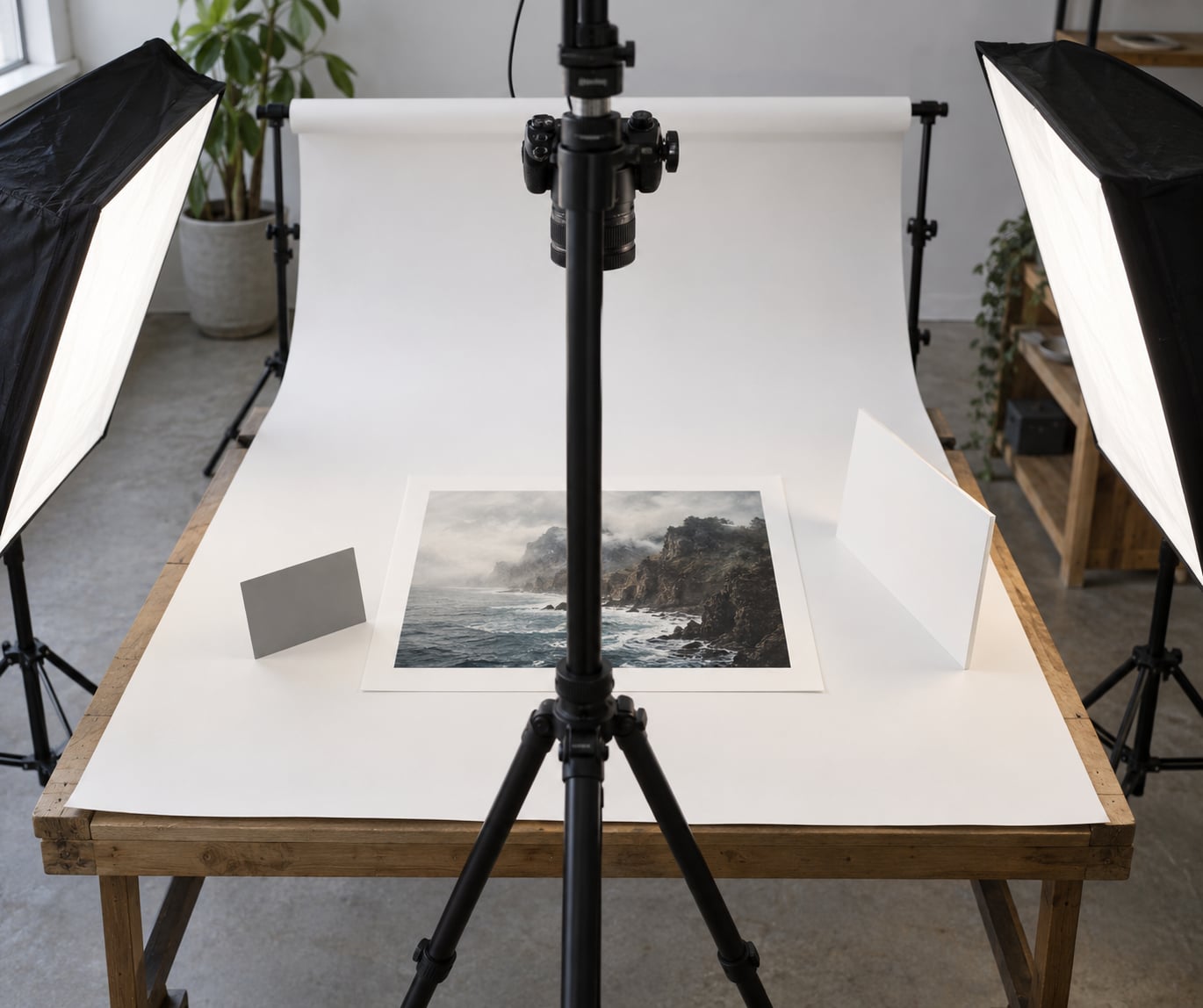
The simplest reliable setup is a table with the roll of continuous paper sweeping down toward you, or a bare matte wall with nothing on it. Lay the print flat on the surface for matte and fiber work, or tape the four corners for gloss, metallic and canvas so a heavy print cannot lift at the middle.
Put the camera directly above and perpendicular to the surface, then adjust until the print is a perfect rectangle in the frame. A spirit level on the camera back saves you a lot of keystoning correction later. Leave a small, even margin around the print so you can crop cleanly and so the frame does not feel cramped.
Turn off every overhead light in the room, including the one in the ceiling you would normally ignore. Mixed overhead and side light is the single most common cause of the shadow along one edge of a print photo, and it is free to fix.
Light the Print for Accurate Color
Place two identical lights at roughly 45 degrees on either side of the print, both pointing at the same spot. That symmetry is the whole trick: matching lights at matching angles cancel the shadow each one would otherwise cast.
Distance controls evenness. Lights too close give you hot spots, those bright patches in the middle where the surface reflects the source directly, and the corners fall into shadow. Move them further away and the light spreads wider across the whole print, which flattens the hot spot but softens the light overall. Moving back and feathering up with a diffuser fixes both at once.
On an overcast day, put the print beside a window and bounce a foamcore board from the opposite wall to lift the shadow side. Do not mix daylight with household bulbs in the same frame. The result is a color cast you will spend an hour chasing in software that should never have been there.
If the print is already framed or under glass, take the glazing off if you own the frame. That is the real fix, and it takes five minutes. If you cannot remove it, four things help: angle the lights further off-axis so the reflection lands outside the lens, cross a circular polarising filter at maximum rotation and shoot through it, place a black card opposite the light to kill the mirror image of the room, and shoot in a dark room with nothing bright behind the camera. If two of those still fail, photograph the print unframed and add the frame in software or in the layout later.
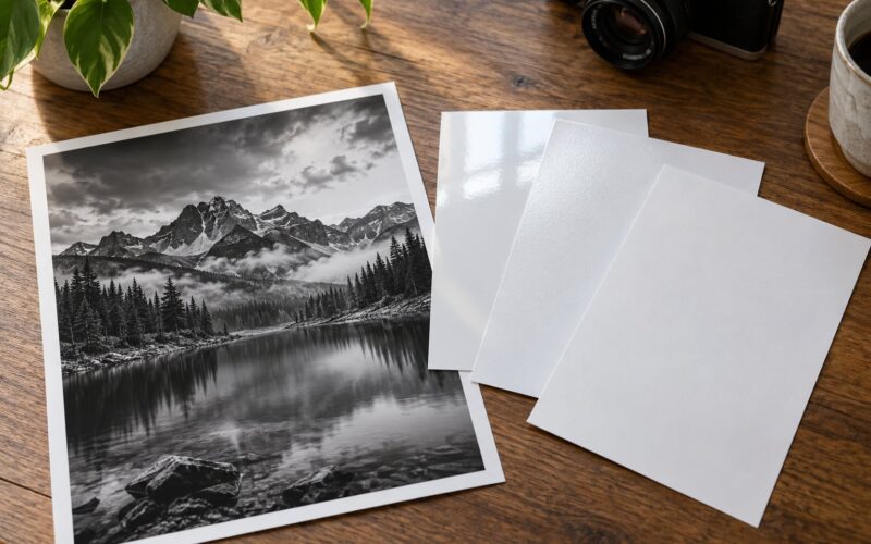
Surface type changes the recipe. Glossy and metallic prints throw a specular reflection at you, so keep the lights further off-axis and further away. Matte and fiber prints scatter light, which lets you work closer and softer. Canvas has real depth, so shoot it slightly off-axis or expect the near edge to dominate.
Compose the Portfolio Photograph
Shoot straight down for anything flat. Slight angles are what create keystone distortion, the trapezoidal skew that makes an otherwise accurate reproduction look sloppy, and if you must angle, correct it in post with the Perspective or Upright tools in Lightroom.
For a textured or dimensional piece, a modest angle shows the surface, which is sometimes what the buyer needs to see. Keep it under about 15 degrees, and keep the camera far enough back that the perspective shift stays minimal.
Leave negative space on the side of the frame where the print is darker, and decide early whether the background shows. A pure reproduction on clean white works for submissions, print sales listings and grant panels. A shot with a little context, a corner of the table or the frame edge visible, works for an exhibition catalogue where the viewer wants to feel the physical object.
Capture and Check the Result
Here is the setup I use every time, with the reason for each value, so you can adjust instead of guessing.
- ISO 100. The lowest native sensitivity, because noise is the one defect editing cannot fully remove from a smooth gradient.
- Aperture f/8 or f/11. Deep enough depth of field to hold the whole print sharp front to back, especially on a thick canvas or a print standing off the wall.
- Shutter speed as the tripod allows. On a tripod, drop to several seconds. The only cost is movement from anyone walking past.
- Manual white balance set from the grey card. Put the card in the same light as the print, take a reading, then remove it. This is what kills the grey, washed-out cast.
- RAW, not JPEG. RAW is the unprocessed digital negative, and it leaves you room to fix white balance in software instead of guessing at the shoot.
- Manual focus or single-point autofocus on the print surface. Autofocus sometimes hunts on low-contrast matte surfaces. Zoom to 100 percent and confirm.
- 2-second timer or remote release. The tripod is what allowed the slow shutter; touching the camera undoes it.
- In-camera corrections off. Auto contrast, auto color and highlight recovery all fight a reference match. Turn them off.
On a phone, set the aperture and ISO as low as the app allows, tap to focus on the print, then lock exposure and white balance with the long-press control. Shoot in the most manual mode your phone offers rather than trusting auto.
Check the result before moving on. Open the histogram and look for clipped whites or crushed blacks, then zoom to 100 percent at a corner to check sharpness and dust. If the whites are clipping, dial exposure down until the brightest white sits just under the ceiling. Most bad print photos fail this two-minute check and get discovered only in the edit.
Edit and Export Portfolio Images
The workflow that produces consistent results is simple: match the file on screen to the physical print lying next to your monitor. That print is the reference, not your memory of how it looked in the studio.
In Lightroom Classic or Darktable, start at the top. Set white balance from the grey card shot, then apply lens and profile corrections, then set exposure until the histogram sits where you want it. Now open the raw file and the physical print side by side and compare a midtone, a deep shadow and a highlight. Adjust until the screen agrees with the paper.
If color has to be accurate for a licensing or print sale, use a calibrated monitor. An uncalibrated screen can be several hundred Kelvin off, and no amount of editing compensates for that reliably.
For the background, do not spend hours removing it by hand in Photoshop unless you have to. A clean white sweep is easier to clone or crop around, and it reads as intentional. Photoshop earns its place when you are compositing a two-angle set or building a diptych of paired prints.
Export for delivery: sRGB, JPEG, roughly 2500 pixels on the long side, and under about 250kb for a web gallery. When a submission asks for a print-ready file, go to 300 dpi at the intended output size. Keep the untouched RAW files, name them systematically, and back them up in two places. These reproductions become the archive of work that otherwise only exists as paper.
Common Mistakes
Almost every disappointing print photo traces back to one of these.
- Leaving the overhead light on. Fix: kill every ceiling fixture and let the two side lights do the work alone.
- Lights too close. Fix: hot spots in the middle and shadowed corners mean moving the lights further back, not turning them up.
- Shooting through glass. Fix: remove the glazing. If you cannot, cross a polariser and put a black card opposite the light.
- Mixed color temperatures. Fix: one window only, or lamps only, and set white balance manually from a grey card.
- An angled camera. Fix: mount the camera perpendicular and level; correct any residual keystone with Upright.
- Overediting in post. Fix: compare against the physical print before adding contrast, clarity or vibrance. If the file looks better than the paper, it is wrong.
- Inconsistent backgrounds and margins. Fix: shoot the whole set in one session on one background with the same framing, so the gallery looks like one body of work.
A dusty surface is the quiet seventh. Photographs look fine on the camera screen and show every speck once you are matching color on a monitor at full brightness.
Frequently Asked Questions
How do I photograph my own prints so the colors match?
Shoot RAW, set manual white balance from a grey card placed in the same light as the print, and turn off all in-camera color corrections. Then match the edited file against the physical print sitting beside your monitor: a midtone, a deep shadow and a highlight. If those three agree on screen and on paper, the rest will agree too.
How do I get rid of glare when photographing a framed print?
Take the glass out if you own the frame. That single step solves most glare. If the glazing stays, angle the lights further off-axis so the reflection misses the lens, cross a circular polarising filter at maximum rotation, and place a black card opposite the light to kill the mirror image of the room. Photographing unframed and adding the frame later is the fallback.
Do I need a scanner or can I just photograph my prints?
Scan anything that fits a flatbed platen, roughly A4 or 11 by 17 inches, because a scanner gives you a near-perfect digital negative of a glossy print. Past that size the lid will not close and a photographer is the only realistic tool. Most portfolio prints are larger than a platen, so plan on a camera, a tripod and two diffused lights.
What camera settings should I use to photograph prints?
ISO 100 for the cleanest gradients, f/8 or f/11 for full depth of field across a large print, and whatever shutter speed the tripod allows. Set manual white balance from a grey card, shoot RAW, focus manually on the print surface, and use the 2-second timer or a remote release. Leave auto contrast and auto color switched off so the file stays a neutral reference.
What background is best for photographing prints?
White or neutral grey, and nothing textured. A continuous roll of paper sweeping down from a pole avoids a seam line, and a bare matte wall works just as well for most people. White and grey bounce light back and soften shadows, while black absorbs it and coloured surfaces tint everything. Keep the same background for the whole set so the gallery reads as one series.
How many photos do I need for a photography portfolio?
Start with one strong image and build outward. Tier it: a small online gallery of roughly three dozen images for browsing, a wider archive for deep dives, and around ten to twenty for a printed book where each page costs real paper. Cut hard against your own taste, then ask a second reader who is not a photographer to point at the ones that confused them.
Conclusion
Photographing your own prints is a technical discipline, not a creative one, and the whole thing collapses into one habit: set the light once, lock it, and repeat it for every print in the set. If you do only one thing, shoot a single print under two diffused lights at 45 degrees with the camera on a tripod at ISO 100 and f/8, and edit it against the paper until the screen agrees. Keep that file as your reference, and everything you photograph after it will match.