Prints look darker than your screen mostly because a display makes its own light while paper only reflects the light in the room. On top of that, most monitors sit far brighter than print work needs, often 200 to 300 cd/m2 against a target of 80 to 120 cd/m2. That gap makes shadows look open on screen and crushed on paper. The fix usually lives in your monitor settings and your viewing conditions, not in the photo file.
Table of Contents
- Why Do My Prints Look Darker Than My Screen? The Core Reasons
- How Much Difference Is Normal Between a Screen and a Print?
- How to Fix Prints That Look Too Dark
- Monitor and Room Lighting Checks
- Paper, Ink, and Printer Profile Choices
- A Simple Test Print Workflow for Consistent Results
- Frequently Asked Questions
- Should I make my monitor brighter to match my prints?
- How do I soft-proof a photograph for a specific paper?
- Do matte photographic papers always print darker than glossy papers?
- Why do black-and-white photographs print darker than expected?
- Can printer ink limits cause photographs to look too dark?
- How do I know whether the problem is my monitor or my print?
- Conclusion
Why Do My Prints Look Darker Than My Screen? The Core Reasons
Two different lighting systems are in play. A screen pushes photons toward you, which means dark tones stay visible and shadows keep detail. Paper has no light of its own, so the brightest it can ever get is the light falling on it.
Beyond that physics, six things account for nearly every dark print:
- Monitor brightness set too high. This is the number one cause, and it is consistent across print-lab technicians and forum regulars alike. Your monitor is a light source pointed at your face; a print is a reflector sitting in a room.
- Viewing the print next to a glowing screen. Side by side, the screen always wins. Judge the print away from the monitor or with the screen switched off.
- Ambient light in the room. A dim hallway makes a good print look muddy. Overhead kitchen bulbs make the same print look harsh and blown.
- Contrast and shadow handling in the file. If the black point sits too low, a screen hides it. Paper does not.
- Paper white and finish. Bright white glossy stock reflects more light back to you than a warm matte fibre paper.
- Printer, driver and profile settings. Wrong media type, automatic colour management switched on at the wrong end, or a mismatched ICC profile will shift the whole tonal scale.
Print dynamic range is also much narrower than display dynamic range. Tone you can separate on screen at 300 cd/m2 often clips to solid black on paper, which is why a print can look darker even when nothing in the file changed.
How Much Difference Is Normal Between a Screen and a Print?
Some difference is permanent and nobody fixes it. A print will not have the contrast, the colour volume or the punch of an emissive display in a dark room, and expecting a perfect match is how people end up over-correcting good files.
What you can control is the size of the gap. With a monitor around 110 cd/m2 at 5000 to 6500K and gamma 2.2, judged under consistent light, most people stop noticing the difference once they know what to look for.
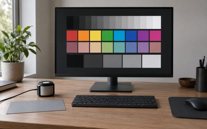
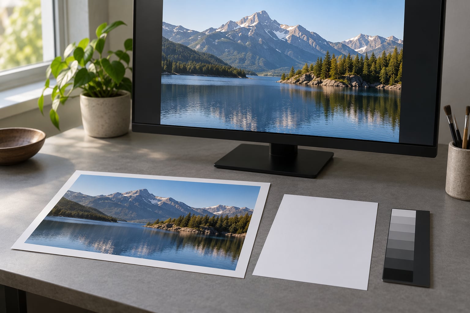
For a controlled comparison, work from a neutral grayscale image or a step wedge held next to a white sheet of paper in daylight that has bounced off a wall rather than coming straight from a window. If the whites read as the same brightness, you have a fair reference. A rougher version of the same test: take a photo of your screen showing pure white and a photo of a sheet of white paper under the room light, then compare the two on the same device.
How to Fix Prints That Look Too Dark
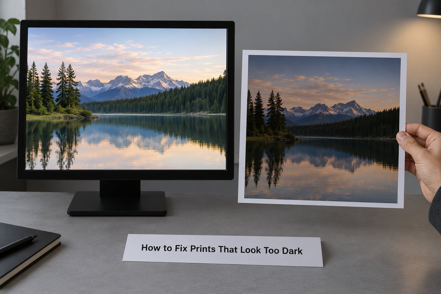
Work through these in order and change one thing at a time, otherwise you will never know which fix mattered.
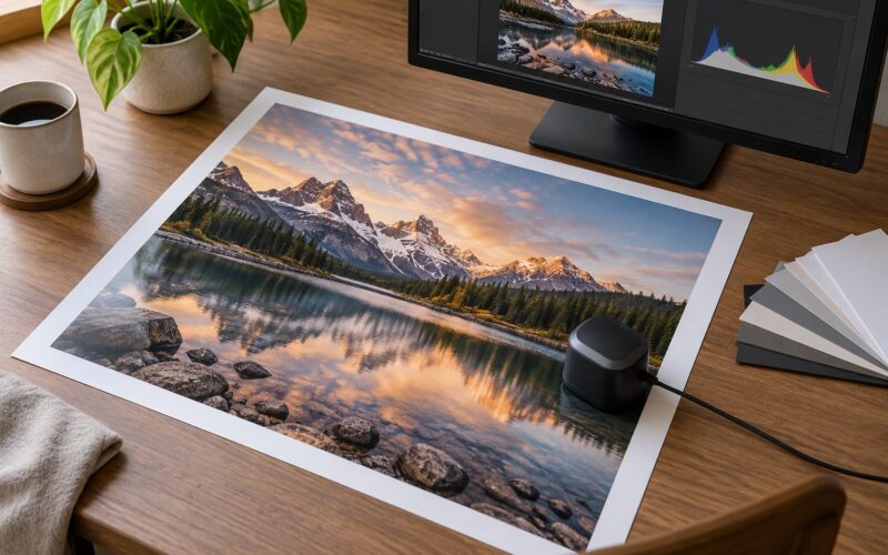
- Check the file itself. Open the histogram. If the shadows are bunched against the left wall, the photograph really is underexposed and no monitor setting will save it.
- Lower the monitor brightness. Drop the slider until screen white matches paper white in the same light. Around 60 percent is a reasonable starting guess on a typical display, and closer to 40 percent on older all-in-one machines.
- Turn off automatic display features. Night Shift, True Tone, Night Light and adaptive brightness all change colour and brightness without telling you. Disable them for editing sessions.
- Judge the print in the right light. For a rough check, indirect daylight works. For real judgements, a viewing booth or a light box gives you a known, repeatable level instead of a guess.
- Adjust the image gently. Nudge exposure or lift shadows, then watch the histogram. Keep important detail in the upper three quarters of the range, because anything lower is likely to block up on paper.
- Check the printer settings. Match the media type in the driver to the actual paper, confirm colour management is handled in your editing application rather than by the driver, and make sure you are printing through the manufacturer ICC profile for that paper and ink set.
- Proof before you commit. Order one small print on the exact paper you plan to use. Large runs and canvases hide mistakes very expensively.
Here is the brightness situation most people are actually in:
| Setting | Typical default | Target for print work |
|---|---|---|
| Monitor luminance | 200 to 300 cd/m2 | 80 to 120 cd/m2 |
| Brightness slider | Near maximum | Around 60 percent, then judge by eye |
| Colour temperature | Whatever the system picked | 5000 to 6500K |
| Gamma | 2.2 on most displays | 2.2 |
| Night Shift and True Tone | On | Off while editing |
Monitor and Room Lighting Checks
Screen calibration and print proofing are different jobs. Calibration fixes what your display actually emits. Soft proofing uses a printer profile to simulate a specific paper on your screen. Neither replaces looking at the real print.
Without hardware, you can still get most of the way. Right-click the histogram in Lightroom and choose Show Lab Color Values to read actual luminance. A widely used trick among photographers is to check the red channel value of the brightest diffuse highlight on a face: roughly 87 plus or minus 2 percent in ProPhoto RGB, or about 236 to 240 in sRGB, indicates the exposure is roughly where you want it. macOS and Windows both ship a basic calibration assistant, and free tools such as Calibrize exist for Windows if you want manual control of gamma and white point.
A hardware colorimeter is worth it once you sell prints, prepare work for exhibition, or mix critical client retouching with printing. For family photos printed a few times a year, spending that money on better trips to photograph in beats spending it on a gadget.
Glare and reflections on the screen fool you as often as brightness does. A window behind your monitor, a pale wall in front of it, and a desk lamp bouncing off the panel will all make your image look brighter and more contrasty than the numbers say. A neutral grey surround behind the display helps more than any setting.
For print evaluation, aim for even light of moderate brightness. Standards-based booths sit around 500 lux for photographic work, which is brighter than most living rooms and much brighter than a hallway at night.
Paper, Ink, and Printer Profile Choices
Paper sets the ceiling. Every print can only reflect the light it receives from a white base plus its dyes, so a warm, textured fibre paper returns less light to your eye than a bright white resin-coated sheet. That alone reads as a darker print.
| Finish | How it looks under the same light |
|---|---|
| Glossy | Highest contrast and deepest blacks, bright whites, strong specular reflections |
| Lustre or semi-gloss | Slightly lower contrast than glossy, far less reflection, forgiving to hang |
| Matte | Lower perceived contrast, slightly warmer, shadows can look flatter |
| Canvas | Texture breaks up fine detail; the weave reads as noise up close |
Ink limits matter more than most people expect. Printers cap how much ink a surface can hold before it dries, and when a driver ignores that limit, shadows fill in, colours smear and the result reads as heavy and dark. Letting the driver handle it, or using a profile built for the correct ink limit, is the fix.
The rule of thumb that keeps prints predictable: let the printer or lab manage colour, not your application, for normal photographic printing. Your editing application should convert to the printer profile, and the driver should then handle the ink limits. Turning both on at once means one of them silently overrides the other.
Why do my prints look darker than my screen after editing?
Because editing happened against a screen that was too bright. When the screen is set at 250 cd/m2, a curve that looks balanced on screen will print muddy, because the shadows you thought were open were only open relative to that brightness.
Three other editing-side causes show up constantly:
- A contrast curve with too low a black point. Push it and the print gains contrast but blocks up in the shadows.
- No preview of the output profile. In Lightroom, switch the profile to the paper you intend to use so the simulation accounts for that paper’s black point and gamut.
- The file you are printing is not the file you edited. Screenshots and files sent through messaging apps are recompressed and lose shadow detail. Print the original, or an export from the original.
If your image is genuinely underexposed rather than badly displayed, lift it in small steps and check the histogram after each one. Trying to fix a dark file and a bright screen in one move is what blows out faces while leaving the background still too heavy.
A Simple Test Print Workflow for Consistent Results
This sequence takes about an hour and removes almost all guesswork from printing.
- Disable Night Shift, True Tone and any auto brightness for the session.
- Set the monitor to around 100 to 110 cd/m2, 5000 to 6500K, gamma 2.2, and leave it there.
- Adjust the image against a neutral gray surround with a calibration target or ColorChecker Passport on screen.
- Check the histogram and the red channel value on skin tones before you commit.
- Turn on the soft proof for your chosen paper and ICC profile, then make any last adjustments.
- Print one small proof on the intended paper, judged away from the screen in neutral light.
- Write down the settings and the profile you used, then print the final size.
Keep that proof sheet. It becomes the reference you hold next to the next batch, and comparing two prints is far more reliable than comparing a print to a screen.
Frequently Asked Questions
Should I make my monitor brighter to match my prints?
No, the opposite. Prints reflect ambient light, so brightening the monitor makes the mismatch worse. Bring the display down to roughly 80 to 120 cd/m2 and compare its white against a sheet of white paper in the same room light. If the screen is dimmer than the paper, raise it slightly. Match the paper, not the other way round.
How do I soft-proof a photograph for a specific paper?
Install the ICC profile that came with your paper from your printer or lab, then in Lightroom or Photoshop switch the image profile to that file and turn on Soft Proofing. Pick the paper option matching your finish, matte or gloss, because the black point changes between them. The screen is then predicting that paper, though only a real proof print confirms it.
Do matte photographic papers always print darker than glossy papers?
Not always, but matte papers usually read as slightly lower contrast and marginally darker, because they reflect light more diffusely instead of returning it to your eye. The bigger factor is paper white. A warm or textured fibre base lowers the brightest the print can be. Expect a small difference on the same image and check a proof before committing to a large run.
Why do black-and-white photographs print darker than expected?
Three things usually combine. The display was brighter than print standard, contrast was set with a low black point, and print dynamic range is far narrower than screen dynamic range, so tones you separated on screen merged into solid black on paper. Deep black-and-white work also gains perceived density on matte stock. Lower the display, lift the black point carefully, and proof on the paper you plan to use.
Can printer ink limits cause photographs to look too dark?
Yes. When a driver allows more ink than the paper can absorb, shadows fill in and colours go dense and heavy, which reads as a dark print. Let the driver apply its ink limit, or choose a profile built for the correct limit for that paper and ink set. If your prints have muddy blacks and colour bleeding in dark areas, this is one of the first things to check.
How do I know whether the problem is my monitor or my print?
Turn the screen off, or cover it, then look at the print in neutral light. If the print looks fine on its own, the screen was lying. Next, check the histogram with the screen set to a realistic 80 to 120 cd/m2. If the shadows are still bunched against the left edge after you lower the brightness, the file itself is underexposed and needs correcting rather than the display.
Conclusion
Start with one comparison: turn the monitor off, hold the print in neutral light, and judge it on its own. Then lower the display to around 100 cd/m2, turn off automatic brightness features, and proof on the paper you actually intend to use. Correct the file or the output profile before you touch anything else, because changing several settings at once tells you nothing about what worked.