To use colored backdrops for mood in portraits, decide the feeling you want first, pick a backdrop color that carries it, then light and frame so the color supports the subject instead of fighting them. This is about a photography backdrop on a stand behind your subject, not paint on a wall, so the whole guide stays on color, light and camera settings.
Color is the fastest mood lever you have in a portrait. Before a viewer reads an expression, they register the background hue, its brightness and how saturated it is, and that sets the emotional temperature for everything inside the frame. A muted teal behind a quiet portrait and a hard red behind the same face produce two entirely different photographs, from identical lighting.
The mistake most photographers make is starting with the color. They walk into a shop, they hold up a roll, they like it, and they hang it. Then the client looks flat, the skin goes greenish, and nobody can say why. Working the other way around — mood, then color, then light — takes about fifteen extra minutes and fixes most of that.
Table of Contents
- What You Need
- How to Use Colored Backdrops for Mood: Step-by-Step
- Common Mistakes
- Frequently Asked Questions
- What color backdrop creates a calm mood for portraits?
- How do I choose a colored backdrop that flatters the subject?
- What lighting setup keeps a colored backdrop from casting color on skin?
- Can I use colored paper, fabric, or a painted wall instead of a studio backdrop?
- Should I correct a colored backdrop in-camera or during editing?
- How do I create a darker or more dramatic colored background?
- Conclusion
What You Need
You need very little to build a strong colored backdrop setup, and the expensive part is optional.
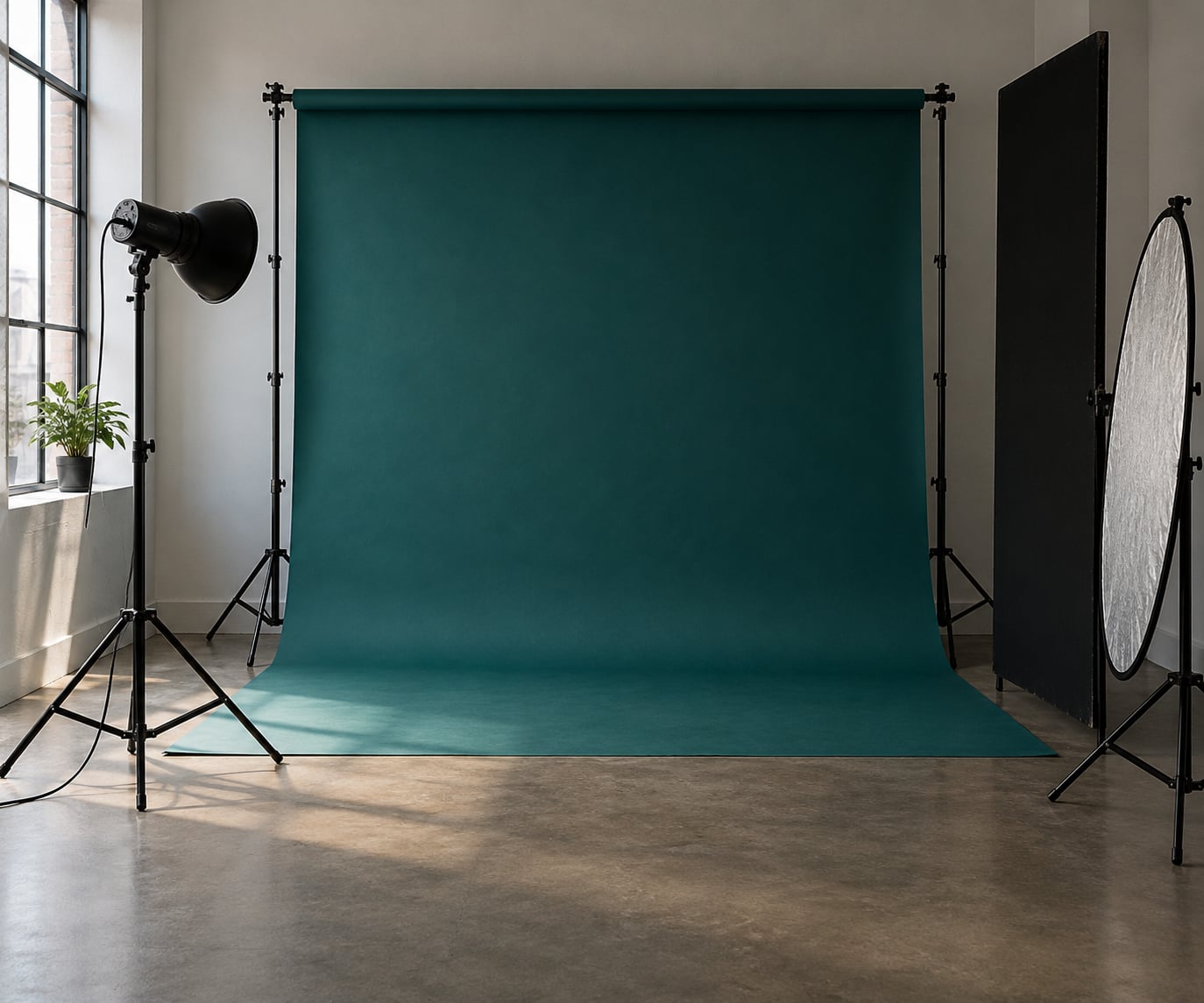
- A backdrop surface. A wide roll of matte paper backdrop is the cheapest way to get an even, saturated field of color. Fabric (muslin or microfiber) is softer and hides wrinkles better but reflects more light. A painted wall works if the paint is matte. Printed backdrops give you a pattern at the cost of sheen and hotspots.
- A support. A crossbar stand or a wall-mounted clamp holds the paper flat and lets you control tension, which is what removes sagging and creases.
- A key light plus something to shape it, a camera, and a reflector.
- A background light with a grid or snoot, aimed at the backdrop rather than the subject.
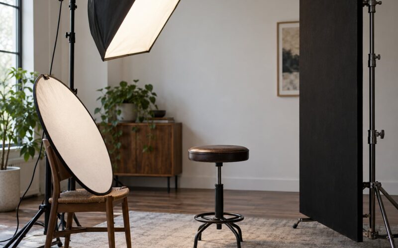
- Flags or a black sheet to cut spill off the background and stop color bouncing back onto your subject.
- Styling basics: a neutral wardrobe option, a reflector, and a tape measure or a marked floor spot so separation distance stays consistent between setups.
If you have none of that yet, a painted wall and a window are a legitimate studio. Work through the process first, then spend money on the pieces where you felt blocked.
How to Use Colored Backdrops for Mood: Step-by-Step
1. Define the emotional message
Name the emotion in one word before you touch anything: calm, melancholy, energetic, intimate, mysterious, joyful, aspirational, nostalgic. One word keeps the whole set consistent, because every later choice — hue, saturation, distance, aperture — gets judged against it.
Two words is workable. Three is usually a sign the brief has not been decided yet.
2. Choose a backdrop color for the mood
Hue does the heaviest lifting, saturation controls intensity, and brightness decides whether the color reads as background or as a second subject.
Warm hues (red, coral, terracotta, mustard) read as close, energetic and immediate. Cool hues (blue, teal, indigo, purple) read as distance, calm and introspection. Desaturated versions sit in the middle and usually flatter more people, because they carry the emotional direction without shouting.
| Mood | Backdrop color | Backdrop lighting | Subject distance |
|---|---|---|---|
| Calm | Soft teal or dusty blue | Even, low contrast | About 1.5 m |
| Melancholy | Cool gray-blue or muted sage | Dim, gentle falloff | About 2 m |
| Energetic | Bold red or saturated orange | Bright and direct | About 1.5 m |
| Intimate | Deep plum or charcoal | Underlit with a single soft source | About 2.5 m |
| Mysterious | Dark navy or black with a gel | Backlit pool of color | About 3 m |
| Joyful | Light yellow or sky blue | High key, near white level | About 1.5 m |
| Aspirational | Slate, deep teal or gold | Controlled gradient | About 2 m |
| Nostalgic | Warm cream, faded rose or brown | Flat and even, no gradient | About 1.5 m |
Two details decide whether the color feels rich or cheap. A matte surface holds saturation without glare, and a slightly darker backdrop than you think you need keeps the subject dominant. Bright, saturated backdrops pull the eye first, which is useful for fashion and dangerous for headshots.
Color relationships matter too. An analogous backdrop sits next to your wardrobe hue and looks harmonious but risks blending into it. A complementary backdrop sits opposite on the color wheel, so a warm outfit pops against a teal field. Monochromatic — backdrop close to the wardrobe in one family — reads as intentional and expensive when the values are separated.
3. Match the backdrop to the subject
Hold a paper swatch of the color next to your subject’s face in daylight before you commit. That test takes ten seconds and it is the most reliable one you have, because your eyes adapt to the viewfinder and to the room light.
| Skin tone | Backdrop families that work well |
|---|---|
| Warm, golden or deep brown | Teal, emerald, dusty blue, plum, deep navy |
| Cool, pink or fair | Coral, terracotta, mustard, sage, warm gray |
| Olive or neutral | Almost anything except green-adjacent hues at similar value |
Hair and clothing count too. A red backdrop next to red hair disappears at the edges. A green backdrop and olive clothing merge into one shape, and no amount of lighting rescues it. If wardrobe is fixed, choose the backdrop after; if you control the wardrobe, coordinate rather than match, so the person still reads as the subject.
4. Arrange the backdrop and control distractions
Keep the subject 1.5 to 3 meters off the backdrop. Closer and color spill from the paper contaminates skin and hair edges; further away you gain separation and falloff control but need a longer lens or a wider aperture to keep the background soft.
Pull the paper taut, remove wrinkles with a steamer or a warm iron held at a distance, and check for anything reflective in frame. Watch for the frame edge of the backdrop itself showing up as a hard line behind the shoulders. Positioning matters as much as color: keep the brightest or most saturated part of the background behind the subject’s face, and let it fall off toward the edges of the frame.
5. Light the backdrop for a controlled result
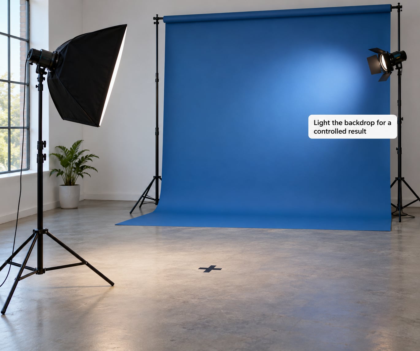
Separate the backdrop lighting from the key light. Aim a gridded or snooted background light at the paper from an angle, close enough to the backdrop to build a pool of color, and flag it so no light reaches your subject. That control is what separates a clean, even field from a bright hotspot in the middle of the frame.
For an even field, light the backdrop square on and keep the subject’s key far away from it. For directional falloff, move the background light sideways so brightness slides across the paper. For a gradient, raise it high and aim down, then stop it down a little or feather the edge with a flag.
Color gels work here. Roscoe gels over a background light give you a hue no paper roll offers, including deep saturated tones and mixed colors for unusual moods. The technique is discussed on dpreview forums as a lighting tool as much as a physical prop, and it is the cheapest way to test a color idea before buying anything.
Then flag the spill. Any light that hits the backdrop bounces onto the subject, and a saturated backdrop produces a visible color cast in the shadows. Black foam board on the shadow side of the subject usually removes it in seconds.
6. Test the color in your camera
Switch to the histogram and shoot a frame of the empty backdrop with your subject in place. You want the backdrop sitting in the middle tones, bright enough to read as color but never clipped. Clipped red or blue channels lose hue and come back as a flat, dead patch.
Your camera will try to neutralize the backdrop. Auto white balance sees a strong color cast and compensates for it, which quietly shifts your skin the opposite way. Set white balance manually, or shoot RAW and correct later. Starting near 5000 K and nudging warm or cool until skin looks right is faster than fighting the automatic setting.
7. Refine the palette through small adjustments
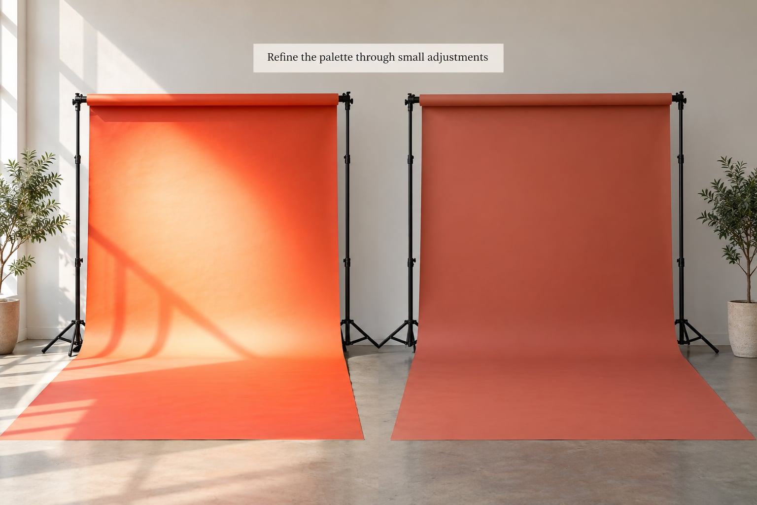
Almost every problem at this stage is solved with three moves: adjust the background light, adjust the distance, adjust the white balance. Move the light closer for a hotter, more saturated pool, further away for a softer, darker one. Add a meter and read the backdrop separately from the subject.
In post, grade the background rather than the whole frame. Push the hue you intended, pull saturation back if it started to look electric, and cool or warm skin separately so the backdrop gets more character while the face stays believable. If a color read wrong in the file, a targeted HSL adjustment on the background often fixes it faster than reshooting.
For a series, keep the same backdrop color and lighting ratio across every frame so the gallery reads as one mood. Change one variable at a time, and change it on purpose.
Common Mistakes
Picking a color because it looks good online. Screens lie about saturation, and a bright teal roll under tungsten light arrives on set as a dull gray-green. Test in the room where you will actually shoot.
Letting color spill onto skin. The classic failure. Push the subject further from the backdrop, flag the bounce side, and keep the background light behind a grid.
Making the backdrop brighter than the subject. A glowing background pulls the eye first. Meter the subject’s face, then bring the backdrop down until it sits half a stop to a stop below it.
Skipping the wrinkle pass. Small creases catch specular highlights and break an otherwise even field. Steam or warm the paper while it is still on the stand.
Leaving it to auto white balance. The camera fights your color on purpose. Shoot RAW and set white balance by eye.
Using two saturated colors at once. A bright wardrobe plus a strong backdrop leaves the subject nowhere to sit. Keep the wardrobe neutral whenever the backdrop carries the mood.
Forgetting dark subjects. A dark backdrop behind dark hair or a dark pet merges the outline. A pet photographer on a photography forum described the opposite result with a light backdrop for dark fur, which is a useful reminder: separation beats the rule of thumb every time.
Frequently Asked Questions
What color backdrop creates a calm mood for portraits?
Soft, cool hues create calm: dusty blue, sage, muted teal and desaturated gray-green. Keep the backdrop a stop or so darker than your skin tone so the subject stays dominant, and light it evenly with no gradient. Warm tones pull the other way, so if you want peace rather than comfort, stay on the cool side and drop the saturation a little.
How do I choose a colored backdrop that flatters the subject?
Hold a swatch of the color beside the subject’s face in daylight before buying anything. Cool tones sit well on warm and deep skin, warm tones flatter cooler and fair skin. Then check hair and wardrobe: if either is close to the backdrop in hue and value, move to a contrasting color or separate them with distance and falloff.
What lighting setup keeps a colored backdrop from casting color on skin?
Aim a separate gridded or snooted light at the backdrop from an angle, keep it flagged so no light reaches your subject, and place black foam board on the shadow side to absorb bounce. Push the subject 1.5 to 3 meters back, and meter the background two thirds of a stop under the face. That combination removes most color spill without touching your key light.
Can I use colored paper, fabric, or a painted wall instead of a studio backdrop?
All three work, and each behaves differently. Paper gives the most saturated, even color but shows every crease. Fabric is softer and forgiving, though it holds more light and can sheen. A matte painted wall costs nothing and is fine for practice, but you cannot move it, and a glossy finish will produce hot spots. Test the surface with a side light before you commit.
Should I correct a colored backdrop in-camera or during editing?
Shoot RAW, set white balance manually while you are on set, and do the creative work in editing. In-camera correction gives you control over channels and prevents clipping, which destroys hue. In editing, grade the background separately from skin so the backdrop can get more character while the face stays believable.
How do I create a darker or more dramatic colored background?
Move the background light further from the backdrop and lower its power, which darkens the field without changing the subject exposure. Or light the backdrop from high above at a raking angle for a gradient that falls off behind the subject. For maximum drama, flag almost all spill so only a narrow band of color stays lit and the rest of the frame goes quiet.
Conclusion
Pick one mood, write it down, choose a color that carries it, and test it on a single subject before you adjust anything else. Get the face brighter than the backdrop, flag the spill, and set white balance by hand. Everything after that is refinement.