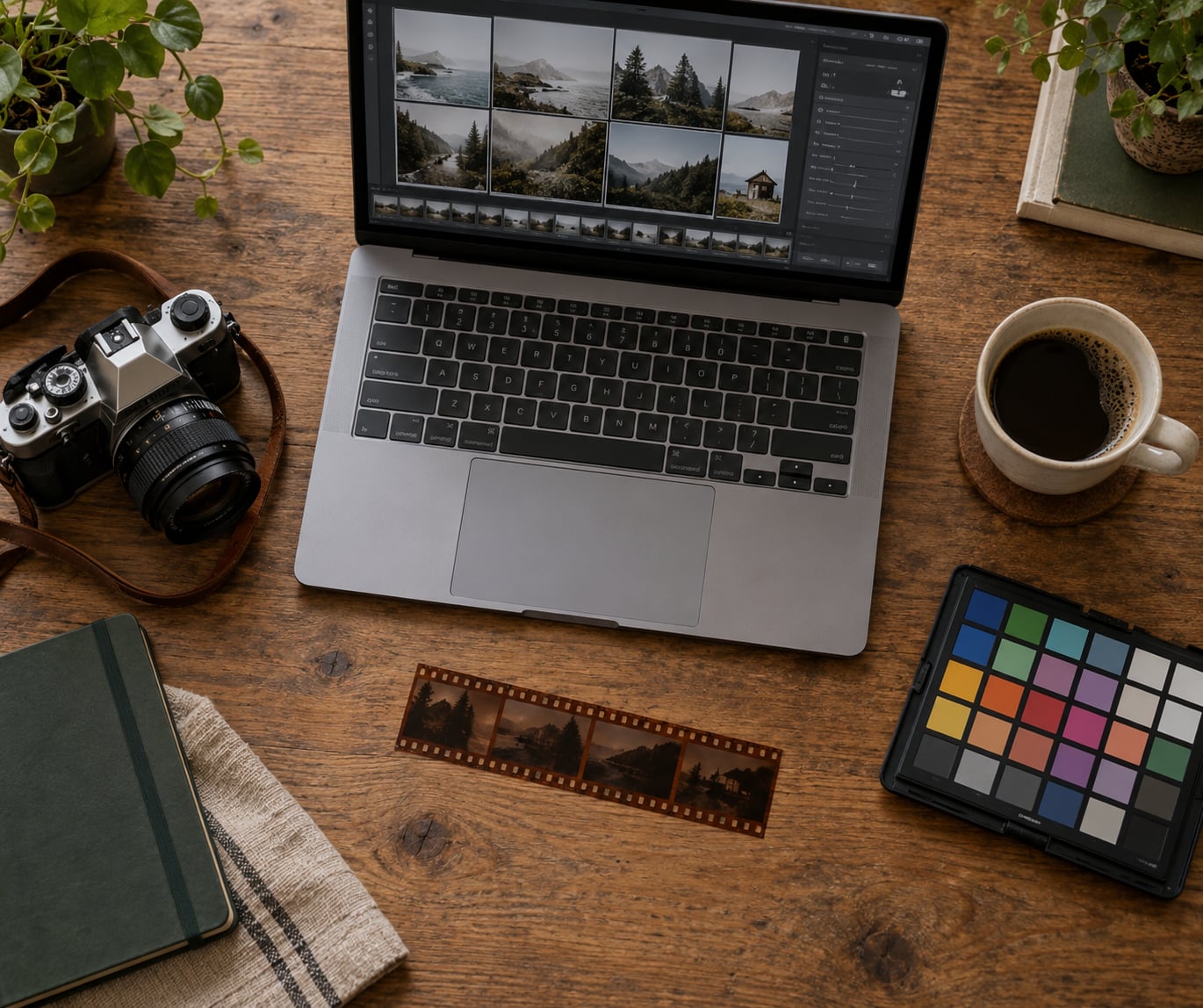
A film look in Lightroom is made the same way every time: soften the global contrast, lift the black point so shadows never hit pure black, shift the color mix toward warm highlights and cooler shadows, and finish with a small amount of fine grain. That is the whole trick, and it takes about five minutes once you know which sliders to move.
If you have never done it before, the whole process on one RAW file takes maybe 10 to 15 minutes including the checking. The difficult part is not the sliders, it is resisting the urge to push them further than a real film stock would.
I break the process below into seven steps, with the actual numeric starting values so you can reproduce the result instead of guessing. Every value is a starting point you adjust by eye, not a rule. The panel names are Lightroom Classic’s, and I note where the cloud and mobile versions differ.
Table of Contents
- What You Need
- Step-by-Step: How to Create a Film Look in Lightroom
- Common Mistakes
- Frequently Asked Questions
- What is the best way to create a film look in Lightroom without using a preset?
- How much grain should I add to make a Lightroom image look like film?
- Should I use Lightroom Classic or Lightroom to create a film look?
- How do I keep skin tones natural when applying a film color preset?
- Can I create a film look from a JPEG in Lightroom?
- How do I make a film preset work across a whole photo set?
- Conclusion
What You Need
You need Lightroom and one RAW file to practise on. The RAW part matters more than people expect, because a film look is a large tonal change and a JPEG has almost no room left to give.
Lightroom Classic, Lightroom (cloud), or Lightroom Mobile? All three can produce a convincing film look, but they are not identical. Classic has the Tone Curve, Color Mixer, Grain with amount, size and roughness, and the Calibration panel. The cloud version has all of those too, and it saves them into the Develop module the same way. Mobile has the tone curve and Color Mixer, plus grain with amount, size and roughness, but it lacks the Calibration panel and does not have the same Color Grading wheel. That is fine for most work. If your goal is matching a specific film stock precisely, Classic or cloud is the place to do it.
Classic also has the Develop module’s masking tools, so you can correct skin tones separately. On mobile, you get the Select Subject mask, which covers most portrait work.
RAW over JPEG. A JPEG has already been tone-mapped and clipped by the camera. Lifting blacks and rolling highlights off gently both need highlight and shadow latitude, and a JPEG has very little of it left. You can build a film look on a JPEG, it just tends to look harsher and the grain will read as noise on top of noise. Start from RAW whenever the original is available.
Work non-destructively. Everything in this guide happens in the Develop module, which is non-destructive. That means you can push the blacks to +40 to see the effect and then drop them back to +15 with no loss. Film looks go wrong more often from overcorrection than from wrong settings, and non-destructive editing lets you find the edge without consequences.
Useful extras. A film scan of the stock you are chasing speeds everything up, because you can put the scan and your edit side by side and match them rather than remembering what a Portra looks like. A calibrated display matters too. Judging a warm, low-contrast look on an uncalibrated laptop screen is how you end up over-warming it, and you will not notice until you see it on a phone.
Step-by-Step: How to Create a Film Look in Lightroom
Start With a Consistent Base
The look has to sit on top of a clean, neutral render, or the film styling will just amplify whatever was already wrong.
Pick a shot where the histogram shows a full tonal range without spikes pinned at either end. Then set the profile. Adobe Color is the neutral base in Classic; in the cloud and mobile versions, choose the Adobe color profile or the closest neutral option. Profiles like Adobe Landscape push saturation and contrast hard, and the more the profile does for you, the harder it becomes to control the film result afterwards.
Now normalize the image before styling it. Set Exposure so the histogram’s brightest area sits between about 70 and 80 percent, not jammed at 100. Fix white balance next, either with the eyedropper on a neutral surface or by dialling Temp and Tint until skin looks right. Getting white balance right now saves you fighting the Color Mixer later.
Set Contrast back to zero and leave it there. A lot of film-look tutorials add contrast in the Basic panel and then soften it again in the tone curve. Pick one. I do all the contrast shaping in the tone curve, because that is where I can control the shape rather than just the amount.
How to tell it worked: the image looks plain and slightly flat. That flatness is correct at this stage. If it looks finished already, you have probably added something in the profile that you will have to undo later.
Set the White Balance and Color Palette
Film stocks separate warmth and coolness in a specific way: highlights drift warm, shadows drift either cool or green depending on the stock. Digitally, you reproduce that split rather than pushing one global temperature.
Open the Color Mixer panel (labeled HSL in older versions and in mobile). Work on saturation first, because it changes everything downstream. Three moves cover most film emulation:
- Drop red saturation by 5 to 10 and raise red luminance by 5 to 10. This is the signature of Kodak negative film, and it is what stops skin from reading as sunburn.
- Drop blue saturation by 10 to 20 and raise blue luminance by 5 to 15. Greens in trees and grey skies get gentler and less digital.
- Drop green saturation by 5 to 10, or raise it by 5 to 10 if you are chasing a cine look with green shadows.
Next, set the overall Temp and Tint. If you started from a correct white balance, nudge Temp up by 200 to 400 Kelvin for a warm Kodak feel, or leave it alone and add warmth later with split toning instead. Tint down by 5 to 12 pushes magenta into the highlights, which is a very common film trait and one most people miss.
Protecting skin tones: before you commit, zoom to 100 percent on a face and check the midtone skin values in the histogram. Skin should sit in a narrow band, roughly between 55 and 75 percent luminance, without a visible spike. If skin is running green or orange, undo the global Temp change and fix it with a local mask on the Color Mixer instead. It is much easier to control that way.
Shape Contrast and Tonal Color
This is where the film look actually lives. Digital renders tend to hit true black and clip highlights hard; film emulsions do neither.
Lift the blacks. In the Basic panel, set Blacks to +20 to +30. This is the single most important move in the whole recipe and it is the one people leave out. Printed and scanned film almost never delivers a pure black, because the dye layers sit on top of the base and the film base itself holds a small density. Photographers on r/Lightroom make the same point repeatedly: lift the black point rather than reaching for a preset.
Pull the whites back. Set Whites between -20 and -40. Combined with the black lift, this compresses the tonal range from both ends, which is exactly the low-contrast character most film stocks have. Stop pulling whites as soon as the brightest non-specular areas start to look dull.
Open the Tone Curve. You are building two shapes here. First, lift the bottom-left point so the curve’s origin sits above zero. The Blacks slider already did some of this in the Basic panel, so move this gently. Second, pull the highlights down toward the top-right so highlights roll off gradually into what is called the shoulder, instead of reaching white abruptly.
That combination gives you the low-contrast film response. If you want a punchier Kodak look, add a gentle S-curve in the midtones on top of it. For a matte look, keep the curve nearly straight and let the lifted blacks do the work.
Color grading panels. The Color Grading panel has three wheels: shadows, midtones and highlights. A film-like starting point is shadows toward cyan or green at around 25, midtones left alone, highlights toward warm yellow or orange at around 20. Split toning does something similar and is available in mobile too. Set Shadow Hue toward blue or green, keep Shadow Saturation low at 10 to 20, and set Highlight Hue toward amber with Highlight Saturation around 15 to 25.
Softening detail. Push Clarity down to -10 to -25 and leave Dehaze at 0 or slightly negative. Adobe’s own film-style guidance points at Clarity and Dehaze for softening detail, and this is where most people go wrong in the other direction. Adding clarity for “pop” is the fastest route to a digital, crunchy image that no amount of grain will fix.
How to tell it worked: the deepest shadow in the frame is a dark grey rather than black, and the brightest highlight is a light grey rather than white. If the image looks flat but still has bite, that is the target.
Add Fine Grain Instead of Heavy Texture
Grain goes last, after all the tonal work, because every earlier adjustment changes how much grain you need. The three controls mean different things and you need all three.
- Amount sets how strong the grain is. It also controls the coarseness somewhat, since high amounts create larger clumps.
- Size sets the diameter of the grain structure in pixels. Bigger values look like medium format film or pushed stock. Smaller values look fine and delicate.
- Roughness sets how much the grain varies in density. Low roughness looks uniform and artificial. High roughness looks irregular, which is what real grain does.
Start at Amount 40 to 50, Size 25, Roughness 50. That combination circulates widely as a subtle film texture, and it is a good first pass because it is easy to see and easy to back off. Then adjust for your image.
Grain size also has to match your camera’s resolution. A 24-megapixel file needs a smaller Size value than a 45-megapixel one to produce the same apparent grain, because the same pixel-level structure covers a smaller part of the final image. If grain at Size 25 looks heavy on a high-resolution body, drop Size toward 15. On a lower-resolution camera, go up toward 40.
Two adjustments matter more than the exact numbers. Lower Amount in the deepest shadows, since real grain is most visible in midtones and fades in the blacks. And raise Amount a touch in bright areas, because grain in a highlight looks like exposure noise rather than film.
The limit worth knowing: Lightroom’s grain is even across the frame, while real grain density changes with exposure and emulsion type. That uniformity is why some photographers consider plugin-based film emulation a step up in realism. It is a small difference at web sizes and a visible one at print.
Add Vignetting, Sharpening, and Optical Character
Two details do most of the work of making an image feel photographic rather than digitally perfect.
Vignette. Use the Post Crop Vignetting sliders in Classic, or a radial filter for more control. Midpoint at 40 to 60, Feather at 60 to 80, Roundness around 0, and a negative Amount of -10 to -25. Enough to draw the eye inward, not enough to notice as a dark ring. A vignette of -40 is a costume effect; a vignette of -15 is an optical one.
Sharpening. Set Amount to 50 or 60, Radius near 1.0, Detail 20 to 40, and Masking 70 to 90. The high Masking value keeps the sharpening off the grain you just added and off the sky, which is where oversharpening shows up first. If you are exporting large prints, drop Amount and Masking further.
Halation. This is the glow film gets around blown highlights where light scatters back through the emulsion and reflects off the film base. You can fake it with a radial filter over a bright window or a streetlight: drop Exposure down to -2, raise Texture and Clarity, push Dehaze up hard, then lower Exposure further until only the halo survives. Mask the effect so the halation ring does not sit on your subject.
Light leaks. A soft radial filter placed off the edge of the frame, with a warm color and low opacity, gives you the streaked edge light of an old camera back. Reduce the filter’s exposure to around -1 and set the Temp up strongly. Keep it subtle, because a light leak is a joke that gets old fast.
Make the Look Consistent Across the Set
A single preset that only works on the photo it was built on is the most common film-look complaint in the forums, and the reason is that presets carry absolute tonal values rather than relative ones. Here is how to avoid that.
First, never let a preset set your black point or white point blind. Those are the two values that depend entirely on the light in each frame. Apply everything else, then set Blacks and Whites by looking at the histogram. A backlit portrait and an overcast street scene should end up with visibly different whites.
Second, group your preset so the film look sits apart from your base correction. Copy the profile and white balance into a “Base” preset, then put all the film styling above it in a child preset. When the base changes, the whole set updates together.
Third, use copy settings for a batch. Select the finished image, then the batch, and use Copy Settings. Paste with the film adjustments checked and the exposure, whites and blacks unchecked. That is the single fastest way to keep a mixed-lighting shoot coherent.
Fourth, use masks for the variation you cannot fix globally. A select subject mask with a small exposure and white balance correction on faces, applied after the film look, rescues skin tones across an otherwise uniform preset. In mobile, the Select Subject mask does the same job.
Save and Reuse the Film Look
Once the look survives a handful of different lighting conditions, save it. In Classic, open the panel on the right, click the folder icon to create a group for film looks, then the plus icon to create a developed preset from the current image.
Then go through the preset’s settings and decide what you want baked in. My rule: keep the profile, color mixer, tone curve, grain, vignette and split toning. Uncheck exposure, whites, blacks, highlights and shadows, because those are the ones that need to respond to each frame. A preset that controls its own tone curve while leaving the black point open is far more portable than one that locks everything down.
Create two or three variants from the same master. A single warm Kodak-style preset will be too strong on an overcast beach day and not strong enough at a night market. One base look plus a warm and a muted variant covers most shooting, and you adjust the variant rather than starting over.
Keep the master preset untouched and never edit it after you start using it on client work. If the look needs a change, duplicate it, rename the copy, and treat that as version two. Losing a preset you have already delivered a shoot with is a genuinely painful afternoon.
Common Mistakes
Grain that reads as digital noise. Usually the Amount is too high or the Size is too coarse. Halve the Amount first, then drop Size. If it still looks like noise rather than grain, raise Roughness above 60 so the structure becomes irregular instead of uniform.
Skin that turns green or orange. The global Temp or Tint is too aggressive. Undo it and move the warmth into split toning highlights at a saturation of 15 to 25. Then use a select subject mask to pull the face back toward neutral.
Crushed blacks and plastic-looking skin. Usually a preset with exposure, whites and blacks baked in, or a tone curve dragged well below the origin point. Blacks at +20 to +30 with a slight lift at the tone curve’s bottom-left corner fixes it. Clipped highlights are harder to recover; that is why you work in RAW.
One preset applied to a whole shoot regardless of light. Uncheck exposure, whites and blacks inside the preset, and paste settings with those values disabled. Judge each frame on its own histogram.
Editing a JPEG. You will fight clipping the entire way. Convert to RAW if the original exists, or accept that the look will be harsher than intended and pull the whites down less than the recipe suggests.
Changing six variables at once. Add grain, then look. Add the vignette, then look. Film looks fail from over-adjustment, and you cannot tell which slider did the damage if you moved them all together.
Adding clarity for punch. Negative Clarity is what softens digital edges. If clarity and dehaze are positive in an image with grain on it, the grain has nothing to sit on and the whole frame looks crunchy.
Over-saturated color as a shortcut for film. Film emulation is mostly about restraint. Dropping red and blue saturation in the Color Mixer gets you much closer to a negative-film look than raising vibrance ever does.
Frequently Asked Questions
What is the best way to create a film look in Lightroom without using a preset?
Build it in order: set a neutral profile and correct white balance, lower global contrast to zero, lift Blacks to +20 or +30, drop Whites by -20 to -40, shape the tone curve with a lifted origin and soft highlight roll-off, mute red and blue in the Color Mixer, soften with negative Clarity, then add grain at low amount and small size. Saving that sequence as a developed preset is how you get the look without a preset.
How much grain should I add to make a Lightroom image look like film?
Start at Amount 40 to 50, Size 25, Roughness 50 and adjust from there. Fine, subtle grain suits portraits and bright outdoor work. Push Amount toward 60 to 80 with a larger Size for a grittier pushed-film feel. Lower the Size on high-resolution cameras, since the same pixel structure covers a smaller part of a larger image.
Should I use Lightroom Classic or Lightroom to create a film look?
Classic and the cloud version both have the full toolset: tone curve, Color Mixer, Color Grading wheels, grain controls and the Calibration panel. Mobile has the tone curve, Color Mixer and grain, but no Calibration panel and a simpler Color Grading panel. For matching a specific film stock precisely, use Classic or cloud. Mobile works well for quick edits and travel shots.
How do I keep skin tones natural when applying a film color preset?
Check the histogram at 100 percent zoom and keep skin in a narrow luminance band, roughly 55 to 75 percent, without a spike. Drop red saturation and raise red luminance by 5 to 10 in the Color Mixer, which is the main film trait that prevents sunburn. Avoid large global Temp changes and correct faces with a select subject mask instead.
Can I create a film look from a JPEG in Lightroom?
Yes, but expect it to look harsher than the same recipe on a RAW file. A JPEG has already clipped its shadows and highlights, so lifting blacks and rolling off highlights pushes into limited latitude and can introduce banding. Work in RAW whenever the original file is available, and on a JPEG pull the Whites down less and skip the tone curve origin lift.
How do I make a film preset work across a whole photo set?
Leave exposure, whites and blacks out of the preset, since those values depend on the light in each frame. Group the film styling above a separate base preset holding your profile and white balance, then use copy settings with those three sliders unchecked for the batch. Apply faces last with a select subject mask to rescue skin tones across mixed lighting.
Conclusion
Start with the profile and white balance, then lift the blacks and pull the whites. Shape the tone curve, mute the reds and blues, soften clarity, and add grain last at a low amount and small size. Save that as a preset with exposure, whites and blacks unchecked, then judge the result on a calibrated display rather than the laptop you edited it on.
That is how to create a film look in Lightroom that survives contact with a real shoot instead of only the demo photo it was built on.