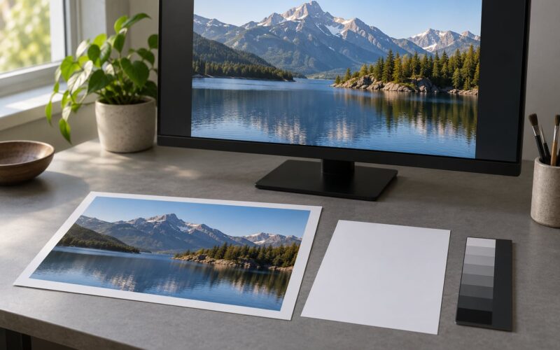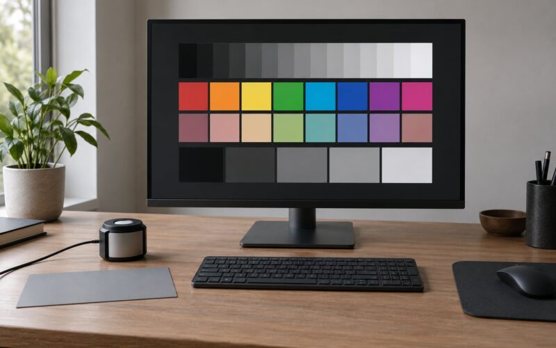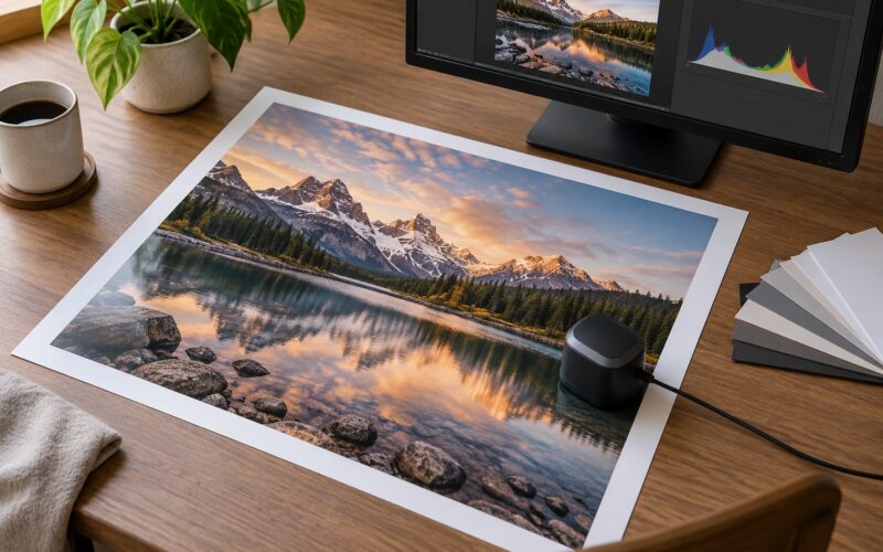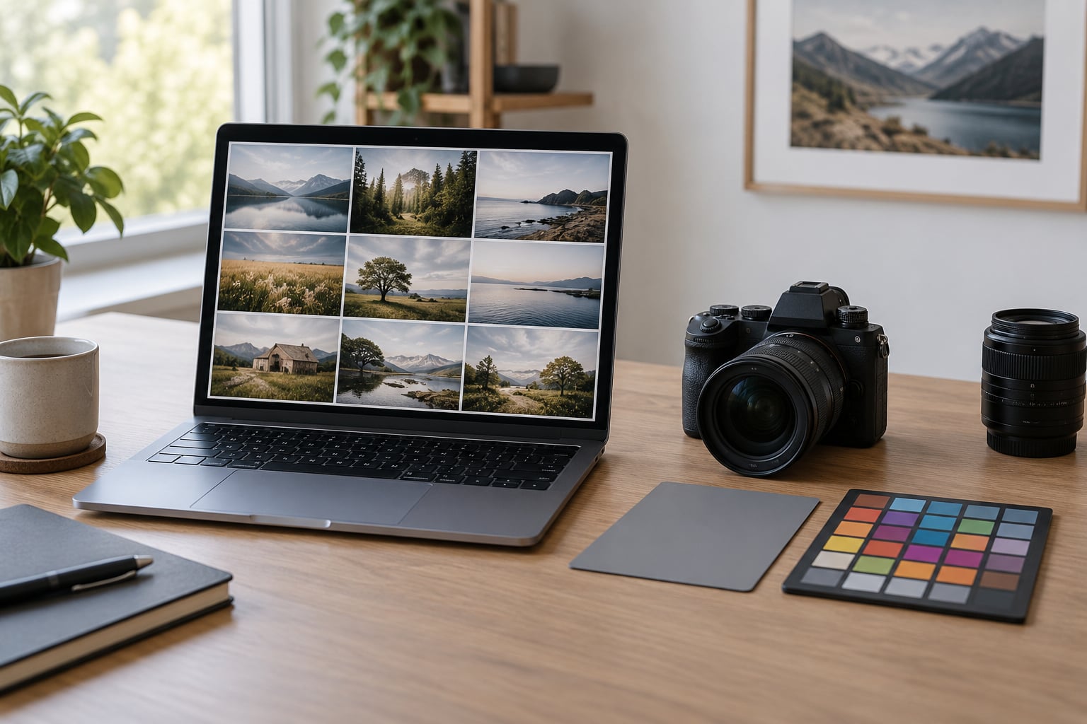
A series only reads as one body of work when the same visual decisions repeat across it: one white balance logic, one contrast curve, one colour palette, one crop language. Learning how to create a consistent editing style across a photo series is mostly about removing small random choices, not about adding effects. Set one base treatment on one reference frame, push it to the whole set, then adjust only where the light genuinely differs.
Budget about 20 to 40 minutes to build the base treatment once, then roughly a minute per frame on a 40-image edit. The skill itself is not difficult. It is just repetitive, and repetitive is exactly the point.
What follows is the workflow I use on portrait sessions and documentary sets, written so you can repeat it on your next series without reinventing the look each time.
Table of Contents
- What You Need
- Step-by-Step
- Define the series intention before editing
- Create one adjustable base treatment
- Apply the base treatment to the full set
- Adapt the treatment to lighting and subject differences
- Check consistency across the entire series
- Refine the outliers without creating false uniformity
- Export and document the final look
- Common Mistakes
- Frequently Asked Questions
- How many images should I edit together to create a consistent style?
- Should I use the same preset for every photo in a series?
- How do I keep skin tones consistent when lighting changes?
- What is the best way to compare a whole photo series?
- Can a consistent editing style include different crops?
- How do I save my editing style for future photo projects?
What You Need
Everything below is cheap or already on your desk. The only real prerequisite is a selected set, because you cannot style frames you have not decided to keep.
- A selected image set. Cull first, style second. Editing a 900-frame raw shoot and then deleting 800 frames wastes the consistency work you are about to do.
- RAW files. RAW gives you the latitude to match a mixed-light set. JPEGs lock in the white balance the camera chose at capture.
- An editing application with a sync or copy-paste settings function. Lightroom Classic and Lightroom, Capture One, and Darktable all qualify; the exact menu names differ, the logic does not.
- One reference image or style direction. Either the frame that best represents the series, or a small folder of past work whose colour and tone you want to echo.
- Comparison views. A grid, a loupe view and a before-and-after or split view, so you are judging the set rather than one frame at full size.
- A consistent export and naming workflow. One export preset per delivery format and a naming pattern, decided once.
If the series was shot on two camera bodies, add a colour target or a grey card frame from each. That single frame tells you how far apart the two colour renderings are before you start guessing.
Step-by-Step
Define the series intention before editing
Start with the through-line, not with a slider. Decide in one sentence what the set should feel like, then pick the frame that already carries it. That frame becomes your reference image and everything is measured against it.
Then write a short style brief. Six lines is enough: colour temperature and tint direction, how much contrast, whether blacks sit dense or open, how saturated the palette is, how tight the crops tend to be, and what must stay natural. Skin texture is the one I always write down, because it is the first thing a client notices when it is overcooked.
Doing this on paper is not ceremony. Without a written brief, image 200 gets decided by whatever mood you were in at midnight, and the set drifts.
Create one adjustable base treatment
On the reference frame, work in a fixed order every time: exposure and highlight recovery, white balance, tone, colour, then texture. Fixing the order is half the consistency.
Exposure and white balance come first because everything downstream reads wrong when they are wrong. Set the temperature and tint by eye against neutral areas rather than trusting auto white balance, which is the single most common source of drift in a series.
Then build tone on the tone curve, keeping the adjustments gentle at the ends so shadows stay open and highlights keep some detail. Add the palette in HSL: pull saturation from the colours that fight, keep one or two that anchor the series, and leave skin alone until you have checked it against a reference. Split toning comes last and should be subtle enough that a viewer could not point to it.
Save the result as a preset, but keep it adjustable. A preset that cannot flex is a filter, and a filter is the fastest way to make a series look fake.
Apply the base treatment to the full set
Push the base treatment across the set in one action. In Lightroom that is the Sync function on a selected group, in Capture One it is the Clip tool, in Darktable it is applying the style across the selected images.
Watch for what sync actually carries. A preset that includes white balance and exposure will rebalance a correctly shot frame just as happily as an incorrect one, so on frames that were already right, sync the creative layer only and leave the technical layer alone.
After the batch, switch to the grid. Not to cull, to read the set. Sequence, rhythm and the odd frame that no longer belongs are obvious in a grid and invisible one at a time.
Adapt the treatment to lighting and subject differences
Consistency is not identical treatment. A frame shot in open shade and a frame shot in direct sun cannot both be the same technical state, and trying makes the set look worse, not better.
Keep the colour relationships and the curve shape, then correct the exposure and white balance per frame. Match skin first: drop a temporary skin tone mask or eyedropper sample on each face and adjust temperature until the sampled tones agree, rather than pushing saturation around until it feels right.
Across mixed lighting, four situations cause most of the trouble. Indoors under warm tungsten against daylight through a window needs a temperature correction plus a careful check on the colour cast in the shadows. Backlight pushes the background bright and the face dark, so exposure is the variable, not the palette. Two camera bodies usually need matching camera profiles or a neutral target reference before the creative layer even applies. A flash mixed with ambient light shifts skin toward a cooler, flatter tone, so take the skin down slightly and let the ambient warmth stay in the background.
In every case the palette holds and the technical values move. That is the difference between a series and a set of unrelated frames.
Check consistency across the entire series
Run a fixed quality-control pass, in the same order every time, so nothing slips through:
- White balance: compare neutral areas across frames for a colour cast.
- Brightness: check that the set has a deliberate range rather than random exposure jumps.
- Contrast and black point: make sure no frame is noticeably denser or flatter than the rest.
- Skin rendition: compare the same tones on different faces and different lighting.
- Crop language: the series should share an approach to edges, horizons and headroom.
- Focus and sharpness: catch the frame someone softened to hide a handshake.
- Visual rhythm: the sequence should alternate, not repeat one framing thirty times.
- Distracting inconsistencies: stray reflections, dated colour casts, background clutter that pulls the eye.
Zoom out to 100 percent and toggle the whole set on and off. If the set reads differently with the group visible than it did frame by frame, that difference is the consistency you were looking for.
Refine the outliers without creating false uniformity
Most of the time two or three frames need real work. Use local adjustments, masks and dodge and burn rather than pushing the global treatment further, because every global push drags the ninety good frames down with it.
Some difference is the story. A darker, quieter frame in the middle of a bright sequence is doing something intentional, and flattening it removes information. Judge an outlier on whether it looks accidental, not on whether it matches.
Stop when the set holds together at a glance. One thing I have learned the hard way is that the frame you are still not sure about at midnight is usually the one holding the series back, so give it one focused pass, then leave it alone and come back after a break.
Export and document the final look
Consistency ends at delivery if you skip it. Set one export preset per format rather than exporting by hand, with matching colour space, sharpening and sizing, so a client browsing on a phone and a client holding a print see the same series.
For print, soft proof against the paper stock, since the same image reads cooler on a matte fibre paper than on a glossy one. Name files with a fixed pattern, series folder and date, so the set stays together six months later.
Finally, save the preset with a short note on what it assumes. A line such as “neutral daylight, matte contrast, muted greens” tells you in a year whether the preset is failing or the light was different.
Common Mistakes
Matching every image identically. The fix: hold the palette and curve constant, and let exposure and temperature move per frame to match the light you actually had.
Using presets blindly. A preset built on one lighting condition will wreck frames shot under another, and the giveaway is usually skin. The fix: apply presets to a selected group after culling, then review each frame rather than trusting the batch.
Changing white balance frame by frame. If every image has a slightly different temperature, your series will drift. The fix: define your temperature and tint logic once in the style brief, and correct against that rule instead of against each image’s own neutral areas.
Cropping inconsistently. Some frames leave a foot of empty floor and others crop tight to the eyebrow, and the set stops feeling deliberate. The fix: decide the crop language in the brief and apply it to every frame, even when a looser crop is the better single image.
Judging edits only at full size. Every edit looks defensible at 100 percent, which is why a set can look fine one frame at a time and inconsistent in a gallery. The fix: review in grid or loupe view on every pass, including the final one.
One habit worth adding: step away from the screen before the last pass. Editing fatigue is the most common cause of style drift, and it hits hardest around image 1000, exactly when a gallery is most at risk of falling apart.
Frequently Asked Questions
How many images should I edit together to create a consistent style?
Edit in sets of 20 to 40 selected frames. Small enough that you can still hold the whole sequence in your head, large enough that the base treatment pays for itself. Larger sets are fine as long as you review them in grids of that size rather than in one pass, because consistency is judged on what you can see at once.
Should I use the same preset for every photo in a series?
Use the same base preset, not the same finished result. A preset should carry your palette, curve shape and texture, while exposure, white balance and local corrections stay per frame. If a single preset produces identical settings on every image, it is doing the job of a filter, and the series will look processed rather than coherent.
How do I keep skin tones consistent when lighting changes?
Sample skin with an eyedropper or a temporary skin mask on each frame, then adjust temperature and tint until the sampled values agree across the set. Work from the darkest neutral you can find rather than the brightest, which is usually blown. Slightly desaturate warm or cool light sources, and accept that some frames need a small local correction rather than a global one.
What is the best way to compare a whole photo series?
Use a grid or loupe view, not full size, and compare the set against itself rather than against one perfect frame. Toggle the whole group on and off, then step back far enough on screen to see rhythm and pacing. A second pass on a different day catches drift that familiarity hides, and a print or a shared screen reveals color problems your monitor has been compensating for.
Can a consistent editing style include different crops?
Yes, as long as the crop language is consistent rather than the crop itself. That means a shared approach to headroom, horizons, edge tension and how close you sit to a subject, applied to every frame. Varying framings inside a series adds rhythm. Varying framing logic breaks the series into separate decisions, and viewers read the difference immediately.
How do I save my editing style for future photo projects?
Save the treatment as a preset and write a short note beside it: the lighting it assumes, the contrast and palette choices, and what it does not handle. Add two or three reference images from the finished series in a folder you keep for style checking. Update the preset as your taste develops, but change it between projects rather than mid-project, so each series has one clear look.
Start tonight with one image: pick the frame that already feels like the series, spend twenty minutes building a base treatment on it, and save that as a preset. Everything else in this workflow falls into place after that one decision.