How to pick a color palette for a portrait series comes down to three decisions: name the feeling you want, list the colors already present in the room, the wardrobe and the light, then give each one a job before you press the shutter. The palette is a decision you make on paper, not a swatch you fall in love with later in the edit.
That order matters. Start with a pretty hex code and you’ll spend the shoot fighting it, because skin tone, a green wall and a tungsten lamp will all pull the frame somewhere else. Start with the story and the light, and the palette arrives already fitted to what you have.
A color palette for a portrait series is a fixed set of three to five colors you commit to before the shoot and hold across every frame, so the finished gallery reads as one body of work rather than a stack of separately edited photographs. Give each color a role, test the whole set in the actual light, then grade the series as a set instead of one image at a time. It takes about an hour of planning and saves a full evening of re-editing on delivery night.
Table of Contents
- What You Need
- Step-by-Step: How to Pick a Color Palette for a Portrait Series
- 1. Define the emotional direction of the color palette
- 2. Look for colors already present in the story
- 3. Give every color a job: dominant, supporting, accent
- 4. Test the palette across lighting and locations
- 5. Apply the palette without flattening the portraits
- 6. Create consistency while leaving room for variation
- 7. Review the series as a whole
- Common Mistakes
- Frequently Asked Questions
- Conclusion
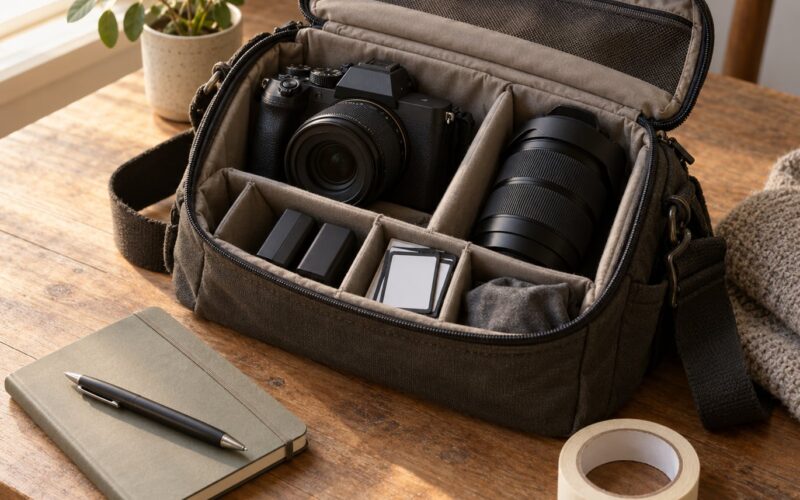
What You Need
A color palette for a portrait series needs less than people expect. No swatch book, no color theory textbook. What you need is a defined story and a way to hold on to it.
- A defined mood. Two or three words that describe how the series should feel to a viewer. “Quiet and close”, “hard summer light”, “clinical and formal”.
- Reference images. Three to five photographs whose color you actually like. Not aspirational ones, the ones where you’d happily print the palette.
- Notes on the location and its light. Where the light comes from, how warm it is, what surfaces bounce color back at your subject.
- Wardrobe or environmental color notes. What your subject is wearing and what is already painted, planted or lit in the background.
- One consistent editing method. The same software, the same camera profile, the same order of operations every time.
Keep all five in one place. A single page of notes is plenty, and the physical version works better than a folder on a laptop because you can carry it onto set.
Step-by-Step: How to Pick a Color Palette for a Portrait Series
1. Define the emotional direction of the color palette
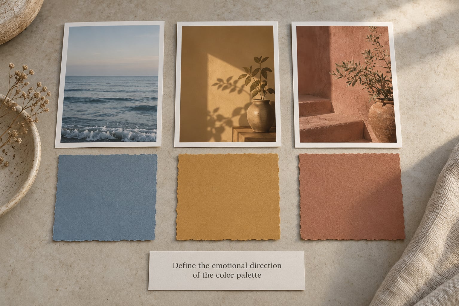
Turn the mood word into color qualities before you turn it into colors. “Quiet and close” tends to mean warm, low-contrast, soft-edged. “Hard summer light” means high contrast, cool shadows, one hot hue. “Observational” means muted and desaturated, close to earth tones.
Write down three qualities, not twelve colors. Warm or cool. Muted or saturated. High-key or low-key. Three lines are enough to steer every later choice, and they survive contact with a real shoot better than a list of five hex codes.
2. Look for colors already present in the story
Inventory what is already there before you add anything. Walk the location and list the surfaces: the wall tone, the floor, the wood, the window light color, the fabric of the chair your subject sits in. Then list the wardrobe colors, including shoes.
Most portraits already contain two usable colors without any effort. The trick is noticing them. Pull the palette straight out of the room when the room has a strong color identity, and use the grade to strengthen what is already working rather than to paint over it.
Where the room gives you nothing, take the palette from a reference image instead. Sample the two or three colors that repeat across your references, and write down their names in plain language. Use the eyedropper in your editor to pull approximate values from a single frame, then treat those as a starting direction, not a finished palette.
3. Give every color a job: dominant, supporting, accent
Every palette needs hierarchy, otherwise the frame reads as several colors arguing. Assign each color one job and one job only.
- Dominant carries most of the frame, usually the background or the dominant wardrobe piece.
- Support sits next to the dominant in a related or complementary relationship and keeps the eye moving.
- Accent is a small, sharper hit of color that repeats in small doses and ties the set together.
- Neutral anchor is skin tone and the whites and grays around it. This one is fixed; you work around it, not the reverse.
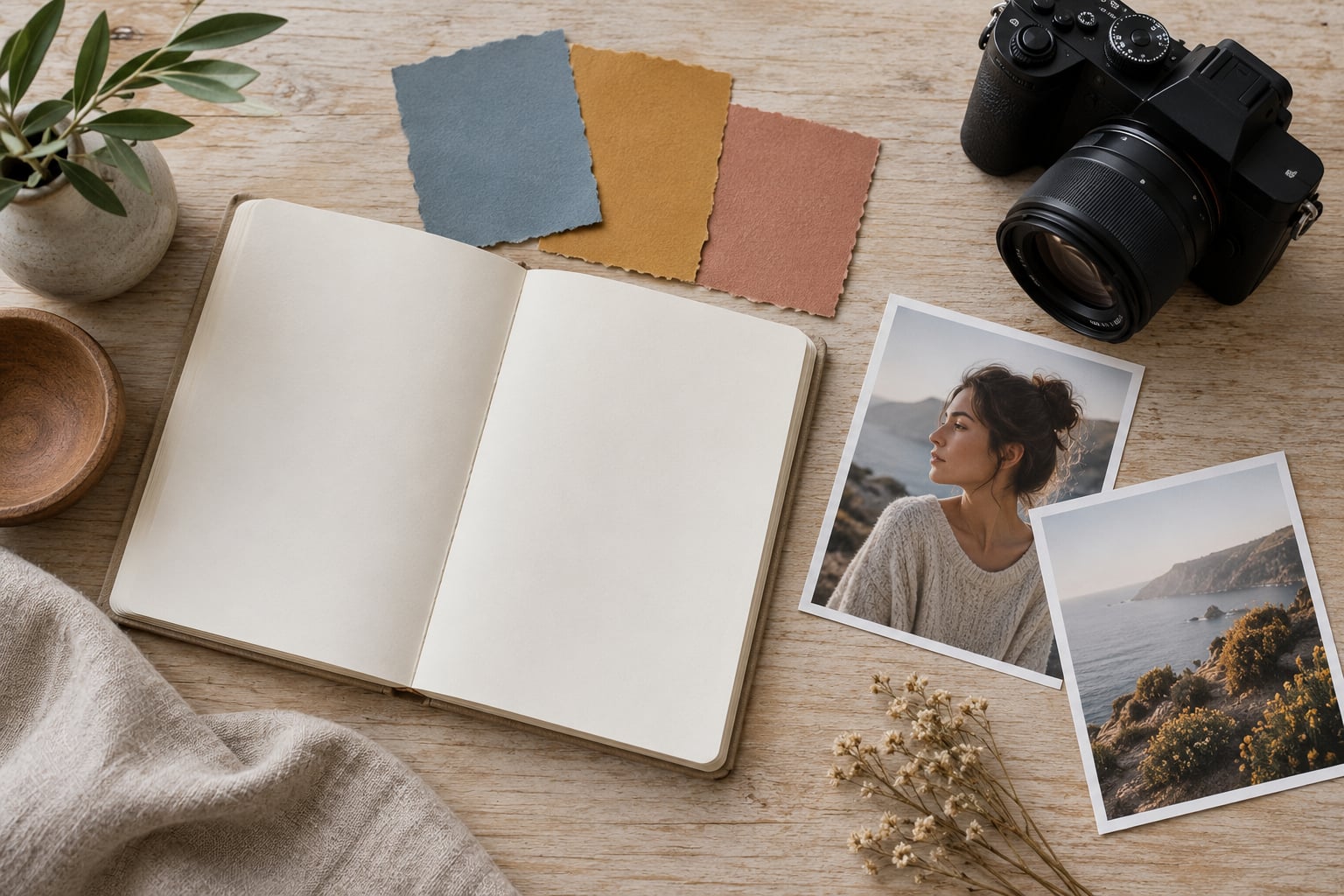
Three to five colors in total, including neutrals, is the workable range for a portrait series. Fewer and the set can drift because there is nothing to repeat; more and you are back to random color decisions every frame. A worked example: a muted sage dominant across the wall and the subject’s overshirt, a warm cream support in the chair and the window light, and a single rust accent on a book spine that appears in three or four frames and nowhere else.
4. Test the palette across lighting and locations
Color relationships shift because the light source changes the hue of every surface it lands on, and mixing sources creates a third color nobody chose. So test before you commit rather than after.
Make a small set of test frames in each light you plan to use: open shade, window light, direct sun, a tungsten practical against daylight. Shoot a gray card or color checker in the first frame of each set so you can correct to a known neutral later.
Look at the test frames in the order you will deliver them. If the warm and cool sets do not sit next to each other comfortably, either change the temperature on set or change the palette. Finding that out in five test frames is far cheaper than finding it out after a full session.
Set white balance from the reference frame rather than letting the camera decide. Auto white balance will neutralize the exact color you chose, which is precisely the thing you committed to.
5. Apply the palette without flattening the portraits
Applying the palette means choosing it deliberately in four places: wardrobe, set dressing, light, and grade. Wardrobe first, because it is the hardest to change once the subject arrives. Send a short list before the session rather than a mood word: two neutrals, one of your support color, nothing in a competing bright hue.
On set, control the light’s color temperature as part of the palette, not as a side effect. A quarter-strength CTO on a warm subject, a cool background gel for separation, or a magenta rim at low strength all give you color separation without extra lights.
In the grade, let skin stay skin. Push the palette into the background, the clothing and the shadows, and hold the midtone on the face close to neutral. When the palette overrides faces, people stop reading the portraits as portraits.
6. Create consistency while leaving room for variation
The risk with a palette is sameness. If every frame carries the identical saturation and contrast, the series turns into a set of variations on one portrait and the differences between people disappear.
Vary how much of the palette appears in each frame rather than how strong it is. A wide environmental frame can carry the full dominant color; a tight portrait can carry only the accent and the neutral anchor. Same palette, different share of frame.
Give your subject room to differ from the palette too. A person whose clothing fights the palette is not a failure to correct; it is often the frame that makes the set feel like real people rather than a color study.
Consistency in a series comes from repeating relationships, not repeating pixels. Keep the dominant hue, the temperature target and the accent color stable, and let hue intensity, crop and contrast move frame to frame.
Write your palette down as a short brief before the first edit: dominant hue, support hue, accent hue, neutral anchor, target white balance range, and one or two reference frames you trust. That brief is what you grade against instead of what you remember on delivery night.
For a series shot across several weeks, re-sync from your reference frame each session. New light and new gear will drift from the old setup, so open the two files side by side and match the background before you touch anything else.
7. Review the series as a whole
Cull before you grade. A tighter set is far easier to hold to one look, and choosing the final frames first keeps weak color out of the decision entirely.
Then grade as a set. Sync the selected frames, apply the same starting point to all of them, and paste your palette settings across the whole selection rather than moving frame by frame.
Finally, review the sequence the way a viewer sees it. Put the frames in delivery order at thumbnail size and look for rhythm, missing colors and any frame that jumps out. Most drift shows up as a single frame whose skin is greener or warmer than its neighbours.
Common Mistakes
Most palette problems are the same handful of errors, and each one has a specific fix.
Overusing one color. When a single hue fills most frames, the series turns monochrome without deciding to be, and faces lose separation from their surroundings. Fix: pull the dominant back to roughly half the frame in a few shots and let the support color take over.
Choosing colors only for decoration. A palette picked because it looks good on a screen but was never tested against the actual skin tone in the actual light will fight you in the edit. Fix: test every candidate set against a real frame of your subject before committing.
Matching everything. Wardrobe, background and light all landing on the same hue leaves nothing for the eye to hold onto. Fix: keep one clear step of separation between skin, clothing and background in every frame.
Ignoring skin tone. Skin is the one color in the frame you do not get to choose, and it is the color viewers notice drifting first. Fix: grade skin last, hold the orange luminance steady, and let the palette live in the background and shadows.
Changing the palette without a visual reason. Switching scheme halfway through a series because one frame looked better destroys the cohesion the rest of the set built. Fix: write the palette in the brief and treat changes as a decision requiring a reason you could defend.
Grading frame by frame. Small individual corrections compound, and by the fortieth image the set is three different looks stapled together. Fix: sync, apply one base look across the selection, and correct exceptions only where they are visible in the sequence.
Frequently Asked Questions
How many colors should a portrait palette have?
Three to five, including your neutrals. That is enough to give every color a role, small enough that you can repeat the relationships without hunting for each one in every frame. One dominant, one support, one accent and skin as the neutral anchor covers most portrait series. More colors than that and you are making a fresh color decision on every frame, which is how a set drifts.
What are the main color schemes I should know for portraits?
Four cover almost all portrait work. Analogous sits colors next to each other on the wheel for a calm, unified look. Complementary pairs opposite hues for real contrast. Split-complementary softens that with one step either side, which usually wears better on skin. Monochromatic uses shades, tints and tones of a single hue. Triadic uses three evenly spaced hues and is lively but harder to keep quiet across a whole series.
Can I shoot a portrait series in black and white?
Yes, and a monochromatic series is one of the easiest to keep consistent because you are not tracking hue at all. Decide early whether it is fully black and white or black and white with one accent color allowed through. Pick the accent during the shoot, not in the edit, and repeat it in the same role across frames so it reads as a deliberate choice rather than an accident.
What if my subject’s skin tone fights the palette?
Work around it rather than correcting it. Skin lives in a narrow orange-to-red band, so palettes built on greens, deep blues and violets sit far from it; warm neutrals, muted earth tones and soft blues usually sit closer. When the conflict is real, move the palette into the background and wardrobe, keep skin close to neutral, and let the contrast between them do the work.
How do I keep the same color grade across a whole shoot?
Set white balance from a gray card or reference frame instead of using auto, shoot RAW, sync your selects in the editor, then apply one base look across the whole set and correct only the frames that stand out in the sequence. Culling first makes this far easier, because a tighter selection has fewer color problems to solve. Keep your settings in a document or a preset so the next session starts from the same place.
Conclusion
Start with the emotional direction in three words, then inventory the colors already in the room, the wardrobe and the light. Pull one dominant, one support and one accent out of what you found, write them down, and shoot five test frames in the real light before committing to the full series. That is the whole answer to how to pick a color palette for a portrait series: decide early, test in the real light, and hold the relationships rather than the exact shades.
Once you have the frames, cull first, grade the set as one, and check the finished sequence at thumbnail size. That last step is where you find the single green frame everyone would have noticed anyway.