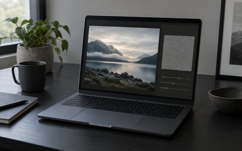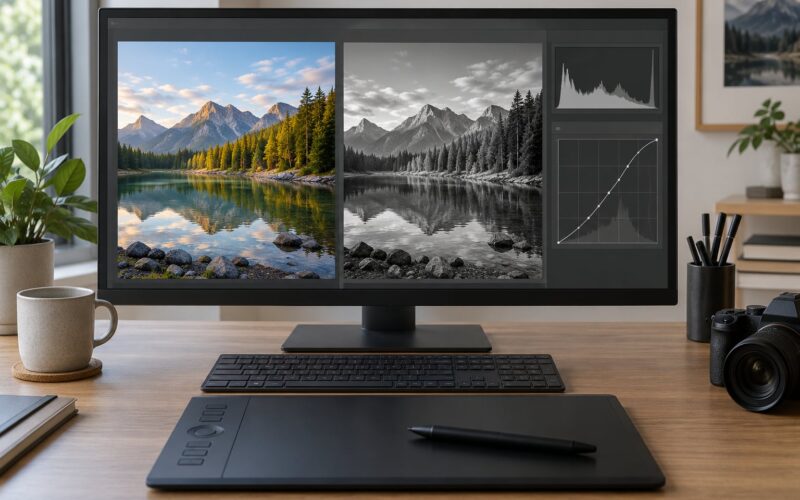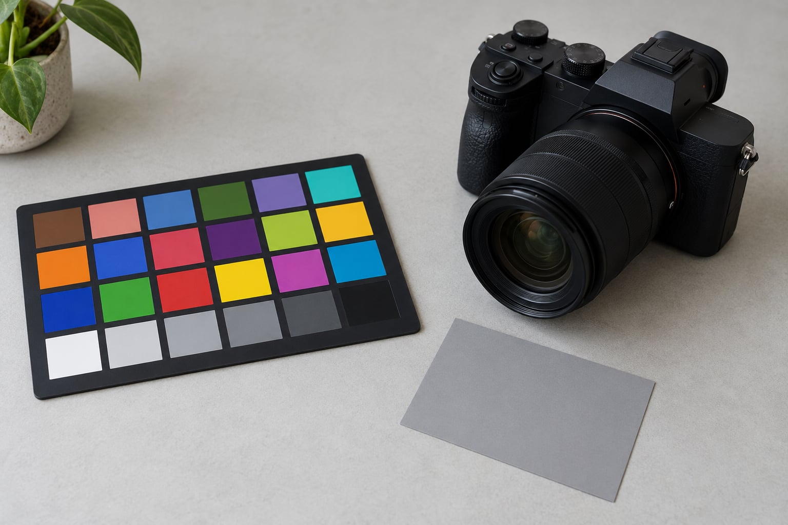
A color checker is a calibrated card of known color patches that you photograph in the same light as your subject, so your editing software can measure how your camera rendered those patches and build a custom camera profile from the difference. Learning how to use a color checker in editing is about ten minutes of setup and a repeatable step order: shoot the chart, start neutral, apply the profile, then check the patches before you touch a single skin tone slider.
The payoff shows up in the boring places. A batch of 400 e-commerce photos that all show the same blue. A portrait series where the bride’s skin does not turn green when you lift the exposure two stops. Skin tones that stay put while you move the tone curve around.
What a color checker cannot do is fix a photograph taken in the wrong light, or fix your judgment. It gives you a neutral starting point so the decisions you make afterward are choices, not repairs.
Table of Contents
- What You Need
- Step-by-Step: How to Use a Color Checker in Editing
- 1. Photograph the Color Checker in the Same Light
- 2. Set a Neutral Starting Point
- 3. Build or Select a Custom Camera Profile
- 4. Read the Patches to Check the Result
- 5. How to Use a Color Checker in Editing Across a Full Shoot
- 6. Make Local Adjustments for Skin and Color
- 7. Check the Result and Export Consistently
- Common Mistakes
- Frequently Asked Questions
- Conclusion
What You Need
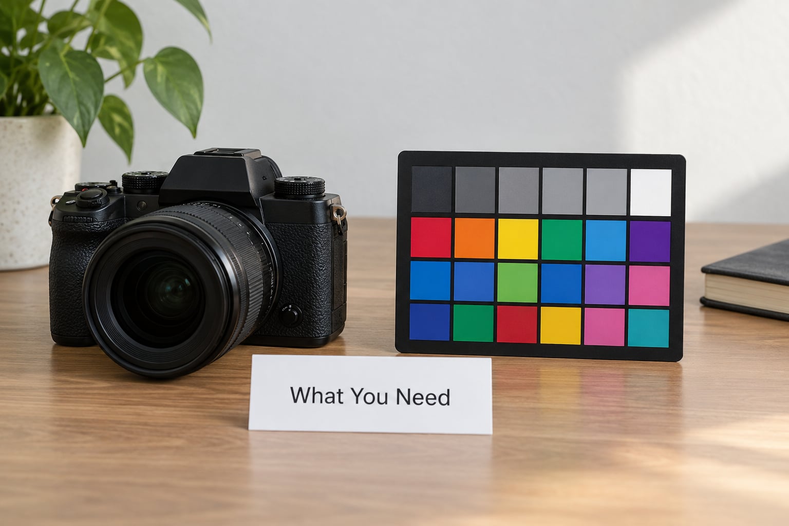
The card itself is the cheap part. What matters is the rest of the setup, because a color checker only works when the conditions around it are controlled.
- A color reference chart. A 24-patch chart in a rigid frame is the standard. A folding travel version works if you keep it flat and out of direct sun.
- A RAW-capable camera and lens. JPEG files have already had color decisions baked into them by the manufacturer.
- RAW editing software with profile creation built in. Lightroom and Adobe Camera Raw both read the chart directly.
- A calibrated monitor. An uncalibrated display will convince you the profile is wrong when it is fine. This is the step people skip and then spend an afternoon debugging.
- A neutral starting exposure. No picture style, no in-camera filters, no lens corrections baked into the file.
On the software side, set your working color space to a wide-gamut option such as ProPhoto RGB, ProPhoto is where you want the raw sensor data before the profile pulls it back into reality. Turn off any auto-tone or auto-optimize option your camera offers.
Give the camera and lens fifteen minutes in the room before the chart shot if you have just come in from outside. Condensation forming on the front element is a real thing in humid weather, and it will quietly tint every frame.
Why the same light matters: each patch was formulated to reflect light the way a real material does, and the camera records what bounced into the lens. Change the light between the chart and the subject and you have changed the variable the profile is trying to measure. The card is not a color key you paste in later, it is a photograph of your actual lighting.
Step-by-Step: How to Use a Color Checker in Editing
1. Photograph the Color Checker in the Same Light
Place the chart where your subject will be, not on a table ten feet away. Fill roughly 5 to 10 percent of the frame with it, keep it flat and parallel to the sensor plane, and turn it slightly if you need to kill a reflection.
Use manual focus, the lowest native ISO your camera has, and an aperture around f/8 so every patch is sharp. Expose for the highlights: if the white patch clips, you have thrown away the data the profiler needs most. Watch the histogram rather than the screen brightness.
Set white balance to the actual light, not auto. Auto white balance makes a different decision on every frame, which makes your reference shot useless as a reference. A preset tungsten or daylight setting, or a custom value from a meter, is fine.
How you know it worked: pull the file up in Camera Raw and look at the greyscale row. If any patch reads as warm or cool rather than neutral, the card is in different light than your subject, or a colored reflection is landing on it.
2. Set a Neutral Starting Point
Before any color correction, level the exposure and tone. Reset contrast, highlights, shadows, whites, blacks and clarity to zero if you have to. Pull exposure until the chart is well exposed, then leave it there.
Do not push saturation or dehaze to compensate for something you have not measured yet. A card shot under a warm tungsten head will look lifeless, and adding vibrance just moves the error further away.
How you know it worked: the grey patches sit at an even brightness from patch to patch, and the brightest grey is not touching the right edge of the histogram.
3. Build or Select a Custom Camera Profile
In Lightroom Classic, open the chart RAW file, switch to the Profile tab, and choose the built-in chart-reading tool, usually listed as something like Camera Profile Creation. The software detects the patches, compares them to their reference values, and generates a .dcp file that appears under Camera Profiles.
Name it properly, because you will have dozens. My convention is body, lens, light type, and Kelvin: R5_24-70_Strobes_5500K. Free-form names lead to the same mystery profile applied to the wrong shoot three months later.
Two habits save time. Keep the chart shots in a separate collection so they do not clutter the catalog with images you will never deliver, and rebuild a profile whenever the lighting setup changes rather than stretching an old one. A profile made under strobes is not a profile for open shade.
How you know it worked: the profile appears in the Profile browser with your name on it, and switching to it visibly changes the image while leaving the grey patches neutral.
4. Read the Patches to Check the Result
With the profile applied, go through the chart row by row. The natural tone row at the top should look like plausible natural things. The second row holds skin tone patches, and they are the fastest way to see if your portraits will match the chart.
The third row is where errors hide. Deeply saturated patches are unforgiving: a profile with a hue twist will show up here as a magenta or green lean in blues and cyans that is easy to miss on skin but obvious on a saturated product.
The greyscale row at the bottom runs from near-black to near-white in even steps. Any unevenness means either the profile is wrong or the shot was flawed.
How you know it worked: every grey patch reads as grey, the skin tone patches read as skin, and nothing in the primary row has a visible color cast.
5. How to Use a Color Checker in Editing Across a Full Shoot
Apply the profile as the first step on every frame from that lighting setup, then paste or copy the settings to the rest. In Lightroom, profile, white balance and tone sliders copy together when you paste settings with the Develop module selected.
That only works while the light holds. If you moved the subject across the room, opened a curtain, or the sun moved behind a cloud, the conditions are different and so should the profile be. Shoot a chart at each change and treat it like a lighting note.
For video, the same logic applies across a timeline. One chart shot per lighting condition, and each clip gets the profile matching the setup it was recorded under.
6. Make Local Adjustments for Skin and Color
With the overall balance right, local work becomes restrained. A soft brush at low opacity over a face can even out a patch of warmth. HSL is useful for pulling a single hue out of a background without touching everything else.
Leave skin alone if it already matches the chart’s skin tone patches. That comparison is the whole reason the chart exists: it tells you when to stop.
How you know it worked: step back from the monitor. Local adjustments that look right at 100 percent frequently look wrong across a whole contact sheet.
7. Check the Result and Export Consistently
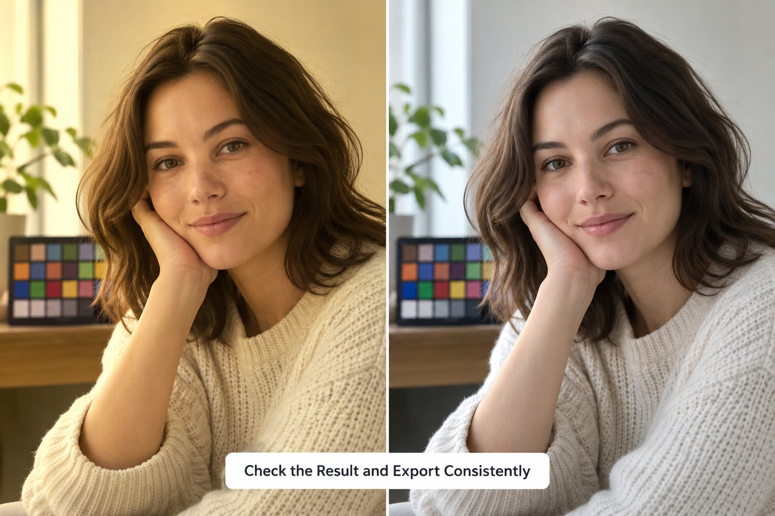
Do a final pass with the image side by side with the chart, then check the histogram for clipped channels. Soft clip the whites slightly rather than letting faces hit the ceiling.
Export from one place with one set of settings. A common setup is sRGB for web delivery, with the export sharpening and color space written down so a second editor reproduces the same result.
How you know it worked: the same export settings applied to a frame you have not touched produces a file that matches the rest of the series.
Common Mistakes
Almost every bad color checker result comes from one of these. They are worth reading through before a client shoot rather than after.
- Chart in different light than the subject. The profile then describes a lighting condition you are not shooting. Fix: place the card in the subject’s position and shoot it there.
- Angles that catch glare. A specular reflection across the grey row corrupts the read and the profile fails quietly. Fix: tilt the card slightly and check the histogram.
- Card too small in frame. Under about 5 percent of the frame, patch detection gets unreliable. Fix: fill more of the frame or move closer.
- Clipped highlights on the white patch. You lose the brightest reference value. Fix: expose for the highlights and confirm nothing is pinned.
- A faded or fingerprinted chart. A degraded chart is worse than no chart, because it produces confident wrong answers. Fix: handle the edges only, store away from sunlight, and replace a chart every few years.
- Applying two profiles at once. A stock profile plus a custom profile double-corrects and shifts everything warm or flat. Fix: set Profile back to Adobe Neutral or Standard before applying yours.
- Judging color on an uncalibrated screen. You will blame the profile for your display. Fix: calibrate the monitor first, in the ambient light you actually work in.
One more habit pays off: after building a profile, look at a saturated patch before you accept it. Skin tones forgive small errors. A blue product does not.
Frequently Asked Questions
How do I use a color checker in Lightroom?
In Lightroom Classic, open the chart RAW file and go to the Profile tab in the Develop module. Choose the built-in camera profile creation tool, let it detect the patches, and give the result a descriptive name. To apply it, select that profile for every frame shot under the same light, then copy and paste the settings across the rest of the set.
How do I use a ColorChecker in Photoshop?
Open the chart as a RAW file through the Camera Raw filter, then use the Profile panel in the Detail section to create a custom profile from the patches. For a quick white balance correction without building a profile, use the white balance eyedropper directly on the middle grey patch in the greyscale row, which sets a custom temperature and tint in one click.
How do I use a color checker in DaVinci Resolve?
Shoot a chart frame under each lighting setup, then in Resolve use a color managed workflow and apply an input transform matched to that setup so the chart frame and your footage are decoded the same way. Shoot the chart on a tripod at the start of each setup and record a slate with the light type and Kelvin. For grading, use the vectorscope and waveform to confirm the patch positions land where the chart says they should.
Should I use a color checker or a grey card?
A grey card is for white balance only and it is faster when that is all you need. A color checker gives you white balance plus a full color correction, which matters for product work, skin tones, and video camera matching. If you are correcting white balance on a single JPEG-heavy shoot, the grey card wins on speed. If color accuracy is the deliverable, use the chart.
Can one color checker shot correct an entire photo set?
Only while the lighting stays the same. One chart shot per lighting condition is the practical rule, and if the light changes during the shoot, shoot the chart again. Keeping the chart frames in a separate Lightroom collection makes them easy to find later. Rebuild the profile rather than reusing an old one when the setup changes, since a stale profile describes conditions you are no longer shooting.
Do I need to shoot RAW, and should I set white balance to auto?
Shoot RAW, because JPEG files already contain the manufacturer color decisions you are trying to correct, and there is no recoverable detail in them. Avoid auto white balance on the chart frame, since it makes a different decision on every shot and your reference stops being a reference. Set it manually to the actual light, or use a custom value from a light meter.
Conclusion
Start with the chart shot, not the software. Put the card where the subject will be, expose for the highlights, keep it flat and glare-free, and set white balance manually. That frame is the only thing standing between your camera’s color rendering and a correction you can trust.
Then apply the smallest correction that gets neutral whites and believable skin. A color checker gives you ground truth, not a decision. Once the greyscale row reads as grey and the skin tone patches match your subject, stop adjusting global color and move on to the part only you can do.