Converting color photos to black and white properly comes down to one thing: mapping each color to the gray tone your eye would perceive, instead of just draining the color out. Dragging the saturation slider to zero gives you a flat, lifeless image because it weighs red, green and blue equally at 33 percent each, while human vision leans far more heavily on green. A dedicated monochrome conversion with adjustable channel weights, followed by tonal and local refinement, takes about ten minutes per frame and gives you full control over the result.
The rest of this guide walks through that workflow step by step, with the exact menu paths for Photoshop, Lightroom Classic and the free alternatives, plus the mistakes that flatten most first attempts.
Table of Contents
- What You Need
- Step-by-Step: How to Convert Color Photos to Black and White
- 1. Duplicate the File and Open a Non-Destructive Copy
- 2. Convert the Image With a Black-and-White Adjustment
- 3. Set the Overall Tone With the Channel Mixer
- 4. Adjust Contrast Without Losing Shadow or Highlight Detail
- 5. Add Local Adjustments for Texture and Separation
- 6. Sharpen Carefully and Check at Several Sizes
- 7. Export in the Correct Format
- Common Mistakes
- Frequently Asked Questions
What You Need
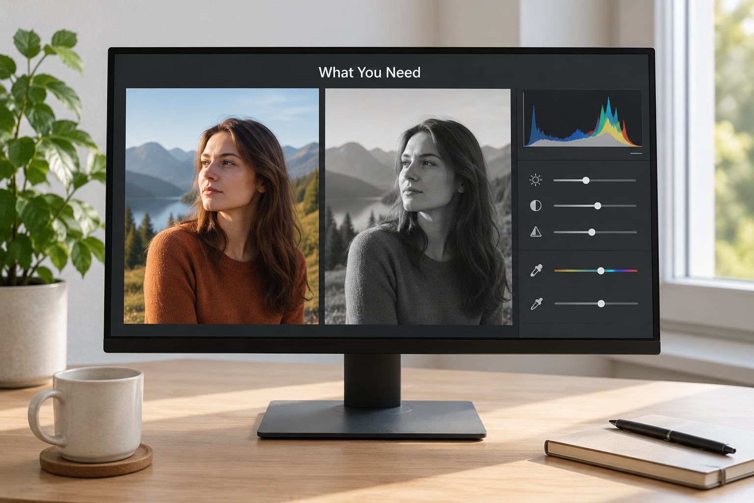
Any editor that exposes the individual red, green and blue channels will do the job. Photoshop and Lightroom Classic both have a black-and-white mix tool built in. GIMP, RawTherapee and Darktable all expose a channel mixer too, so a free setup loses you nothing except the polish of Adobe’s sliders.
Start with the best color file you have, usually a RAW original, because the conversion pulls detail out of the color channels that a compressed JPEG has already thrown away. RAW also keeps the bit depth higher, which matters when you push contrast in the shadows.
A histogram panel is worth having open the whole way through. It tells you in a glance whether you have clipped highlights or crushed blacks, which is how most converted images end up looking harsh.
Work non-destructively from the start. Duplicate the file before you touch anything, or build the whole conversion on adjustment layers so nothing is baked in.
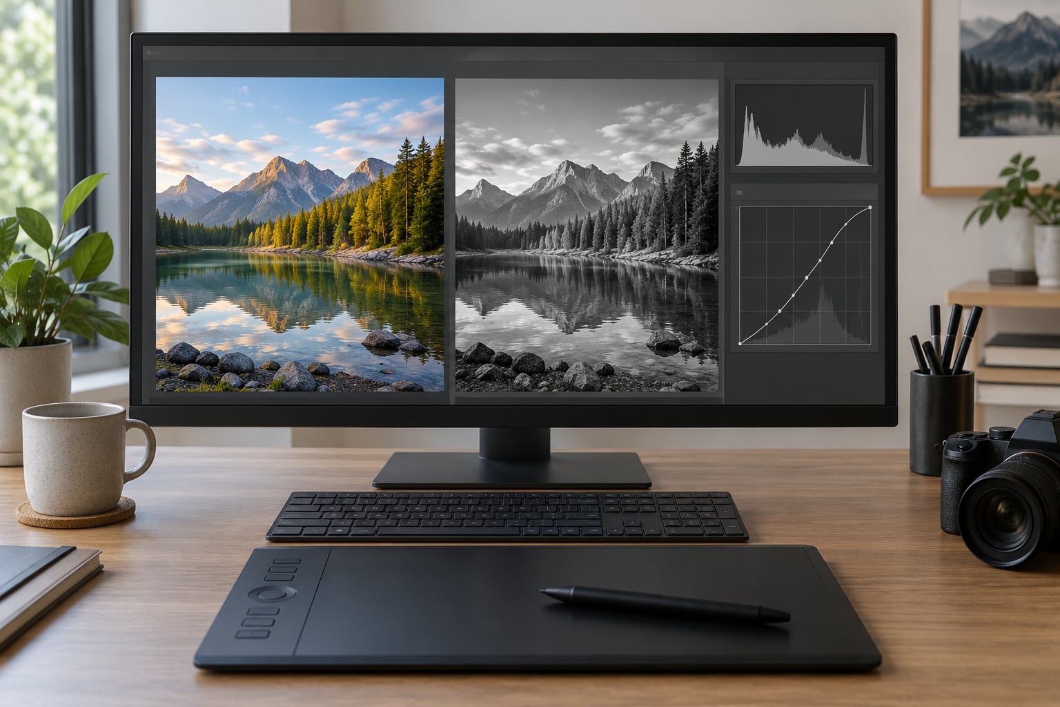
One optional extra: a second monitor or a tablet held next to your screen makes side-by-side judging of tonal separation much easier than squinting at a single small preview.
Step-by-Step: How to Convert Color Photos to Black and White
The goal is control over tone, contrast and local detail, not the absence of color. Each step below adjusts one of those, and you can always go back to a previous stage because nothing is destructive.
1. Duplicate the File and Open a Non-Destructive Copy
In Photoshop, use Image > Duplicate or work on a copy placed as a Smart Object. In Lightroom Classic, the Develop module is already non-destructive, so simply make sure the file is a RAW original and never a flattened export.
How to tell it worked: close the original and reopen it. If it is untouched, your source is safe. This matters more than it sounds, because the temptation to re-edit the master file is strong, and a baked-in conversion cannot be re-tuned when you change your mind about the weights.
2. Convert the Image With a Black-and-White Adjustment
Open the black-and-white adjustment and tick the monochrome option. In Photoshop that is Image > Adjustments > Black & White, which adds a Black & White adjustment layer and opens a panel of six colored sliders plus a tint control. In Lightroom Classic, switch the Color panel to the B&W tab. GIMP and Darktable label the equivalent mixer channel settings.
The conversion happens immediately, which tells you nothing yet. What it tells you is that the image now responds to six controls instead of one, and those controls are where the real work happens.
Do not reach for Image > Mode > Grayscale on the master file. It flattens the color information permanently, gives you a single fixed weighting, and throws away every option you are about to want.
3. Set the Overall Tone With the Channel Mixer
The six sliders control how strongly reds, yellows, greens, cyans, blues and magentas contribute to the final gray. Red, yellow and green adjustments are the ones you will touch constantly; cyan, blue and magenta mostly matter for skies and water.
Here is the reasoning behind the default weights, and it explains why desaturation fails. Desaturation averages the three channels at roughly 33 percent each. Perceptual luminance weights them at about 30 percent red, 59 percent green and 11 percent blue, and in sRGB the imbalance is starker still at roughly 21, 72 and 7. That is why a desaturated portrait looks dull: skin sits mostly in the red channel, and red is being under-weighted while blue, which is noisy and visually heavy, gets a third of the image.
For portraits, pull red up and green slightly up, and drop blue hard, typically to 5 or 10. Skin brightens, the background falls away, and the blue channel noise drops with it. For landscapes with sky, push blue and cyan up so the sky reads as a clean bright tone rather than a muddy gray, and accept some noise in exchange.
Foliage responds to the opposite treatment: lift greens and yellows to separate leaves from the background, and pull the blues down so shadowed vegetation goes dark instead of gray.
Watch the histogram as you move the sliders. If pushing reds starts clipping skin to pure white, back off until the histogram settles just short of the right edge.
4. Adjust Contrast Without Losing Shadow or Highlight Detail
Add a Curves or Levels adjustment above the black-and-white layer. In Curves, set the black point so the deepest shadow lands just above zero rather than at zero; a fraction of a percent of separation between the darkest and lightest pixel is what keeps the image from looking printed and flat.
Set the white point where the brightest highlight is dense but not solid. A gentle S-curve, with maybe a ten percent midpoint lift, adds contrast without touching the endpoints, which is safer than dragging the black and white handles inward and losing detail in both.
How to tell it worked: look at the histogram. It should span nearly the full width with a small gap at each end, and it should not be touching either edge. Also check the deepest shadows at full size; converted images often look fine zoomed out and blocked up when you inspect them at 100 percent.
5. Add Local Adjustments for Texture and Separation
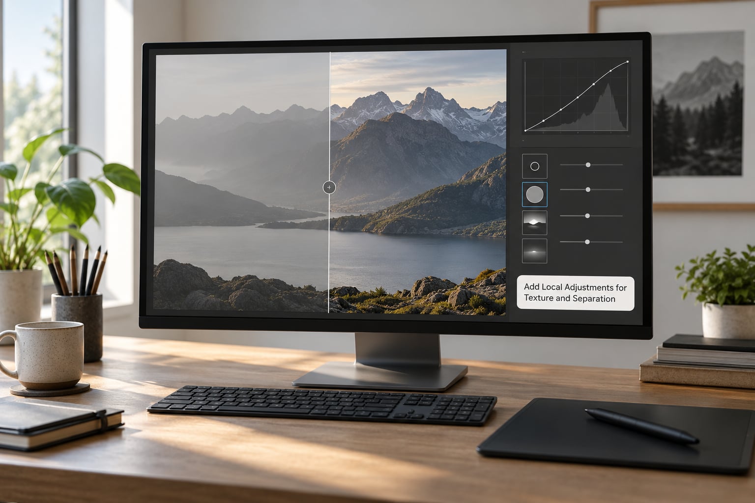
Global adjustments get the overall tone right, but texture lives in local work. Dodge the areas the light would naturally hit, burn the ones it would fall away from, and use a soft brush on a duplicate layer at low opacity so you can build density gradually instead of in one pass.
For texture, the classic move is high-pass sharpening: duplicate the image, apply Filter > Other > High Pass at a radius around one to two pixels, then set that layer to Overlay or Soft Light at reduced opacity. That adds micro-contrast and makes gravel, brick, fabric and hair read without the crunchy edges that global sharpening produces.
Mask your local work. Paint the dodge and burn layers on black masks and reveal only the areas you want, keeping the brushes large and soft at the edges so no transition is visible.
Split-screen views are worth the setup time here. Put the original color version beside the conversion at the same zoom and check that the structure still reads: if a face has lost its nose or a building has merged into the sky, the local work has gone too far.
6. Sharpen Carefully and Check at Several Sizes
Converted images are usually sharper than they should be, because the tonal contrast between channels is high and the eye reads detail more aggressively in monochrome. Sharpen lightly, and scale the amount to the final output size rather than the pixel dimensions.
A reasonable rule: for an image displayed at half its native size, use an unsharp mask radius near one pixel; at full size, use about half a pixel. Then view it at 100 percent and zoom out to check for halos around high-contrast edges, which appear as bright fringes on skin against a dark background.
Check the result at three sizes: full screen, the thumbnail size it will appear at in a grid, and the actual print or display size. A grain pattern that looks like texture at full size often turns into visible noise at thumbnail size.
7. Export in the Correct Format
Keep the layered working file as PSD, TIFF or your editor’s native format. That is the only version you can re-tune later, and it costs little to keep.
For delivery, export as JPEG at quality 90 to 100 for web and social use, where smaller files matter more than the last few tonal steps. For large prints, export 16-bit TIFF in Adobe RGB or ProPhoto RGB and let the printer handle the profile conversion, or embed the specific profile they supply.
For offset printing, ask for a dot gain profile, usually 20 percent, and convert to that profile when you flatten. Grayscale separations printed this way hold their shadow detail far better than untagged files.
In Lightroom Classic, the same idea applies to soft proofing: check the conversion against the paper profile before you commit to the export.
Common Mistakes
Lowering saturation instead of using a conversion tool. This is the big one. Fix: undo it, add a black-and-white adjustment layer with the monochrome option enabled, and start from the channel sliders instead.
Using identical settings on every frame. A skin-tone weighting that flatters one portrait will make the next one gray and lifeless. Fix: treat the six sliders as the starting point for each image, and adjust from there every time.
Leaving blue high in dark images. The blue channel is the noisiest of the three, and any low-light or high-ISO shot will show it in the shadows as grain once it is mixed in. Fix: drop blue toward 5 to 15 in dim scenes and clean up what remains with luminance noise reduction rather than global noise reduction, which smears texture.
Crushing the tones. Pushing both curve handles to the edges produces a graphic poster look with no gradation in between. Fix: keep a small gap at each end of the histogram, especially in skies and skin.
Over-sharpening to fake contrast. High amounts of unsharp mask on a monochrome image create halos and crunchy texture. Fix: add depth with curves and local dodge and burn, then sharpen gently at the end.
Skipping the grayscale preview. Your monitor shows the conversion with a color cast from the screen and the ambient light. Fix: view the image in a grayscale-proof mode where the display itself is neutral, which reveals any leftover tint immediately.
Two more worth knowing. Convert the file before you do heavy color grading, not after, because the channel weights only make sense on a reasonably balanced color image. And on iPhone, the native black-and-white filter gives you a quick result but no channel control at all; for anything you care about, transfer the original to an editor that exposes the sliders.
Frequently Asked Questions
How can I convert colors to grayscale?
Open a black-and-white conversion tool rather than the saturation slider. In Photoshop use Image Adjustments Black and White and tick the monochrome option; in Lightroom Classic switch the Color panel to the B and W tab. Set red, yellow and green sliders according to your subject, then add a Curves adjustment for contrast. On iPhone, open Photos, tap Edit, then Filters and pick the monochrome filter, though it offers no channel control.
How do I convert a photo on my iPhone to black and white?
Open the photo in Photos, tap Edit in the top right, then choose Filters and scroll to the monochrome option, tapping it to apply. To adjust intensity, drag the intensity slider at the bottom of the filter screen. For finer control, use a third-party app with a real channel mixer, or send the photo to an editor on a computer. The built-in filter is fast and fine for quick posts.
When should you convert a photo to black and white?
Convert when the subject relies on shape, texture, gesture or light rather than on color, and when the color version is already well balanced. Keep it in color when color carries meaning, such as a flag, autumn leaves or a product whose color defines it. Shooting in color and converting later gives you far more control than using an in-camera monochrome mode, so leave RAW files in color unless you have a reason not to.
Why does desaturation look so bad compared to a proper grayscale conversion?
Saturation to zero averages red, green and blue at roughly 33 percent each. Human vision weights them about 30 percent red, 59 percent green and 11 percent blue, and sRGB is even more skewed toward green. Because skin tone lives mostly in the red channel, desaturation under-brightens faces while giving the noisy blue channel a third of the image. Adjustable channel weights fix both problems.
Should black and white photos be sharpened differently than color photos?
Usually yes, and always a little less. Converted images read as sharper because tonal contrast between channels is high, so use a smaller radius than you would in color, roughly half a pixel at full size. Scale it to the output size, not the file dimensions. Global sharpening in monochrome also creates halos more visibly, so prefer high-pass sharpening on a masked layer for texture instead.
Start by duplicating your file, adding a black-and-white adjustment layer with the monochrome option on, and setting red up and blue down. Those three moves take about a minute and already put most of the distance between a flat desaturation and a photograph that holds up. Everything after that is refinement.