To add grain to digital photos, build a monochrome noise layer, blend it over the image in Soft Light or Overlay, then pull the amount down until the texture only shows up when you look for it. In Photoshop or Lightroom that takes about two minutes. On a phone it takes thirty seconds in Snapseed or Lightroom Mobile. The hard part isn’t adding grain, it’s stopping before the picture reads as noisy.
Grain is one of those effects that looks like a slider problem and is actually a restraint problem. The settings that look right at 100 percent often fall apart at phone size, and the settings that look right on screen can look gritty in print. Everything below is built around that: a repeatable workflow you can dial back, plus the judgment calls that decide whether the result looks like film or like a bad export.
What You Need
Almost nothing. If you can duplicate a layer and change a blend mode, you already have everything the effect requires. Here’s what the setup looks like.
- A layer-based editor. Photoshop is the obvious choice, and Affinity Photo and Photopea (free, in the browser) work nearly identically. GIMP can do it too, with a little more clicking.
- Lightroom or Camera Raw, either standalone or via the Filter menu in Photoshop. This is the fastest route for a natural result because the grain sliders are built for photos.
- A mobile editor if you’re working on a phone. Snapseed has a dedicated Grainy Film filter, Lightroom Mobile has the same three grain sliders as desktop, and VSCO does it with presets.
- Optional grain overlay textures. Scanned film grain or high-resolution noise images. Useful when you want a specific stock’s structure, but the built-in noise filters get you most of the way.
One habit matters more than any tool: work non-destructively. Convert the background to a smart object or keep the grain on its own layer, so you can always dial it back to zero. Film photographers get one shot. You get a slider.
Step-by-Step: How to Add Grain to Digital Photos
Step 1: Choose the Right Image and Editing Layer
Finish the essential edits first: exposure, white balance, contrast, any crop. Grain sits on top of those decisions, so adding it early just means redoing the work twice.
Then duplicate your background layer and convert the copy to a smart object (Layer, then Convert to Smart Object). The smart object keeps the filter re-editable later. If you’re using Camera Raw, skip all of this: the whole Grain panel is non-destructive by design.
How do you know it’s set up right? Toggle the grain on and off with the eye icon and nothing else should change. No softening, no color shift, no scaling. If something else moves, a filter is applied to the wrong layer.
Step 2: Add a Subtle Noise or Grain Layer
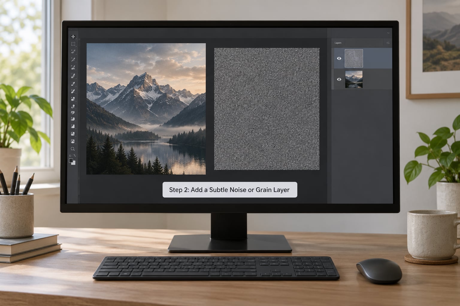
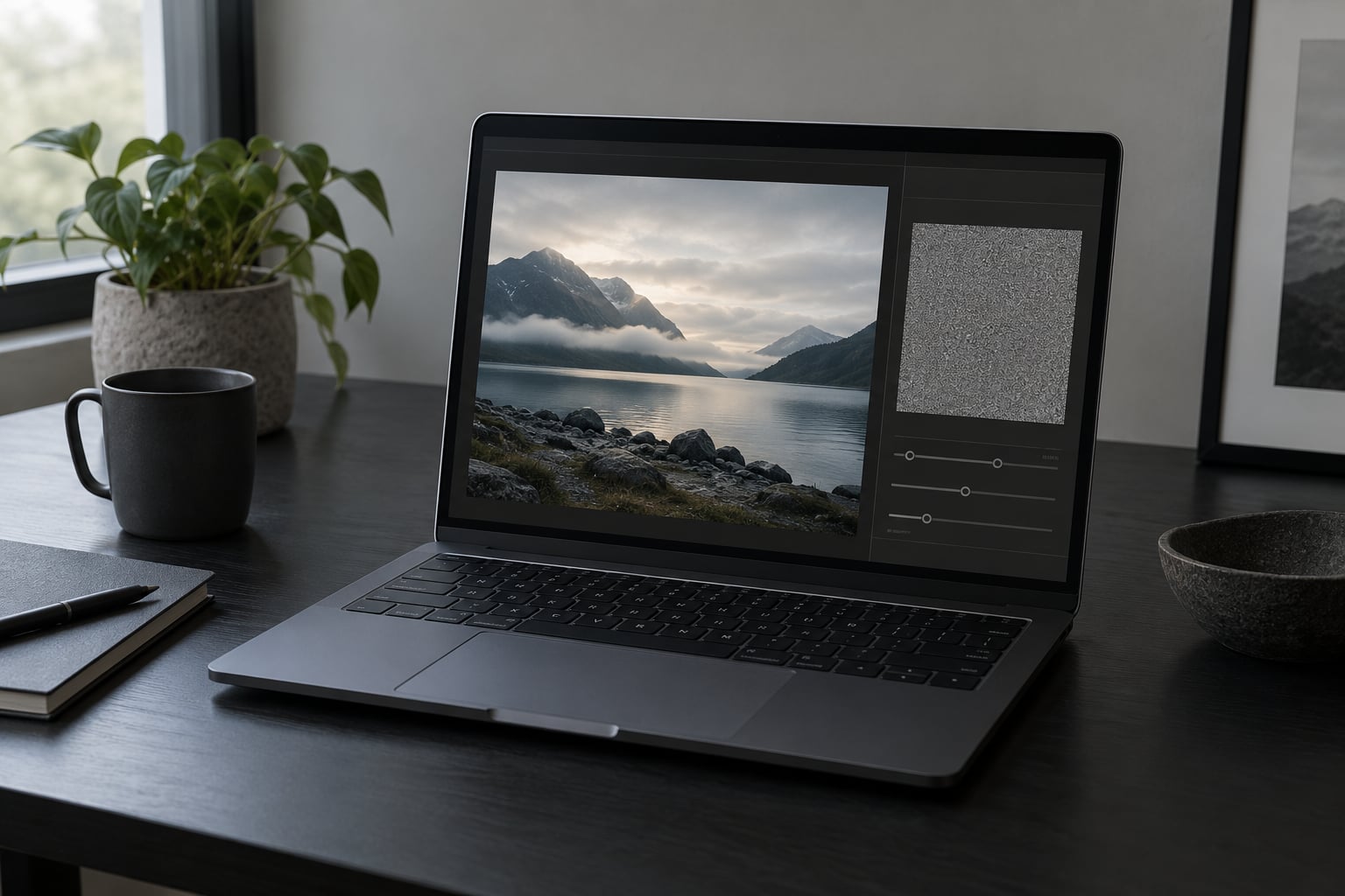
In Photoshop there are two good routes. The first is Filter, Noise, Add Noise on the duplicated layer. Set Amount to roughly 1 percent, check Monochromatic, set Uniform to around 40 percent, and leave Gaussian distribution on. Monochromatic matters more than any other setting here, because color noise looks like a broken sensor rather than film emulsion.
The second route is Filter, Camera Raw Filter, then the Effects panel, where Grain sits next to Texture and Vignette. Same result, but with three dedicated sliders instead of two numbers, and it works on layers.
Set the layer blend mode to Soft Light first. It’s the gentler of the two standard options: Overlay gives you more bite and more risk of blowing out highlights, while Soft Light keeps the grain sitting under the image’s tonal range. Multiply works if your photo is very contrasty and you only want grain in the shadows.
Step 3: Set the Grain Scale, Opacity, and Contrast
Three numbers do most of the work. Size controls how big the grain clumps are, roughly matching the film speed you’re imitating. Amount is the overall strength. Roughness spreads the grain from uniform dots to irregular clumps, and higher roughness looks more like real emulsion.
Low grain size with high amount gives that crunchy, over-sharpened look that gives the effect away. Real film grain is fine and irregular. If you want Tri-X, keep Size around 30 to 40 with Roughness pushed past 50. For a softer Portra feel, drop Size to 20 or 25 and pull Roughness back.
| Photo style | Amount | Size | Roughness |
|---|---|---|---|
| Portraits | 10 to 25 | 20 to 30 | 40 to 50 |
| Black and white | 30 to 50 | 30 to 40 | 50 to 60 |
| Street and night | 25 to 40 | 40 to 50 | 50 to 70 |
| Scenic and nature | 15 to 30 | 25 to 35 | 40 to 50 |
Those are starting points, not answers. The real test is the one in the next section: look at the photo at normal viewing size, not zoomed to 100 percent. Grain that survives a zoom will fall apart on an Instagram grid.
Step 4: Mask the Grain for a Natural Result
This is where a mediocre grain layer becomes a convincing one. Add a layer mask to the grain layer with the image selected, which fills the mask white and lets grain show everywhere. Paint black on the mask to pull it back.
The three areas worth protecting are faces, highlights, and hard edges. Skin should stay smooth enough that pores don’t read as noise, blown highlights turn blotchy the moment grain lands on them, and crisp edges like eyelashes or window frames get a fuzzy halo under too much texture.
Then bias the grain toward the shadows, which is what film does naturally. Hold Alt (Option on Mac) while dragging the mask’s Levels or Curves, or just paint a soft gradient: grain heavy at the bottom of the frame, fading to nothing in the sky. That one adjustment does more for a cinematic look than raising the overall amount.
Photoshop’s new Grain adjustment layer takes this further. Set Intensity low, check the Roughness and Size boxes, then drag the Highlight slider hard to the right. It protects highlights automatically, which saves a lot of masking on skies and windows.
Step 5: Apply Color, Sharpening, and Finishing Adjustments
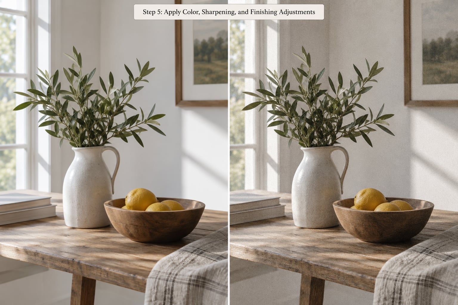
Order matters here. Grain goes after sharpening, not before. Sharpening amplifies high-frequency detail, and grain is high-frequency detail, so grain added first gets chewed up and pushed into visible clumps. Sharpen, then add grain, then stop.
For color, lower the grain layer’s opacity to around 15 to 30 percent and drop Saturation slightly on that layer alone. Grain and color grade well together because a slightly desaturated grain texture reads as emulsion rather than as a digital overlay. Keep the sharpening mask low, maybe 15 percent, and use high-frequency sharpening if your editor has it so the grain survives it.
Two checks before you export. View at 100 percent to confirm no clumping or color fringing, then shrink the image to fit the screen and look again at normal size. If the grain disappears entirely, it’s too weak; if you can see it without hunting for it, it’s too strong. Most of the time the right answer sits at the point where you notice grain on a second look.
If you’re printing, push the amount up slightly. Ink dots and paper texture compete with fine grain, and a print usually needs 20 to 30 percent more than the screen version to read the same way.
Common Mistakes
Grain goes wrong in predictable ways. Each of these has a quick fix, and the symptom tells you which one you hit.
Too much, too fast. If the slider goes past 40 without you checking the image at normal size, you overshot. Halve the amount and look again. Film grain should be something you notice on the second glance.
Oversized noise. Big blobs are the most common giveaway of a digital effect. Drop Size until the texture is finer than you think it should be, then raise Roughness so it stays irregular.
Color noise. Speckled red and green dots mean Monochromatic was left unchecked in Add Noise, or you’re on a color overlay. A single-channel grain layer always looks more like film.
No masking at all. Grain across every pixel flattens depth and destroys skin texture. At minimum, mask it off faces and highlights.
Grain before sharpening. The sharpening pass amplifies the grain into crunchy clumps. Move the grain layer above your sharpening layer and the problem disappears.
A repeating pattern from an overlay. Tiled grain textures show obvious seams at high opacity. If you use one, keep it below 20 percent opacity, set it to a large scale, and place it as a smart object so you can nudge its position per image.
Using it on the wrong job. Grain is an aesthetic choice, not an improvement. Product shots, real estate, medical, and legal documentation should stay clean, since texture can read as an imperfection or a compression artifact.
| Film grain | Digital noise | |
|---|---|---|
| Source | Added deliberately in editing | Sensor artifact from high ISO |
| Appearance | Irregular, monochrome, even across the frame | Colored, blotchy, heavier in shadows |
| Pattern | Random each time | Fixed once the file exists |
| Purpose | Texture and mood | A flaw you manage, not keep |
The last row is the one people get wrong. Grain that helps hide real high-ISO noise works because it disguises the random pattern that makes noise read as damage. Grain that sits on top of clean, low-ISO detail is purely a stylistic choice, and it has to earn its place on composition alone.
Frequently Asked Questions
How much grain should I add to a digital photo?
For most portraits, an amount of 10 to 25 is enough. Black and white and night work can take 30 to 50, but check the result at normal viewing size rather than zoomed in. Grain that jumps out at 100 percent will look heavy on a phone screen. Start low, add 5 points at a time, and stop when you can see it without hunting for it.
Should I add grain before or after sharpening?
Add grain after sharpening, always. Sharpening boosts high-frequency detail, and grain is high-frequency detail, so grain applied first gets amplified into crunchy clumps that look digital. Sharpen first with a low mask value, then add the grain layer on top. If your editor has high-frequency sharpening, use it so grain survives the pass more cleanly.
Can I add grain to iPhone photos?
Yes, and it’s quick. Lightroom Mobile has the same Amount, Size, and Roughness sliders as desktop. Snapseed’s Grainy Film filter does it in a single tap, with strength and style controls. VSCO handles it through presets, though you get less control over the result. All three export full-resolution files, so nothing is lost compared with editing on a computer.
What is the difference between film grain and digital noise?
Digital noise is a sensor artifact that appears when you shoot at a high ISO. It’s uneven across the frame, carries color, and reduces quality. Film grain is added deliberately in software, is monochrome, and is roughly consistent everywhere. Adding grain can disguise noise because it breaks up the random pattern, but grain on its own is a style choice, not a technical fix.
How do I add grain to a black and white photo?
Black and white tolerates and usually rewards more grain than color work, because there’s no color channel for noise to distort. Start around 30 to 50 with Size near 35 and Roughness above 50. Higher roughness matters more than usual here, since grain this visible needs irregularity to look like emulsion instead of a screen door. Bump it until the texture reads as film, then pull back if shadows start closing up.
How do I keep grain consistent across a whole shoot?
Set the grain once as a preset and apply it to every image in the set. In Lightroom, mark the edited photo, right-click it, and choose Create Preset with the Develop settings checked, then sync it across the shoot. One caveat worth knowing: Lightroom’s grain pattern is identical in every export, so identical settings still produce an identical texture from frame to frame.
Conclusion
Start with a monochrome noise layer at low opacity, blended in Soft Light, and check the photo at normal size before you add anything else. Then mask it off faces and highlights, push a little extra into the shadows, and export. Once you’ve done it two or three times on the same image, the amount that looked right will start looking heavy. Trust that first instinct, and go back down.