The short version of how to watermark photos without ruining them: keep one clean master untouched, work on a duplicate, and apply a small mark at roughly 2% of the image width in a corner or along an edge at 30 to 50% opacity. Ten minutes of setup, and you can repeat it forever.
A watermark that works stays legible but stops competing with the photograph. Most of what makes a watermark look cheap is not the software, it is a mark that is too large, too opaque, or sitting right on top of the subject. Get those three decisions right and the rest is mechanical.
The advice below follows how editors actually think: finish the picture first, place the mark where the composition has room for it, and test it at the smallest size anyone will see it. Current versions of Photoshop, Lightroom and the phone apps all do the same job here, so this guide stays tool-agnostic and works whichever one you own.
What You Need
Four things. Everything else is optional.
- An image editor. Photoshop or Lightroom if you shoot professionally, Canva or a phone app if you do not. Any of them can place a semi-transparent layer.
- The final photograph. Not the raw file. Edit to completion first, then duplicate.
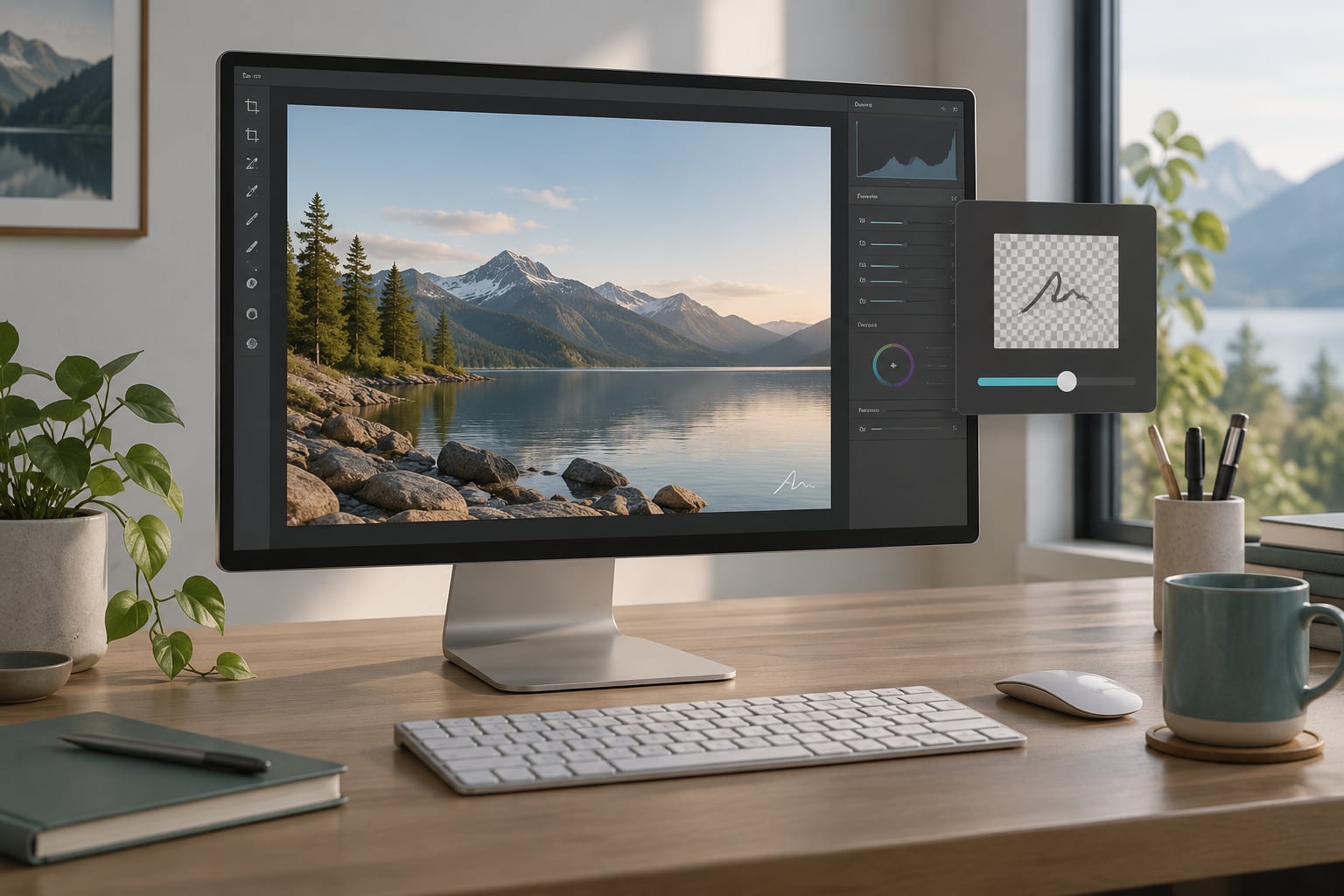
- A mark. Your name, a logo, or a signature graphic exported as a PNG with a transparent background.
- A decision about output. JPEG for sharing, PNG when transparency matters, and a high-resolution master that never gets a watermark on it.
Build the mark once and reuse it forever. A signature drawn at 150 pixels wide and saved as a 24-bit transparent PNG is enough; it scales cleanly to any size.
Step-by-Step
1. Prepare the final photograph
Finish every edit before the watermark goes on. Crop, dodge, colour-correct, sharpen — then save the master, flatten a copy for delivery, and watermark that copy. If you watermark first, you will be scaling and resizing a layer you may need to rebuild later.
How do you know it worked: the copy you are about to mark is visually identical to the master, and the master itself is still clean and untouched.
2. Choose a watermark that stays out of the way

A restrained mark beats a bold one almost every time. Use your name in a clean weight, or a simple logo, sized so the viewer registers it as a signature rather than a sticker. Avoid thin hairlines — at small sizes they disappear against texture, and what survives is a faint smudge.
Text marks scale better than logos across a whole gallery, because they stay legible on light, dark and busy backgrounds. Logos read better for product, architecture and interior work where the frame is usually calm.
3. Place it where it will not damage the image
Placement is the single biggest decision in how to watermark photos without ruining them. Look at the negative space first: skies, floors, dark clothing, plain walls. A mark in empty space costs the viewer nothing.
Corners and edges are the quiet default. A centre mark is the strongest deterrent because a crop removes it only by destroying the composition, but it crosses the frame and pulls the eye. Tiling is the most crop-resistant and the least tasteful — reserve it for galleries of work you sell as previews.
For formats that get cropped — social feed previews in particular — keep the mark within the central square of the frame. Anything in the outer margin is a candidate for trimming.
4. Adjust size, opacity, and contrast
Start with numbers instead of fiddling. A corner mark at about 2% of the image width is a good default; a centred or diagonal mark can run 6 to 10% because it is read as texture rather than as a caption.
| Mark type | Width as a share of the image | Opacity to start | Reads as |
|---|---|---|---|
| Corner or edge signature | 2 to 3% | 30 to 50% | A quiet credit line |
| Centred text or logo | 6 to 10% | 15 to 30% | Part of the image |
| Diagonal corner to corner | Full diagonal, 8 to 12% height | 10 to 20% | A gallery overlay |
| Tiled pattern | 12 to 20% tile | 5 to 15% | Protection, not beauty |
Opacity is the control that decides whether people notice the watermark or notice you fighting it. Too opaque and the mark flattens the photograph; too transparent and it disappears on the highlights. Test over the brightest part of the frame, the darkest part, and the busiest texture — that is where a single opacity value fails.
On a light background a white mark vanishes; on a dark one a black mark does the same. If your mark has to sit anywhere, pick a colour with enough separation from the background rather than pushing opacity up to compensate.
5. Check the watermark at viewing size
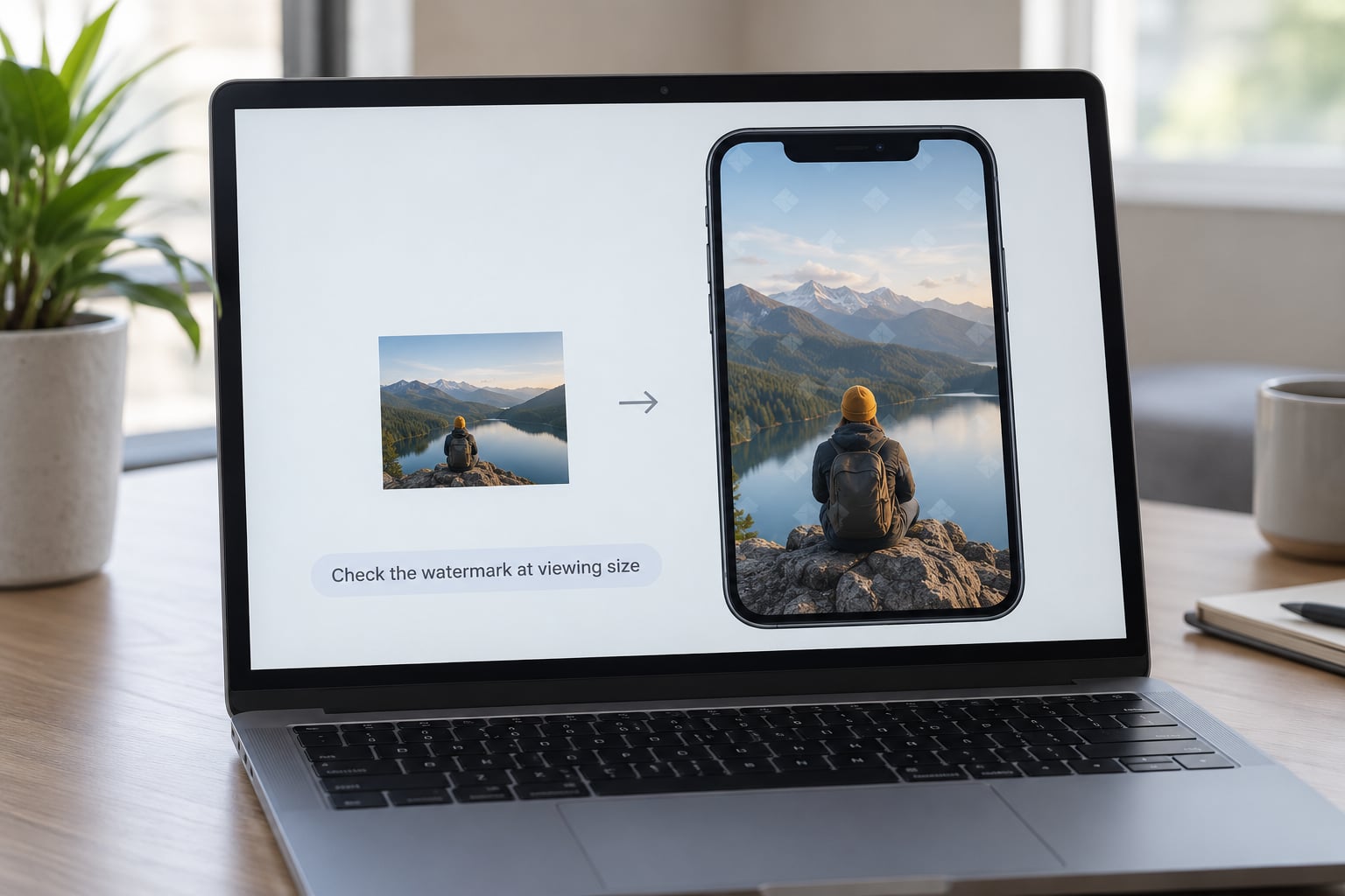
Zoom out until the image is about the size it will actually be seen. Most portfolio grids render at 400 to 800 pixels wide. At that scale a mark set at 3% reads clearly, while one set at 6% starts to look like a flaw.
Open the file on your phone too. That is where the second crop happens — the thumbnail in a social feed, the preview in a messaging app. A mark that survives the desktop view can still vanish in a grid square.
6. Export the right file for the intended use
Use JPEG for anything going to social media, email or a client gallery. Keep quality high, around 80 to 90, and export in sRGB — anything wider will shift colours on someone else’s screen.
Use PNG only when you need real transparency, such as a logo placed over a transparent background or a design draft. PNG files are heavy and no web platform needs them.
Never overwrite your master. Save the watermarked version as a separate file with a distinct name, so a two-version workflow stays possible: a watermarked preview for browsing, a clean high-resolution file for whoever pays. This step is where people ruin quality, by repeatedly re-exporting an already-compressed JPEG until shadows break up.
Common Mistakes
Each of these is easy to fix and hard to unsee once you have made it.
- Mark over the face or the product. Move it to negative space. Nothing distracts faster than a logo across a subject’s eyes.
- Corner marks on square-formatted platforms. Keep the mark inside the central square, or it gets trimmed.
- Huge centred text. If you can read it without pausing, it is too big. Halve the width.
- Pure white or pure black with no contrast check. Test on the specific photo, not on a neutral grey.
- Hairline fonts. They alias into grey mush at small sizes and look like a mistake.
- Watermarking the raw or the master. Keep the original clean, always.
- Re-exporting a compressed JPEG repeatedly. Export from the master every time.
- Changing the mark on every photo. Consistency is what makes a mark read as branding rather than as an obstruction.
- Full-strength tiling on portfolio work. Tiling belongs on sale previews, not on the images you want judged.
- Assuming a watermark is copyright. Copyright exists from the moment of capture in most jurisdictions. A watermark is a deterrent and a credit line.
- Forgetting invisible protection. Copyright metadata and a visible mark do different jobs; use both.
- Skipping the small-size test. If you only ever review at 100%, you have not seen it.
Two habits cover most of the rest. Pick one mark and apply it consistently, then review it after about twenty photos rather than after one — the problems that matter at volume are the ones you stop seeing. And if you sell images or license them, keep the two-version workflow as a rule rather than a preference: watermarked preview online, clean file on delivery.
One honest caveat. A visible mark deters casual copying, and it makes your work advertise for you. It does not stop someone with a clone tool or an AI eraser who is prepared to spend five minutes on your picture. What it does reliably do is make that five minutes visible to everyone else, and it gives you proof of who made the frame.
Frequently Asked Questions
What opacity should a watermark be?
Start at 30 to 50% opacity for a corner or edge signature, and drop to 10 to 20% for a centred, diagonal or tiled mark. Test the same value over the brightest highlight, the deepest shadow and the busiest texture before you settle, because a single opacity that reads on a flat wall can disappear on foliage.
Where should I put a watermark on a photo?
Put it in the negative space first: sky, floor, dark clothing, plain wall. A corner or lower edge is the quietest option for portfolio and product work. A centred or diagonal mark is harder to crop out but crosses the frame, so reserve it for previews and sale images where protection outweighs presentation.
How big should a watermark be?
Measure it against the image width. A corner signature at 2 to 3% reads as a credit without competing. A centred or diagonal mark can run 6 to 12% because it is treated as texture. Check it again at the size it will actually be viewed, usually 400 to 800 pixels wide in a portfolio grid.
Can you put a watermark on iPhone photos?
Yes. The Photos app can mark up an image directly: open the photo, tap Edit, then the key icon at the bottom, choose the Markup tool and draw your signature. For something more repeatable, Canva and similar apps place a semi-transparent logo layer with a slider you can set and save as a template.
Does a watermark protect copyright?
Not on its own. Copyright generally exists the moment you take the photograph, in most countries, without any registration or notice. A watermark is a deterrent and a credit line that helps you trace unauthorized use. If you need enforceability, keep your original file with intact metadata and register the work with your national copyright office.
Do watermarks affect image quality?
A semi-transparent layer does not reduce quality, but re-saving a compressed JPEG over and over does. Export every watermarked file from your untouched master, keep JPEG quality around 80 to 90, and stay in sRGB. Online tools that take an already-exported file and re-encode it are the usual reason a photo looks soft after watermarking.
Conclusion
Start with one action tonight: pick a single mark, save it as a transparent PNG, and apply it to a copy of one finished photograph at 2% of the image width in a corner, at 40% opacity. Zoom out to the size of a portfolio thumbnail, and if it still reads cleanly you have your template.
Then keep your master clean, export from it every time, and review the mark after twenty photos rather than one. That is how to watermark photos without ruining them — the mark stays quiet, the photograph stays the photograph, and anyone who wants a copy has to ask.